- Overview
- How to create simple bar chart?
- Settings
- What analyses work with this chart type?
- Examples
- Questions
Overview
The Bar chart is a way to display category series, usually created using the Scalar or Cross sampling analysis. It can be added only after some of the analyses, the ones which removes 'time' parameter.
It’s a good way to show comparisons between categories or to track changes over time. The graph types you can use are bars, lines, markers, and bubbles.
How to create simple bar chart?
- Add series.
- Add analysis and calculations. To show data in Bar chart you need to convert time series into category series. The best analyses for this purpose here is Scalar and Cross sampling.
- Add Bar chart.
Settings
The settings for the bar chart are different from most of the other chart types.

Chart elements:
- Graph with glyphs (bars)
- Main title
- Chart area
- Header
- Axis
- Column(s)
- Cell
- Legend
- Source logo & text
When you click on any element of the chart, several tabs appear in the ribbon area with different properties that you can edit. Because there are more settings available, they are divided into many tabs instead of having one Presentation properties tab.
Since version 1.30 of MB Analysis, we have implemented improvements that enhance the readability of bar charts.
Now the column headers and footers will wrap the text for column width adjustment without having to hard code the line break in the text box.
Changing default settings
Most properties have a default setting that is applied to the whole chart. You can override a default setting by editing specific elements. The new setting will make field pinned and will no longer use the default value. You can go back to use the default value by unpinning the setting - 'blue pin' will be shown then vertically.

Graph layout
In the Graph layout window, you can add and remove columns. When adding a column, you have the option between displaying values as text or as a graph. Here, you can also adjust the order of the columns, and change the graph types.

By default, a bar chart includes a text column containing the categories’ labels and a graph column with the values displayed as bars. There can also be several graphs within one column - they will be drawn in the order defined in this window.
Graph style
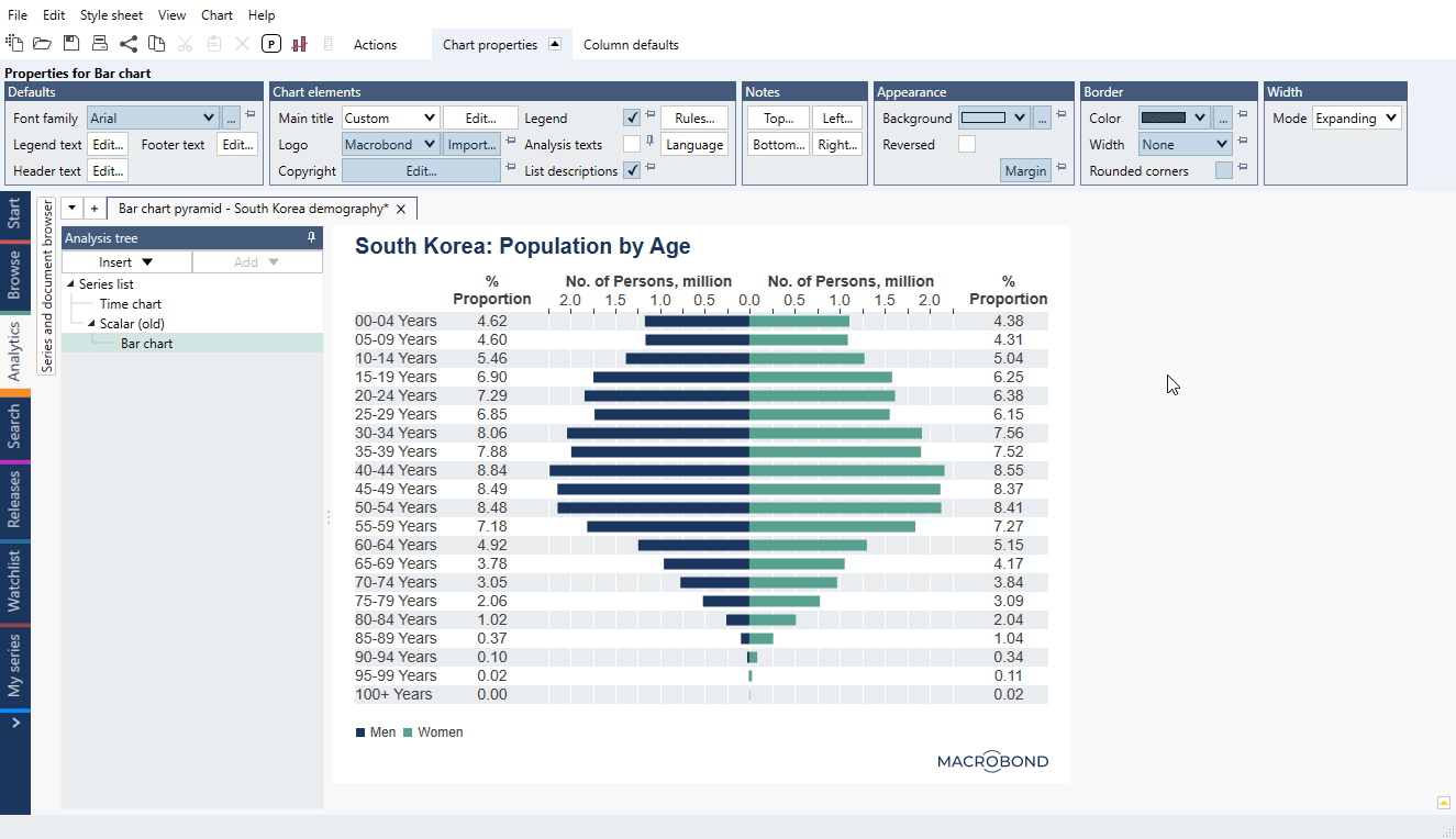
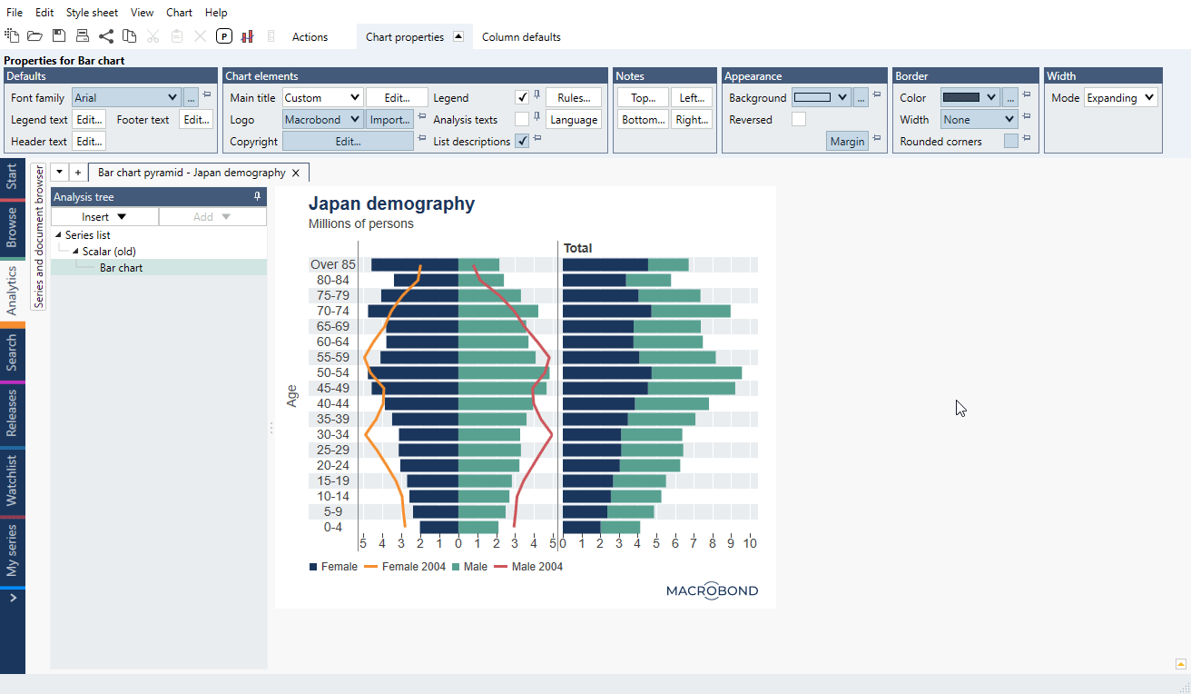
You can present the graph with one of the five available styles: Bar, Stacked bar, Line, Marker, Bubble and Range (which takes two series: one from the start and one from the end of the range). Below, you can see example with Range and Marker:

Chart size
Width
Width can be set to automatic under Chart properties tab > Width in three different ways:
- Expanding mode – where the width of the chart is a sum of all individual column widths.
- Fill mode – where the chart fills the width of the window.
- Custom mode – with fixed size.

When Fill or Custom has been selected, all columns that are not Text columns will be set to proportional mode. You can adjust this and make only some of the columns proportional. The proportions are used to determine the relative size when the size of the chart is changed.
The width of the columns can also be set explicitly per column. You can define it in the Column properties tab, or you can use the mouse to drag the divider between the columns.
Height
The height is determined by the size of the header, footer and graph area (and everything inside it). You can adjust default sizes under column defaults in the Chart properties tab > Column defaults panel.
Note that if you change individual element setting they won't be overwritten by the default ones.
Text columns
It is often very convenient to use Dynamic text in text columns. You can edit all the cells in a column at once by editing the Default text of the column. In the below example, we used the dynamic text {s .Value F2}%, to present the value of the series with one decimal followed by a percentage sign.

Graph columns
Here you can select graphic representation of the numbers. Note that different graph style can be added under same Graph column. Available styles are:
- Bar
- Stacked bar
- Line
- Marker
- Bubble
- Range

Symbol columns
You can also add a symbol in a form of mini pie chart. They are designed to show the proportions of two series or magnitude of one value on a scale 0-100. For more information see Symbol chart from bar chart (mini pie charts).
Legend
Bar chart legend works similar to other chart types' legend. Here it has its own panel Legend properties where you can reverse order, hide forecast, change sample size, change alignment etc.

Conditional formatting
Conditional formatting is used to set colors and text properties based on the values defined by a set of rules. This can be used to create heatmaps, show negative values, highlight largest smallest value and outliers.
True & False - text
You can apply True/False conditions to assign a text to each cell. Go to Column defaults > Text > Default cell text > Edit, navigate to Condition true/false - type in what should appear when the condition is met: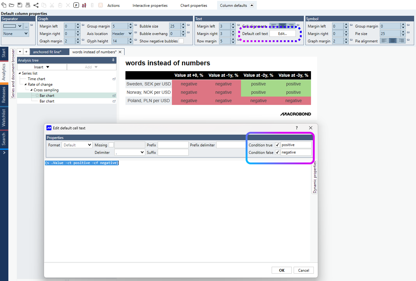
Many conditions - formatting rules
For coloring condition combinations see Bar chart conditional formatting rules.

Style sheets
You can define default settings for Bar charts in a Style sheet. Note that the settings for Bar charts are under separate tab in the Style sheet document.
When you apply a new style sheet to an existing Bar chart, there is an option to unpin settings that you have pinned in your chart so that all of the settings from the style sheet will be applied.

If you have a chart that you think looks nice and wish to create a style sheet based on that look, see section under Style sheet.
What analyses work with this chart type?
All types of analyses which remove time parameter and turn series into category series or use such series.
Examples
In this example, we created simple Bar chart and modify it with different styles and order on Graph layout.
We created a Bar chart with straight vertical line going through all bars. See method for Scalar and Cross sampling.
In this example, we use conditional formatting rules to color table by rows.
Bar chart - condition true and false with words instead of numbers
In this example, we use true/false condition rules to show text message.
Questions
- How to adjust the gap between bars?
- How to change size of bar/glyph?
- How to edit the formatting of all the values in a text column of a bar chart at the same time?
How to adjust the gap between bars?
You can change the distance between columns per observation and the distance between observations. Click on any one of the columns, and the following options will be available under the Column defaults:
- Margin – determines the gap between columns for each observation
- Group margin – determines the gap between column groups, meaning between observations

How to change size of bar/glyph?
Click on each bar and go to Graph properties tab > Content > Bar height.

If you want to change height for all bars/glyphs go to Column defaults tab > Glyph heights. If glyph isn't on default (locked with pin) it won't be affected by this setting.

How to edit the formatting of all the values in a text column at the same time?
Text columns in a bar chart are, by default, formatted individually. You can create a default format by clicking any one of the values and finding one of the following options:
- In the Cell Properties tab, go to 'Text properties' panel, and click 'Edit column default.'

- In the Column Properties tab, go to 'Cell defaults' panel, and click 'Edit text.'

Both of these options will bring you to the following window, where you can select from a list of formats. For more about these see Dynamic text.
