Overview
You can create Age Pyramid/Demography chart by modifying Bar chart.

How to create a simple pyramid chart?
Finding data
Each country has a data set from United Nations regarding age groups. This data also includes projections in various fertility variants. You can find it under Concept & Category data-tree:
Concept & Category > Demography > United Nations Department of Economic & Social Affairs (UNDESA) > Annual Population > Medium Variant
Or you can navigate in Country & Region database view to country node to check if they have such data from National Source:
Country & Region > Japan [jp, Region] > Demography [demo, Category] > Population by Sex
For more information about searching data see Finding data.
Which analysis can I use?
To show data in Bar chart you need to convert time series into category series. The best analyses for this purpose here is Scalar and Cross sampling.
Displaying age pyramid
- Use Scalar analysis to select the year with Calculations 'Last' or 'Value at.'
- Choose in the Output series panel 'Partition into: 2' to create two separate data sets.
- Add Bar chart, open Graph panel (Ctrl+L).
- Each data set add under different Graph column.

- On chart, click on any bar on the left and in ribbon tick box under Axis properties > Reverse.
Examples
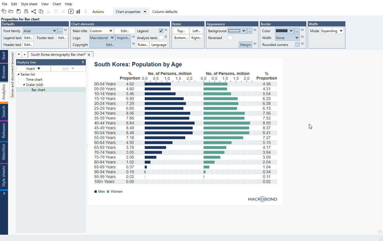
In this example, we created population pyramid with additional text column with proportion of age group in the whole population.
In this example, we created population pyramid and compared current data with older data (shown as a line). Next to it we added a stacked bar chart showing different approaches to presenting population data.
Questions
- How to adjust the gap between bars?
- How to change size of bar/glyph?
- How to edit the formatting of all the values in a text column of a bar chart at the same time?
How to adjust the gap between bars?
You can change the distance between columns per observation and the distance between observations. Click on any one of the columns, and the following options will be available under the Column defaults:
- Margin – determines the gap between columns for each observation
- Group margin – determines the gap between column groups, meaning between observations

How to change size of bar/glyph?
Click on each bar and go to Graph properties > Content > Bar height.

If you want to change height for all bars/glyphs go to Column defaults tab > Glyph heights. If glyph isn't on default (locked with pin) it won't be affected by this setting.

How to edit the formatting of all the values in a text column at the same time?
Text columns in a bar chart are, by default, formatted individually. You can create a default format by clicking any one of the values and finding one of the following options:
- In the Cell Properties tab, go to 'Text properties' panel, and click 'Edit column default.'

- In the Column Properties tab, go to 'Cell defaults' panel, and click 'Edit text.'

Both of these options will bring you to the following window, where you can select from a list of formats. For more about these see Dynamic text.
