When it comes to charting, two things are important to our users: the first is being able to clearly and persuasively present data, and the second is being able to create these presentations quickly. Some of the features that contribute towards these aims are intuitive point and click editing, a variety of chart styles to choose from, and customized style sheets, just to name a few. Overall, you’re saving time and getting your point across effectively.
Point&click approach
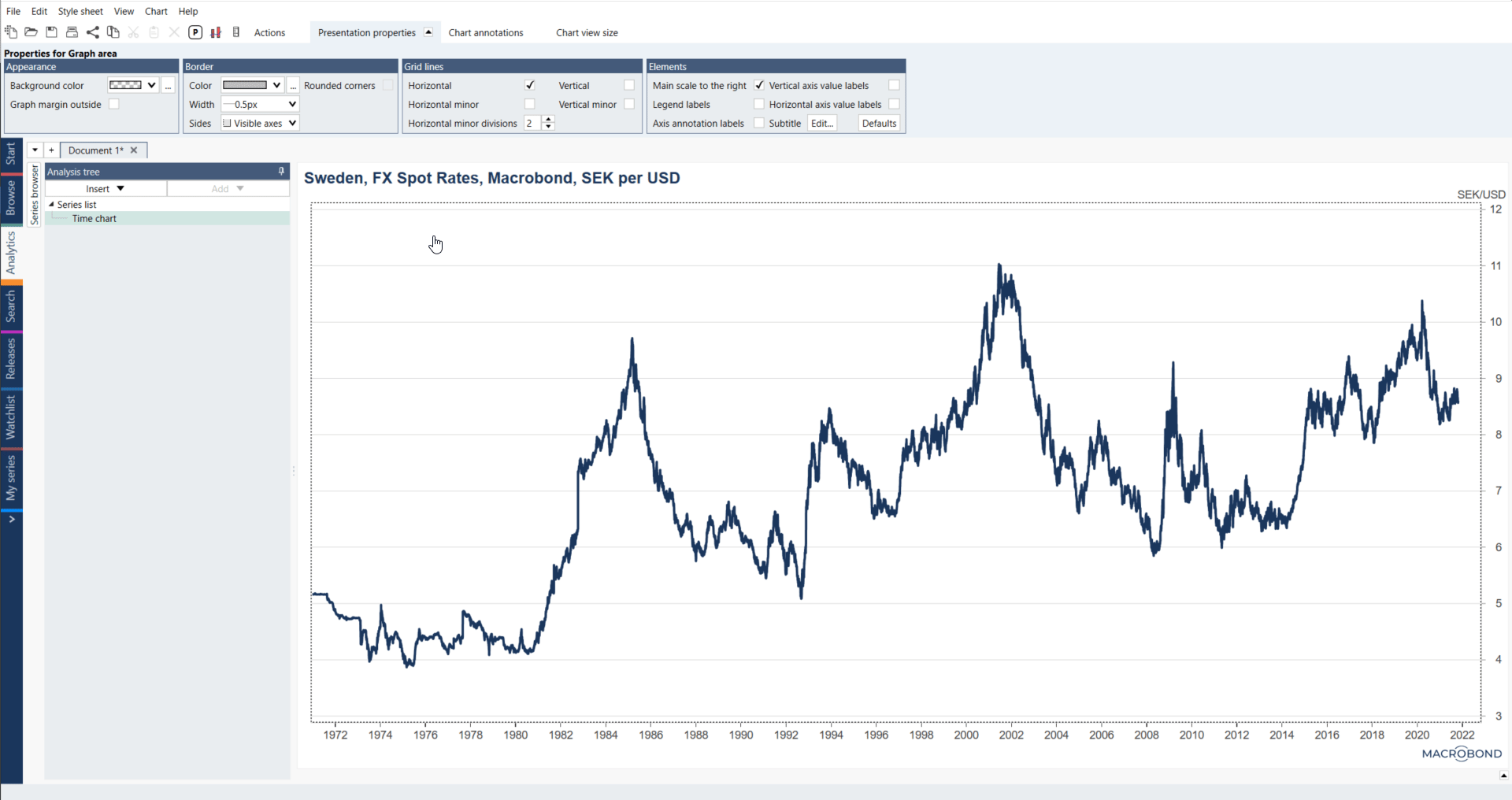
Point and click functions on the principle that any element of a chart you click on will activate the editing options for that element, in the command bar above. As you can see below, when we click on the chart heading the Presentation properties tab becomes active - and all modifications are instantly applied.
Various charts
There are several types of charts which you can use in your work. In Macrobond we call them Presentations. Access to them depends on type of analysis you're currently using, for more see Types of charts. 
Working with chart
Alternate scale
It's worth remembering that besides adjusting the more cosmetic chart properties, like color or font, you can easily modify properties such as the alternate scale. For more see Axis & Scale.

Date range
Mentioned previously point and click approach applies, whether you’re adding an alternate scale or changing the display range in your chart. For more see Axis & Scale.

Annotations
If you want to emphasize certain aspects of a chart you can use additional options besides the fundamental formatting one. For example, to draw attention to specific points you can add text annotations, markers or labels. For more see Annotations.

Graph layout
Graph Layout feature allows you to select graph styles, customize the chart layout, hide series and add or remove panes. Everything it's available in additional window which opens when you click on Graph layout icon, right click on your chart and select Graph layout or press Ctrl+L. For more see Graph layout.

Fill range
This feature can help you highlight a particular angle in a data – recession bands which is also known in Macrobond as Fill range. A fill range can be used to draw attention to a segment of the charted data. Alternatively, you can use the fill range function to create an additional layer of information like recession periods. To open Fill range window, you need to right click on your chart and select 'Fill range' or press Ctrl+F. For more about this see Recession bands (Fill range).

Style of the chart
It is possible to predefine settings for the layout and formatting of your charts by using Style sheet tab. For more see Style sheet.
There's a lot more useful features available when creating charts in Macrobond, you can view detailed information about these under Elements of the chart.