Overview
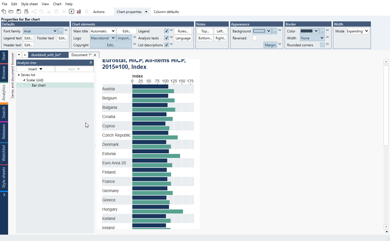
There is no dedicated chart type for Dumbbell charts. However, with Scalar/Cross sampling analyses you can create it out of Bar chart.

How to create a Dumbbell chart?
- Use Scalar (or Cross sampling) with 'Calculations: Value at' for two points in time.
- Add Bar chart (after Scalar countries will be sorted alphabetically).
- Open Graph layout (Ctrl+L), arrange series:
- turn the graph type to 'Range',
- in left panel mark both series, use 'Add new Graph column', change the graph type to 'Markers' and drag it under first Graph,
- mark series, use 'Add new Text column' > 'With value', drag it above Graph.
- mark another series, use 'Add new Text column' > 'With value'.
- Press 'OK'.
Adjusting chart elements
- Click on any range bar, change number under Graph properties > Content > Bar height.
- To change range bar color go to Graph properties > Appearance and change Graph style to Custom, select new color.
- Click on group of markers go to Graph properties > Appearance and change Graph style to Custom, select new color and size.

- Edit legend, main title and columns' titles.
Background graphic elements
- To add vertical line, click on one of them, under Grid line properties >Appearance change its color.
- To match x-axis' tick color, click on x-axis, go to Axis properties > Appearance > Tick color and change its color.
- To change background color go to Graph area properties > Row appearance > Background 1. To remove it put it to 'transparent color'.

Examples
In this example we have used Lists with HICP data and processed them with Scalar (or Cross sampling) to compare values for 2019 and 2022. Using lists make it easier to introduce changes - you make addition/deletion on a list, everything else stay the same.
In this example, we show simple sorted dumbbell chart based on High/Low values.