- Overview
- How to create a scatter chart?
- Settings
- What analyses work with this chart type?
- Example
- Questions
For elements not mentioned here see Elements of the chart.
Overview
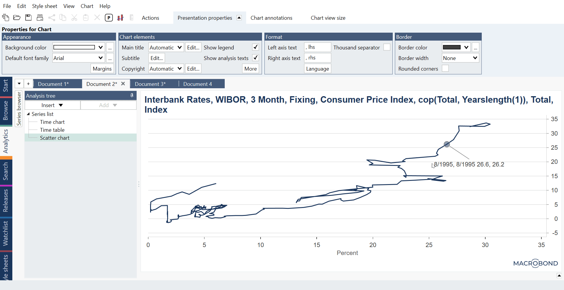
A Scatter chart displays pairs of time series as coordinates, where one series is placed on the x-axis and the other on the y-axis. A point represents the value of both series at one point in time.

Chart elements:
- Points/Graph
- Main title
- Graph area
- Vertical value axis (y-axis)
- Source logo & text
- Chart background (outside chart area)
- Horizontal value axis (x-axis)
- Legend
How to create a scatter chart?
You need two series to create one set of dots - first for x-axis, second for y-axis. If you have data for many series we recommend using List functionality to avoid manually matching series on Graph layout.
Settings
To edit any one of the scatter plot components, click on it, and the available options will appear at the top of the window, under the presentation properties tab. For more information see Editing text parts of chart.
Graph settings

When you click on any point of the graph, the settings that become available under the presentation properties tab are especially relevant to fine tuning the look of your graph. In the Appearance box, you can customize the style and color of the graph display, for example selecting whether you want a line or markers in the case of a line graph, and the size of the bubbles in the case of a Bubble chart.
Here, you can also limit the time range displayed for the graph you have selected by specifying points in time under Data ranges.
Graph layout
You can access this window by right clicking on the chart and selecting Graph layout.

Here, you can define how the graph should be displayed (line or bubble graph) as well as which series corresponds to which axis. On the right side of the window, the graphed pairs of series are displayed under a graph type. The first series of each pair is placed on the x-axis and the second one on the y-axis. Click and drag to move them if you want to switch the axes.
Line chart
When graphing the same pair of series twice in a chart (if, for instance, you would like to display two ranges of time in different color) it is important that the series are in the same order, as in the picture above.
Bubble chart
The bubble chart requires a third series to be added last in the list. This third series will define the relative sizes of the bubbles. For more information about this type of chart see Bubble chart.
Chart settings
These settings can be accessed after clicking outside chart area.
Appearance > Margins

This panel of settings manages the distance between elements on the chart. Indentation defines the minimum distance from the leftmost/rightmost side of the chart and the left/right side of the graph area.
What analyses work with this chart type?
All types of analyses which keep time parameter.
Example
In this example we presented available types of charts.
Questions
How to change connected line to dots?
Click on the line in the chart and look under the Appearance group in Presentation properties.
Here, you can change the Graph style from Automatic to Custom and choose the style you’d like. You can remove the line between observations by setting its thickness to None and add a Marker style and size.

How to highlight the latest observation?
You can highlight the last observation on a scatter chart in one of three ways, depending on how you would like to highlight it. With option 1, you can circle the point and add text. With options 2 and 3, you can change how the point is plotted, and change its shape, color, or size.
- Using an Observation label
a) Having your scatter chart selected in the analysis tree, right-click on any point and select Add observation label.
You can also go to Chart annotations > Annotations, select Observation label and click any point on chart to add an observation label.
b) Double click on a label to change its content. For more information see Dynamic text.
c) Edit the style of the label by ticking the “Custom style” box under the Presentation properties panel. - Plot the same scatter line again and only show the last value on the chart
a) Open the Graph Layout and add another Line graph type with the same time series (make sure they are also in the same order).
b) You will not have a line so you need to turn on markers for that line. Adjust the appearance by changing under Presentation properties > Graph style from Automatic to Custom, selecting Line: None and setting Marker style and its size.
c) Keep that line selected. To limit the range displayed go to Presentation properties > Data range. You can show only the last value by typing '+0' into both fields.
- Use formula language to turn the last value into a forecast, then change how forecast values are presented on the chart
a) Type the following formula into the Series list or an inserted Formula analysis. This flags value as a forecast when the current observation number is equal to the last valid observation number of that series:FlagForecast(fx:s1, Counter(fx:s1)=EndValid(fx:s1))
b) To change how forecast values are presented click on the graph in the Scatter chart, select Presentation properties > Appearance > Graph style: Custom > Forecast

How to show only one date/value in label?
Our labels use Dynamic text feature. The default text for a label is:
{s .Date -m -s " "}{s .ValueLabel -m -s " "}{s .Value}
On the right, under Dynamic properties, you can find 'All series' drop-down menu. There you can find alias for each series. In Macrobond they are named s1, s2, s3, etc. To show Date or Value for a specific series just add this alias before dynamic text:
{s s1.Date -m -s " "}{s s1.ValueLabel -m -s " "}{s s1.Value}