For elements not mentioned here see Elements of the chart.
Overview
Column and Stacked column charts display data as vertical bars. Categories are applied depending on analysis used before. In most cases output can be a time series but after analyses such as Scalar or Slice.
Column
It shows each observation as a single column, when there's more than one series on a graph, it will represent it as separate column in different color.

Stacked column
The difference between Column and Stacked column is that the second one will display all series stacked on top of each other. It's worth to remember that stacked column works only when you have more than one series in your chart, otherwise it will look exactly as normal Column graph with only one series included.
What this type of chart needs?
Column and stacked column chart needs data specified as observations or categories. Both are available in the following chart types:
- Time chart
- Category chart
- Bar chart
How Graph layout works?
Graph layout window allows to choose one of graph styles which differs depending on chart type. There are three ways to access Graph layout settings:
- by clicking on Graph layout icon
- by right clicking on the chart and selecting Graph layout option

- by using the keyboard shortcut CTRL + L

Here, you can define how the graph should be displayed as well as which series corresponds to which axis. On the right side of the window, the graphed pairs of series are displayed under a graph type. The first series of each pair is placed on the x-axis and the second one on the y-axis. Click and drag to move them if you want to switch the axes.
Example
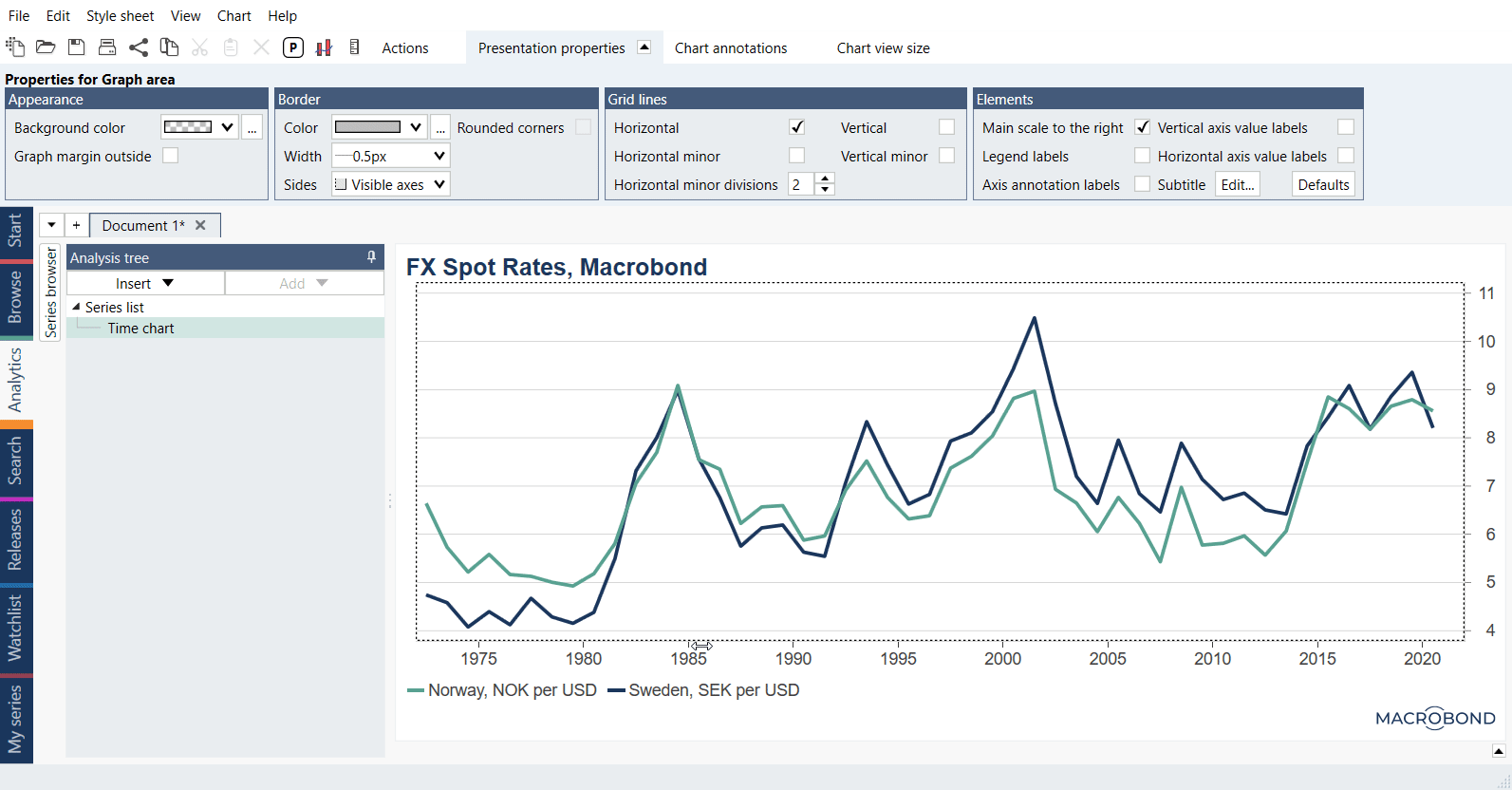
In this example we presented available types of charts.