Overview
You can create a Heatmap by modifying Bar chart in a way that presents values by assigning them a color from defined range of colors - using Bar chart conditional formatting rules.

How to create a heatmap?
Shortcut from panel
In Actions ribbon you will find a panel with shortcuts which create heatmap with latest 12 observations. Mark all series which you want to use and select one of the options:
Build it
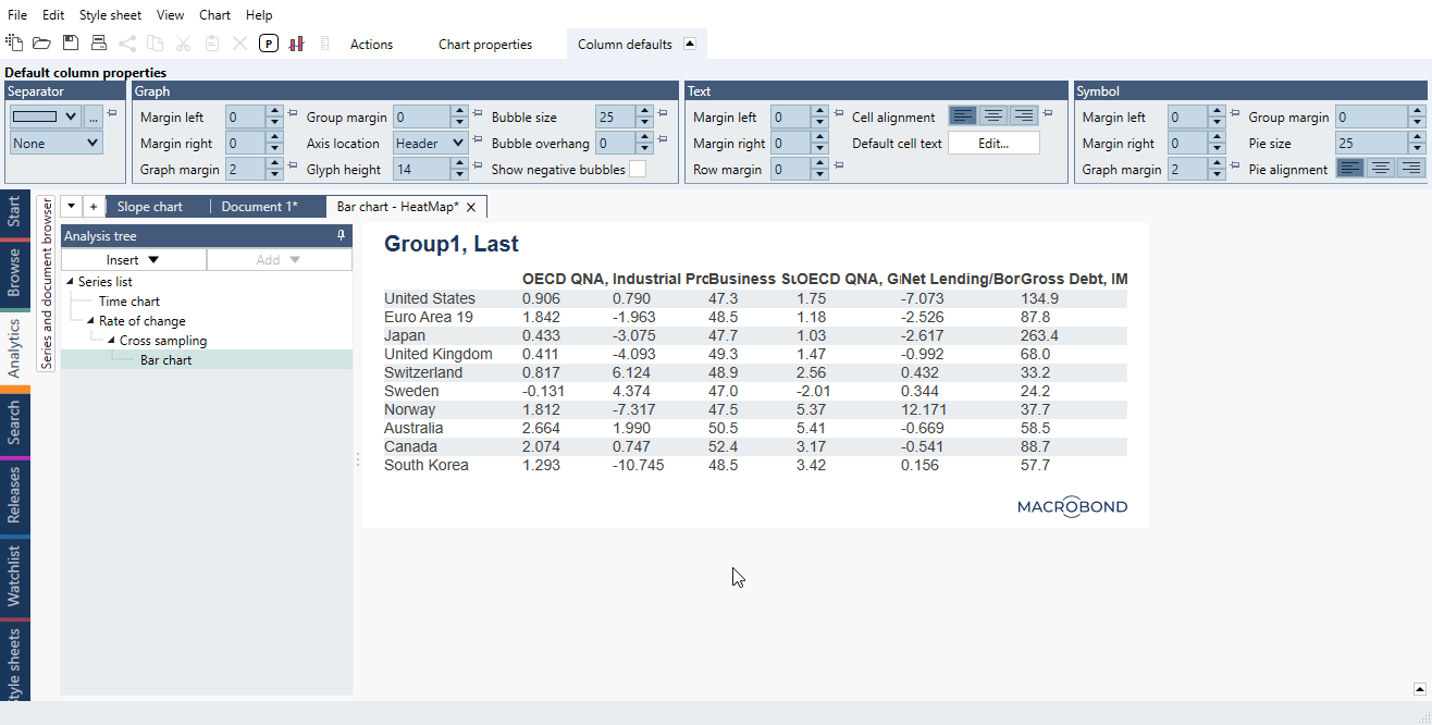
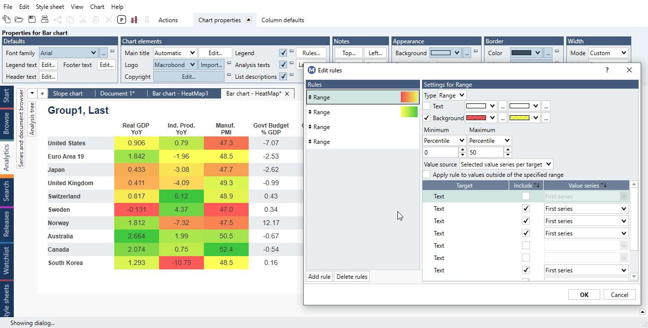
To create a Heatmap first you need to have Bar chart in a form of Dynamic table - this is just a simple table but the values will change after series update. By setting color rules you create Heatmap.
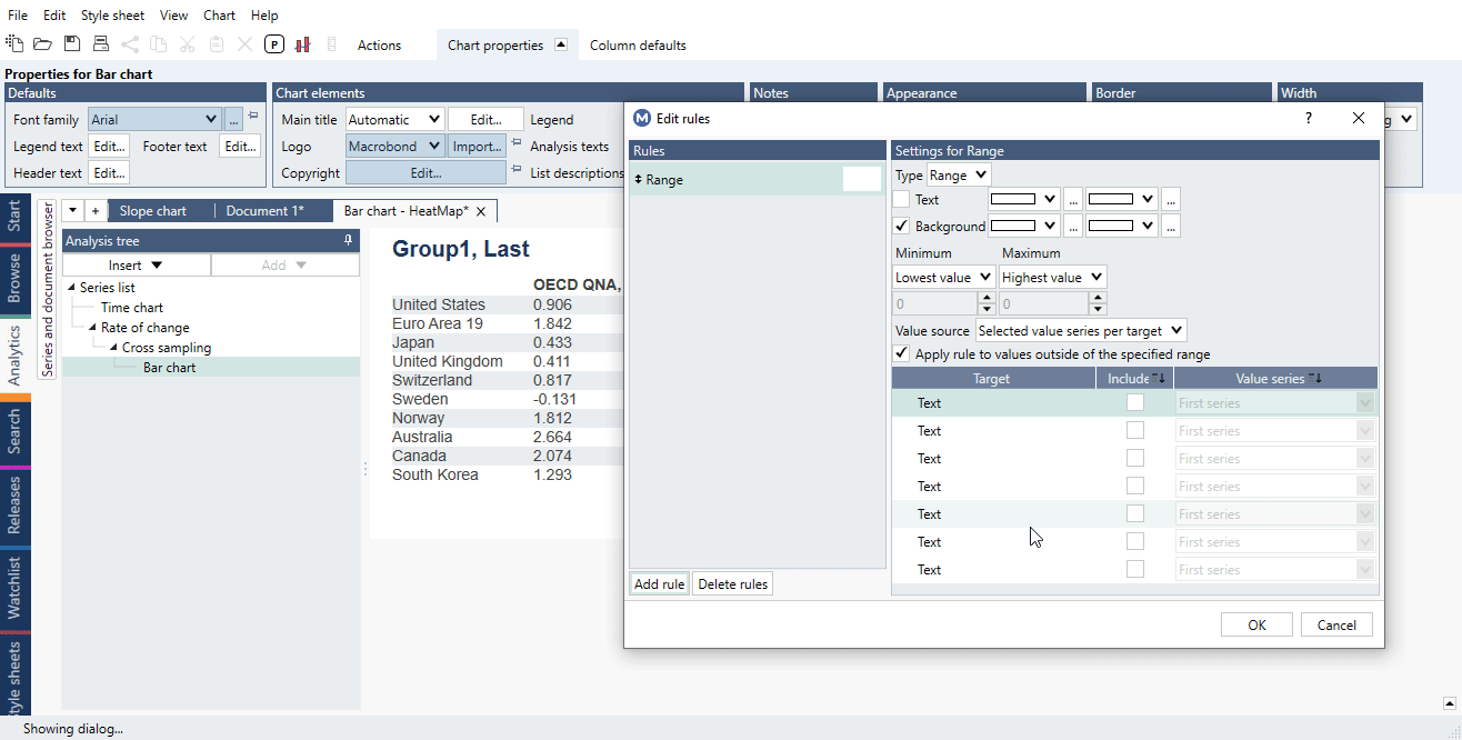
Rules panel is available under Chart properties > Chart elements > Rules. In the new window, simply press 'Add rule' and start the process:
You can highlight either 'Text' or 'Background' for each cell. For more information about types (Range, Condition, Rank, Average) see Bar chart conditional formatting rules.
Choosing color ranges
Two colors
After adding a rule, select colors for backgrounds and check in 'Include' to which columns should this be applied. Then press OK. See below paragraphs to learn more about the process.
Three colors
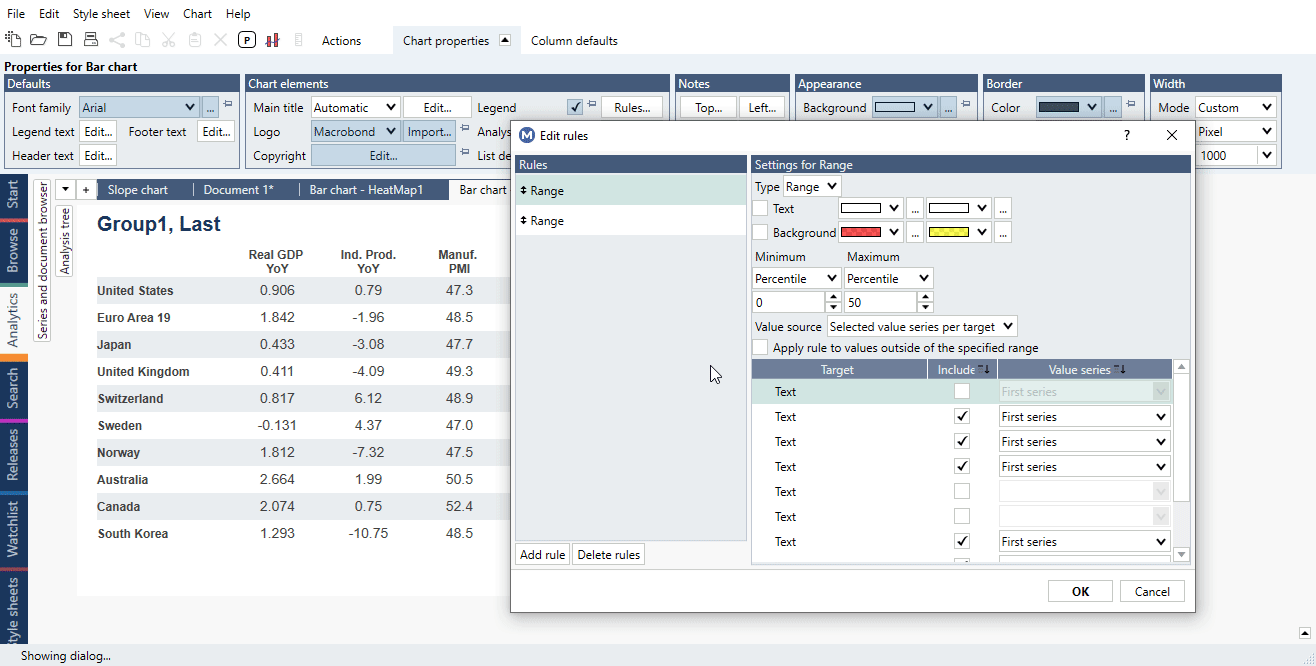
Let's say you want to set three colors on your Heatmap, for high, middle and low values. You need to define two ranges of colors.
For example: 0 to 50th percentile as a range from red to yellow and 50th to 100th percentile as a range from yellow to green. This way you will receive a heatmap showing the highest percentile in green, lowest in red and all others in the colors range accordingly to their values.
Applying rules to chart
You may apply a rule to all visible values in the table, or for each column separately.
 You may also decide to which columns apply the rule. Note that first column is the one with descriptions. It's not possible to apply rules by rows.

Multiple rules - different rules for different columns
In one Bar chart you can have different rules for different columns. Each column is a separate entity, and a rule will apply to each column’s values range separately. For more information about Rules see Bar chart conditional formatting rules.
The Rules will be applied in the order they appear and a Rule further down the list can change settings made by an earlier Rule.
Value series
The default setting in 'Value series' is 'First series'. This means that the range used for coloring cells will be based on that column's value range. You can of course choose another series to be base for a range. This is useful in constructing ranking heatmap - see the file in our Examples.
Using other series for color formatting
You may also use other series to define the range of values of plotted series, even the one not used in the chart.
Example: You have one standard series with values and another which is condition-formula:
if(fx;s1<0, 0, 1)
You want to show the actual values on chart and use the formula-series to color them. '0' value if the change was negative and '1' if it was positive. This would look like this:
Examples
In this example, each column is a different indicator. We applied conditional formatting rules based on range of colors to the Bar chart creating a heatmap. Colors are applied 'by column'.
In this example, we added helper document in-house series to create a heatmap with ranking (by each column). Each country has same color throughout all columns.
Here we used CPI components and its weights to create a heatmap with values for last year (rolling).
In this example, we used main CPI components and added monochromatic pictogram to each category.
Questions
Can I format within a row instead of a column?
No, formatting works only within columns or whole chart.