Overview
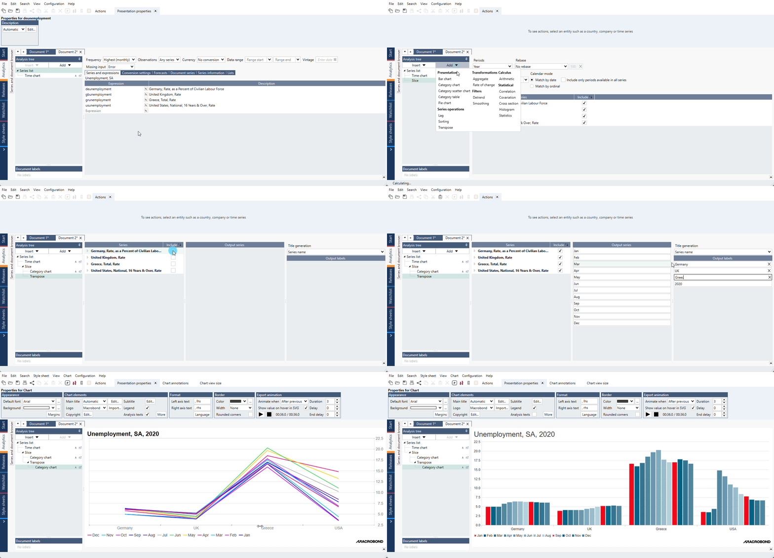
Example of general use of Transpose analysis showing how to swap the axes of Category chart:

This analysis changes position of data - data from x-axis will be shown on y-axis and vice versa. You do not need to re-arrange series or change analysis' settings.
Transpose can be used with Category chart, Category scatter chart and Category table.
After which analyses I can use Transpose?
You can add it only after those analyses which outcome is presented as category data:
- Cross sampling
- Scalar
- Slice
- Seasonal adjustment MA
- Yield Curve
- Correlation
- PCA
- Regression
How to use it?
Add Transpose analysis and check the box in the 'Include' column. The Output labels can be automatically generated with Title generation tool. Below in Analysis tree add the chart/table.
Examples
In this example we performed Cross sampling analysis. With Transpose instead of having each country separately we can have them grouped by region.
Here we sliced 2020 year from unemployment rate series. Then with Transpose we changed place of data - country is on x-axis and color is for each month.
See Transpose used to show distribution of years (with date) by number of starts of new house construction.
Create two stacked columns with different calculations for each of two countries using Cross sampling and Transpose.
In this example we added new row in Bar chart with mean value for each column.