Overview
Example of general use of Scalar analysis comparing Low-High range and Last value for group of series:
The Scalar analysis is a tool for extracting particular values or metrics and comparing them across series. Use this analysis when you want to create a chart with categories, such as countries, along the x-axis, and columns of values on the y-axis.
The scalar analysis can perform a variety of calculations that result in one value per input series, such as the last value, the mean in a time range, or year to date performance. The output is always a category series, meaning that the time variable is replaced by a categorical variable. You can display this output in a Category chart, Bar chart, or Category scatter chart.
Settings

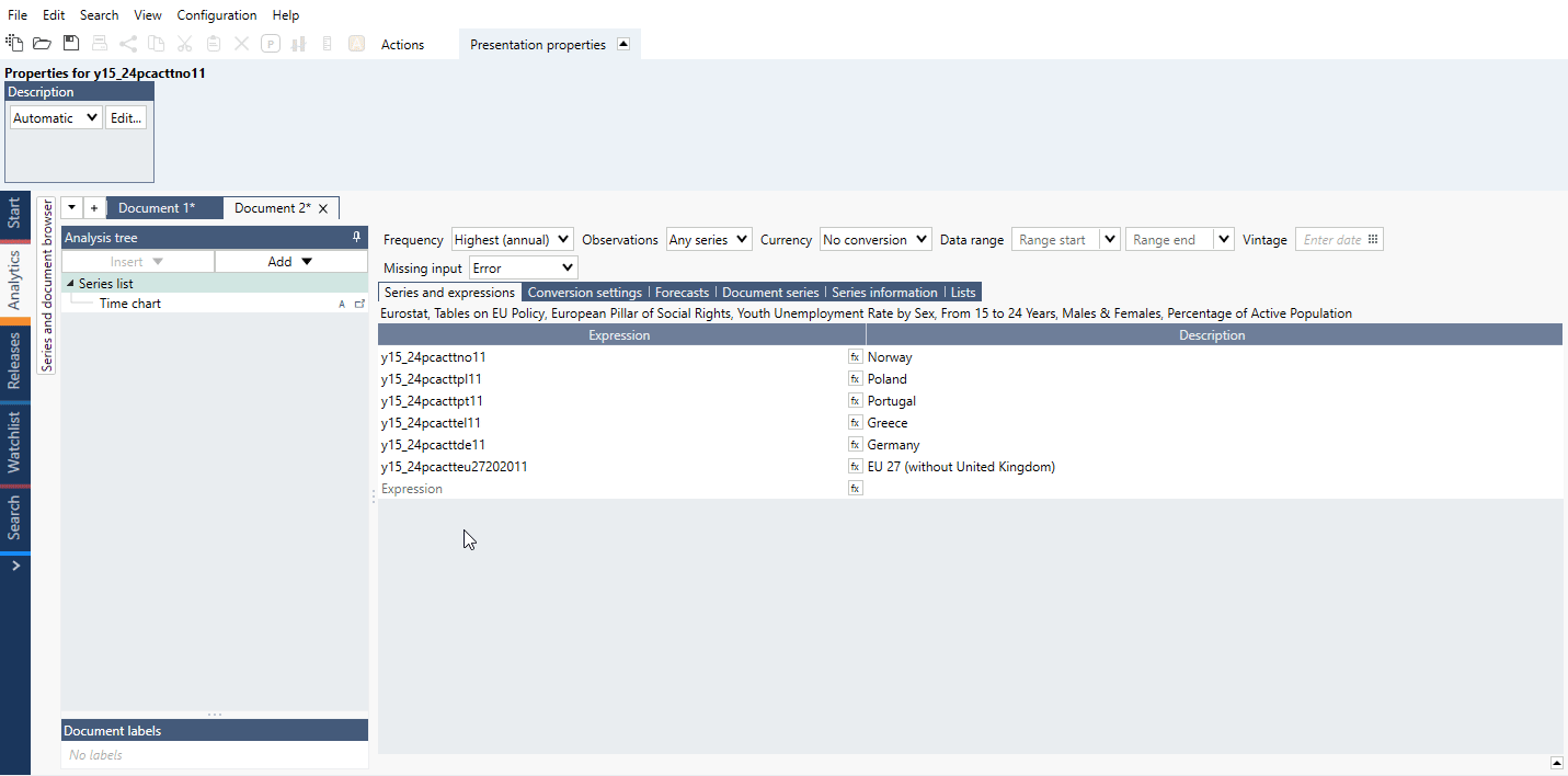
Input series
This is a list of the series in your document that you can include in the scalar analysis. That a series is ‘included’ means that the added calculations will be performed on it, and the resulting values will be included in the output series. You can also select whether new series that you add to your document should be automatically included in the calculations.
The order of the series in this list determines the order of the values in the output series. You can adjust the order by clicking and dragging series, or sort them alphabetically by clicking 'sort.' Sorting is done by region followed by maturity length, price type and, if all else equal or not available, alphabetically by title.
Automatic attributes for Value labels

By default, Value Labels are generated using the non-common elements of the series descriptions. This works well for series using harmonized descriptions.
In certain cases, you might end up with very long value labels. To avoid this, this setting allows you to pick from a list of attributes you want to display to automatically generate the value labels.
Calculations
Here, you can add one or more calculations that will be performed on all selected input series. The available calculations are:
Open, Close, High, Low
The first, highest, lowest, or last value of the specified range.
Mean, Median
The mean or median of the range.
Last
The last valid value of each series.
Last common
The value at the last point in time at which all the included series have values.
Last non-forecast
The last value that is not a forecast in the series.
Value at
The value at a specific point in time. If a series is missing a value for that date, the first available value before that date will be used.
Nth last value
The nth last value of a series, where a value of 1 gives the last value, 2 gives the second value to last, 3 gives the third value to last etc.
Year, Quarter, Month, Week to date
The performance from the start of the period to the specified date. The performance is measured as the change compared to the last value of the previous period.*
Performance since
The performance between two specified dates. The performance is measured as the change compared to the last value of the previous period.*
Performance analysis works a bit different than performance calculation. In Cross sampling and Scalar program finds the first non-missing value and use that as the base value, while in Performance it gives an error if the specified start date is missing. You can use 'Strict' box to select the date.
Note that since version 1.29 the ‘Strict’ option is removed in new documents as it is always turned on for calculation.
Years, Quarters, Months, Weeks back
The change from a selected number and type of periods before the specified date.*
For years and quarters, this is the same as using the 'Rate of change since' method and specifying the start of the range as '-1y' or '-1q'.
Rate of change since
The rate of change between two points in time.*
Rate of change analysis works a bit different than Rate of change since calculation. In Cross sampling and Scalar program finds the first non-missing value and use that as the base value. You can use 'Strict' box to select the date.
Note that since version 1.29 the ‘Strict’ option is removed in new documents as it is always turned on for calculation.
Percentage proportion
The percentage proportion of each series compared to the sum of all series at a specified point in time.
Standard deviation
The standard deviation of the range.
Percentile
The specified percentile of the selected range.
Lower, Upper tail mean
The mean of the values in the upper or lower percentile of the range.
Trimmed mean
The mean of the middle values as specified by the percentage.
Standardize
The mean divided by the standard deviation of the range.
Note that formula Standardize() won't give same outcome. In formula we standardize the series (value - mean)/stddev for each value. While in Scalar we calculate a standardized value for the whole series (or a specified interval) according to mean/stddev.
Settings for calculation methods
*Relative dates
Most scalar calculations require either a point in time or a time interval to be specified. You can use specific dates, but you may want the dates to update when new data is added. In that case, leaving the date box blank or using relative dates, such as '-1y', can be useful. It’s important to understand what default dates are chosen when none is specified, and how relative dates work in each context.
Point in time
First, we’ll talk about calculations that require only one point in time, such as value at. If the point in time box is left blank, the last valid value for each series will be used.
If you specify a relative date here, that date will be relative to the last calendar date, not relative to the last date for each series. If you would like the last calendar date to be used, even though not all series may have values, you should use the relative date '+0'.
Time intervals
If you leave the range start blank, the first available value for each series is used. If you leave the range end blank, the last available value for each series is used.
When you use a relative date for the range start and leave the range end blank, the end point will be the last valid value for each series and the starting point for each series will be relative to its last point, not the last calendar date.
If you use relative dates for both the range start and the range end, they will both be relative to the last calendar date.
Value labels
These are the categories of the output series produced. A tip for when you want to know what your chart will look like is to look at these categories listed as value labels. They are also the labels that will appear on the x-axis of your category chart, or the right side of your bar chart.
Output series
There are four possible ways of organizing your output. The one you should choose depends on:
- Whether you want to group your input series, and
- What categories you would like on the x-axis

These four options can be divided into two types based on whether or not you would like to group the input series.
One series per calculation & one series per input
Choose one of these two settings when you do not want to group your input series. The categories on the x-axis, then, are either the series names or scalar calculations.
- One series per calculation: Use this setting when you want the input series names on the x-axis. It creates one category series per scalar calculation done, where the categories are the input series. Example:


- One series per input: Use this setting when you would like the x-axis to contain the names of the calculations you’ve done in scalar. It produces one output series per input series, where the categories are the calculations done. Example:


New group after every n series & Partition into n series
Choose one of these settings when you do want to group the input series by some series descriptor, such as country. Switching between the two settings will switch which series descriptor is the category on the x-axis (value label), as illustrated by the example below.
- New group after every


- Partition into


The output of this setting also depends on the order of the series in the input series list. Pay attention to the group number that appears next to the series.
Series with the same group number make up the same output series. The application creates the output categories based on the descriptors that are not common within these groups.
Methods
Rates of change as value, percentage or logarithmic are calculated in the following way:
where c is the typical number of observations in one year.
Examples
In this example, we calculated the average GDP growth per decade by adding one 'Mean' calculation per decade. We also used the setting 'One series per input'. This means that one series will be created for each input series that we use. We have 6 countries, so 6 category series will be created, one per country.
We used the scalar analysis to produce a single category series for the YTD performance. Here, 'One series per calculation' means that one category series will be created per calculation applied.
We have taken last value for number of Females and Males in Labor Force. In first example series were sorted by the total number of persons in each country - chart displays Female/Male division.
Second example shows total number of Females and Males in Labor Force for all countries with division by country.
See how to use formula to highlight chosen series or series based on a conditions.
Shows the percentage change of last value of the US CPI components on a Bar chart.
Using 'One series per input' compares three calculations for two countries.
Compare YoY change of GDP for five countries.
Scatter chart comparing two parameters for a number of countries
Compare two indicators for group of countries sorted with 'Partition into'.
The yearly change for several series sorted in descending order
Compare YoY change for several countries.
Questions
- How do I sort category series after Scalar?
- How to show date(s) of observation?
- What is the difference between the Rate of change analysis and selecting ‘Rate of change since’ when doing a Scalar analysis?
- Why I can see 'Strict' option in one document and can't in other?
How do I sort category series after Scalar?
You should use the Sorting analysis.
With multiple category series, make sure that after having set the direction for the main series, you also set the direction of the remaining series using 'by [series name]', so that they follow the main reference-direction.

How to show date(s) of observation?
When using 'Last common' or 'Value at' calculation method you can select metadata {s .ObservationDate}
Example:

What is the difference between the Rate of change analysis and selecting ‘Rate of change since’ when doing a Scalar analysis?
- Rate of change analysis calculates the changes from the end of each time series while
- 'Rate of change since' in Scalar analysis calculates it from the end of the whole calendar. Meaning that if some series do not end at the same observation date, the calculation range will differ.
You can set the 'Range Start' and 'Range End' in the Scalar analysis to make sure the calculation is done on the same range across all input series.
Example:

Why I can see 'Strict' option in one document and can't in other?
Since version 1.29 the 'Strict' option is not available in new documents as it is always turned on for calculation. File where you can see that option was created in an older version of Macrobond.