The legend lists which series were used in a chart along with a legend key. You can edit the legend by clicking on it and adjusting the settings in the Presentation properties tab, above the chart.
Settings
The settings are grouped in four boxes, each for different aspects of the legend. We’ll go through the settings for each box below.
See here pre-1.30 version view
Appearance
Modify things like the background color, text color and font, as well as the following:
Layout mode
Decide how you want the text in the legend displayed: single or multiple columns, or a continuous line (flow).
Sample size/Sample length
Decide how big the sample (line, dot, square, etc.) should be. See Changing length of line or sample size.
Distance
Controls the distance between the element and the next element in the direction of the chart.
Margin
Define how much space you want between the border of the chart and the legend.
Spacing
This setting controls the spacing between legend items.
Show legend
Hide the legend.
Reversed order
Tick this to reverse the order the series are listed in the legend.
By default, the order of the series in the legend will reflect the order of the series in graph layout, and their placement in the chart, from front to back.
Hide forecast
If you have same color for forecasted values on legend you will se two same samples (i.e.; lines). See Removing second (forecast) line from the legend.
Size
You can set the alignment of the legend or, if you have selected a floating legend, you can choose a horizontal or vertical fit for the legend text.
Border
This group contains options for the layout of the border of the legend, such as: color, width and the setting rounded corners.
Content
Location
Set the position of the legend in the chart. This includes an option to freely place the legend anywhere within the chart. Since MB Analysis 1.30 it is possible to choose Floating per pane option.
Default legend text
You can choose to edit the automatically generated legend text and add your own text, or use the dynamic properties feature to specify which series attributes you want to use in the legend.
Analysis texts
By default, the analysis text appears in brackets in the legend text. You can remove it, by unticking the Analysis texts box.
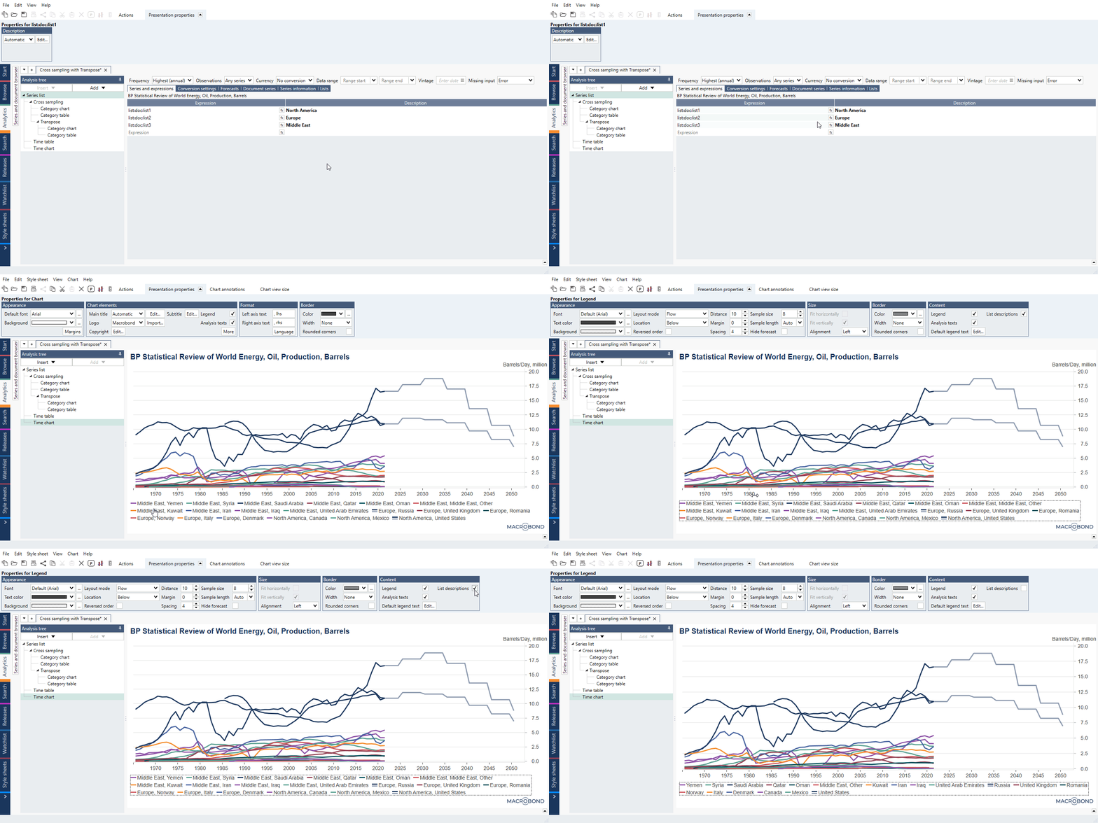
List descriptions
By default, the lists description appears in legend for each series. You can remove them, by unticking the List description box.
Graphics
Removing second (forecast) line from the legend
The second line is the color/style for forecast values. To have only one line, go to mark Legend area and under Presentation properties > Appearance mark Hide forecast. This will remove second lines only from legend.
You can also remove double line by disabling forecast from series with formula:
flagforecast(imfweo_de_ngdpd, 0)
or by removing forecast values from series:
if(isforecast(imfweo_de_ngdpd), Null(), imfweo_de_ngdpd)
Changing length of line or sample size
To change line's length, click on Legend area and under Presentation properties > Appearance > Sample length change setting from Auto.
For charts which use sample size instead of a line (i.e., columns, areas, bubbles) you can change size of sample in legend under Presentation properties > Appearance > Sample size.
Text
Editing the text in the legend
There are several ways to take on changing the text in the legend of a chart. You can modify the legend text for one series at a time, or you can edit the default legend to change all series' legend text at one time.
If text (or anything else) was set to Custom, changing setting in higher hierarchy won't work on that element.
Example: You've changed legend description for one line (click on a line > Presentation properties > Content > Graph text: Custom) so changing 'Default legend text' won't affect it.
Edit one line's legend description
Double-click on the graph for which you'd like to modify the legend text.
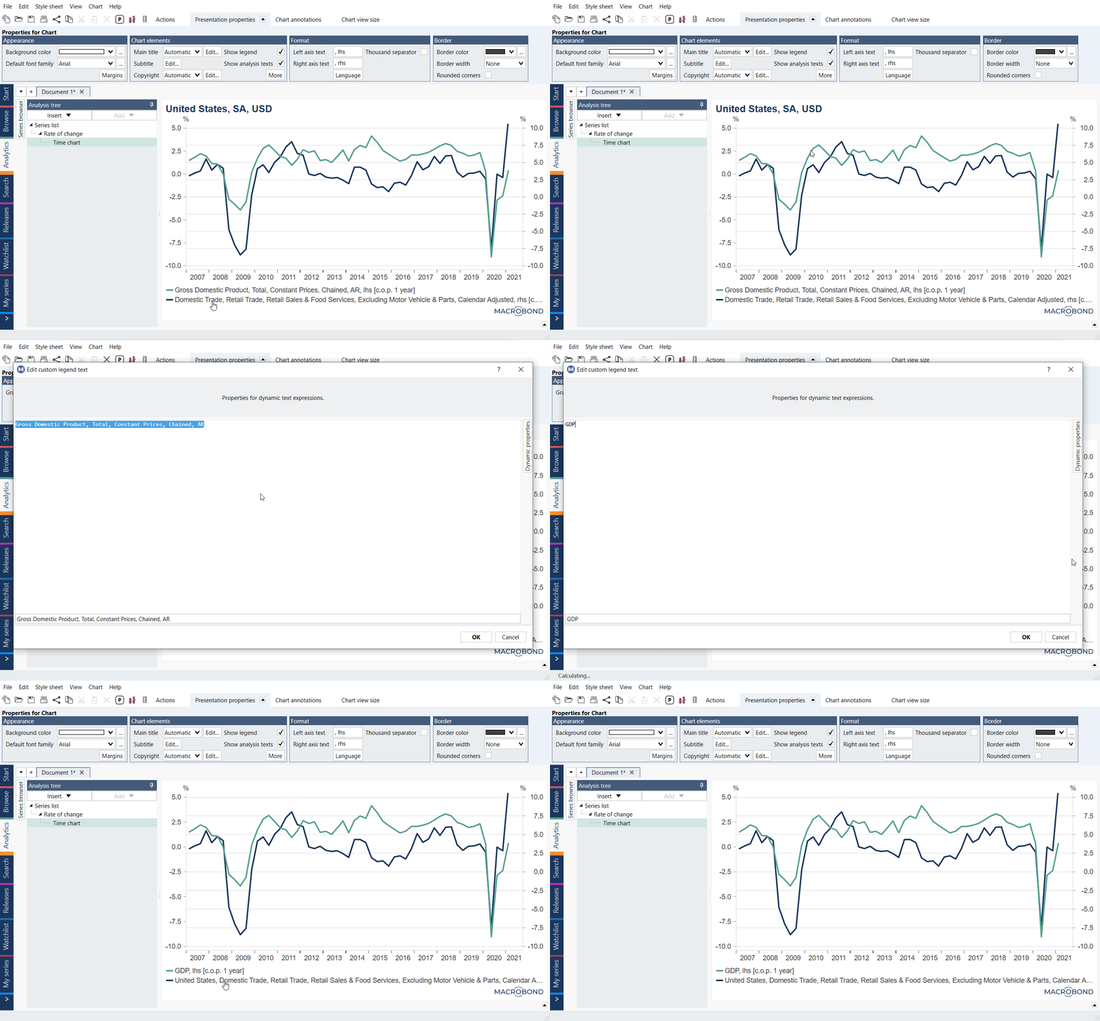 Alternatively, you can click on the graph once and find the "Edit" button next to graph text under the Presentation properties tab.
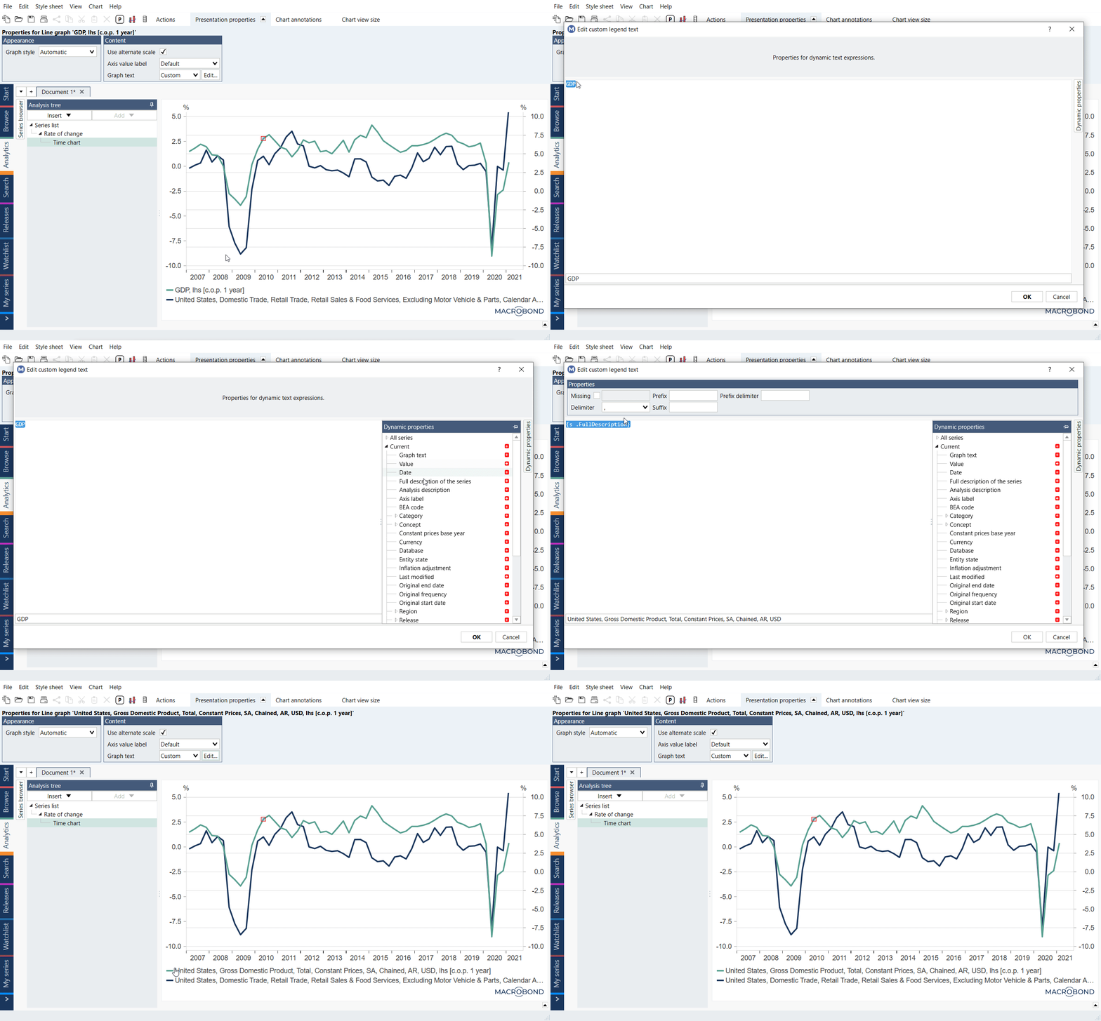
Edit the default legend text
To edit all the series' legends at once, click on the legend. Under the Presentation properties tab, click the Edit button next to 'Default legend text' in the Content group.
This is used together with dynamic properties, for instance if you want only to display the country of each series. If text (or anything else) was set to Custom, changing setting in higher hierarchy won't work on that element.
Editing / removing 'lhs' and 'rhs'
See How to edit / remove the axis text: lhs and rhs?
Hiding all legend's texts
Start by clicking on the legend area. Go to the Presentation properties tab in the 'Content' group, untick the checkbox Legend.
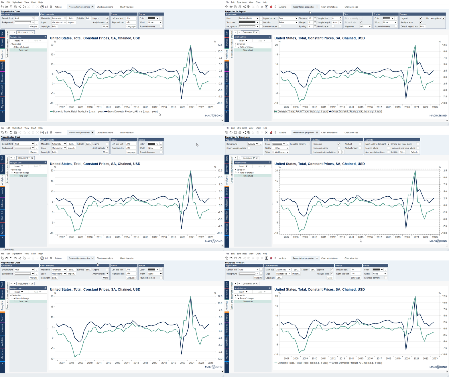
To bring the legend back into your chart, click below the x-axis, go to the Presentation properties tab, in the Charts elements panel, tick the Legend checkbox.
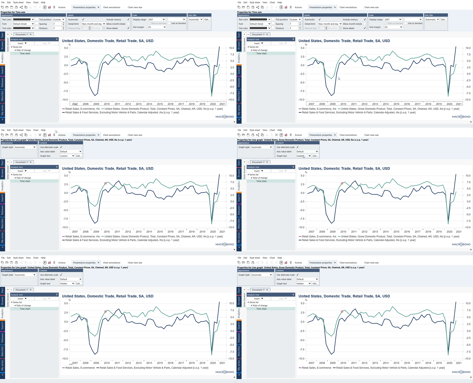
Hiding a particular legend's text
Click on the graph of the series for which you want to remove the legend text. Go to the Presentation properties tab, in the Content panel set Graph text to 'Hidden'.
Hiding analysis texts
See How to hide analysis texts like, c.o.p 12 months?
Hiding list descriptions
Click on a legend and under Presentation properties > Content uncheck Show list description.
Legend
Changing position
To change position of legend click on it and go to Presentation properties > Appearance > Location
Note that with Layout mode you can manipulate how legend elements are sorted.
Reversing the order
Click on the Legend area on the chart, then go to the Actions’ group. Under the Presentation properties tab, in Appearance box, locate the Reversed order box. Tick the setting to switch the order of the series in the legend.
Legend text per chart pane
This feature is available in Macrobond Analysis 1.30 and later.
Since version MB Analysis 1.30 you can choose to display the legend text per chart pane, so that each chart pane will have a floating legend text flagging series displayed in their corresponding pane.