Editing labels & Dynamic text

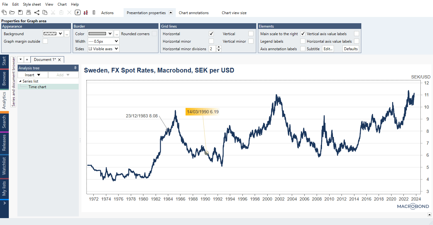
Observation labels
Observation labels let you highlight specific points on a graph and label them with a value, a date, or some other text. To remove Observation label press 'Delete'.
Settings
Label's style
By default, an observation label contains the date and value of the observation you select. To modify either its text or its appearance, click on the observation label and use the settings that open in the Presentation properties tab.

Check the Custom style box to get a full set of options you can edit.

Anchor

The anchor is the part of the label that highlights the point on the graph. Here, you can adjust its appearance, for example its style or shape, color, and width. You can also edit the line that connects the anchor to the text and, for example, add an arrow to it.
Background & border
Here, you can edit the appearance of the label’s text box, including its color, size (margin), shape (style), and distance from the graph. You can also edit the font and its size, by clicking '…' next to the font. You can also customize the box’s border.
Range

By default, the range of the observation label starts and ends with the point you selected. Here, you can change that point by writing in a different date or using relative dates. If you input ' +0 ', for example, the label will always be on the last observation.
See more about range under: Highlighting multiple values and series.
How to add an observation label?
There are two ways to add an observation label to a chart:
From the chart
- Right-click on the data point you want to label.
- Select 'Add observation label'.
From Chart annotations tab
- Select observation label under chart annotations.
- Click on the point you want to label.

How to add observation labels to other points?
You can add them individually or use Ctrl+C/ Ctrl+V keys to copy. Note that it also copies style settings.
How to add observation labels to all points?
Unfortunately, there is no 'one button' for this. To make it easier use Ctrl+C/Ctrl+V to copy it to all points - it will also copy style settings.
Highlighting multiple values and series
If you input different start and end dates, you can expand the range of observations included in the label. This means that you can highlight several values at once.
You can also highlight several series at once by selecting other series to include in the observation.
In the following example, we highlighted an interesting area of the chart by including a range of values and both series in one observation label.

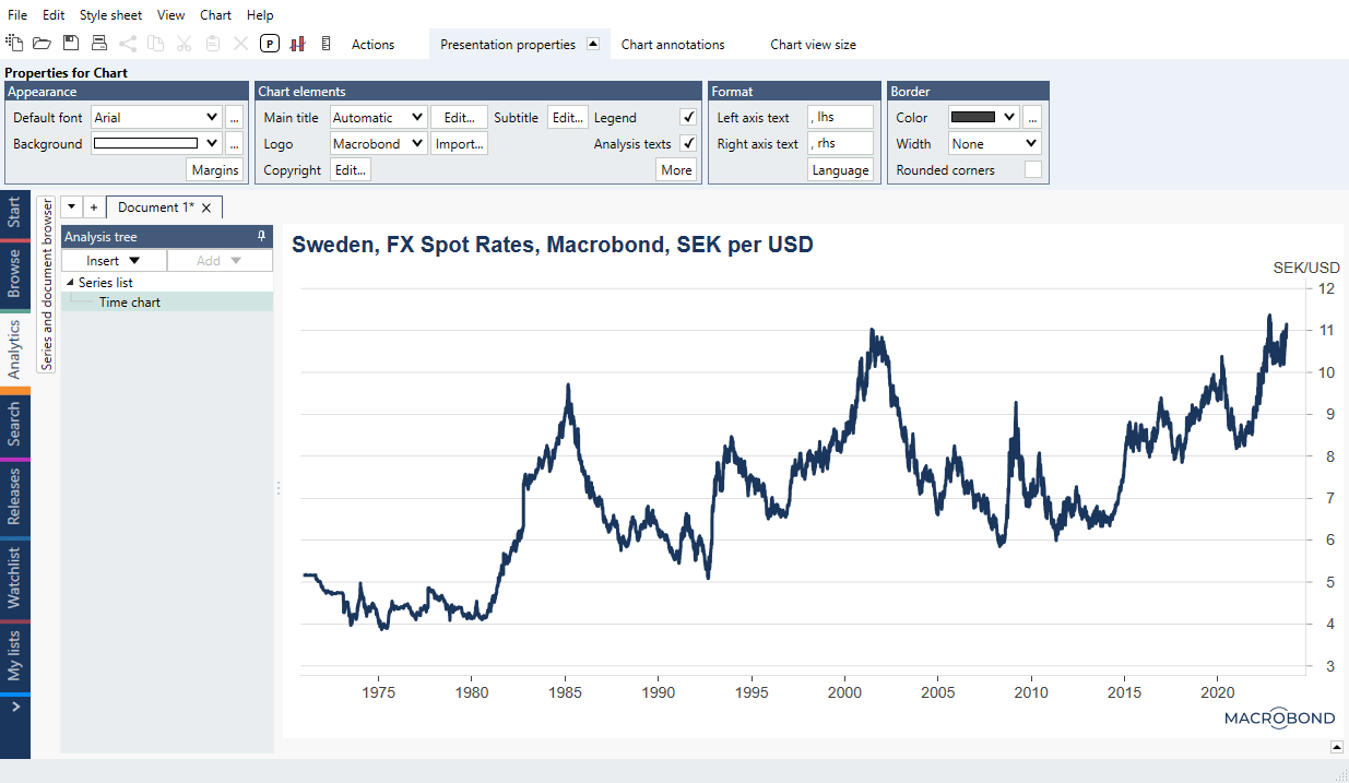
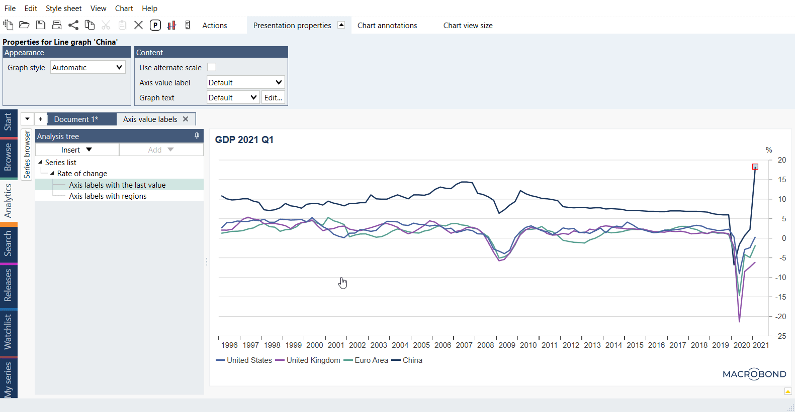
Axis value labels
Axis value labels let you highlight specific points on a graph axis and label them with a value, a date, or some other text. It can show value label either on x-axis as on y-axis, according to chosen option.
Horizontal axis value labels
To add value label on your x-axis, click on the background of the graph area and open the presentation properties tab at the top of the window. In the elements group, tick the box 'Horizontal axis value labels.' If you have vertical lines in your chart, their x-values will now be displayed.

The labels will by default show the date. To change this, double-click on the label and change the text to your liking.
Vertical axis value labels
To add value label on your y-axis, click on the background of the graph area and open the presentation properties tab at the top of the window. In the elements group, tick the box 'Vertical axis value labels.'

The labels will by default show the last valid value. To change this, double-click on the label and change the text to your liking.
Legend labels
Legend labels let you add description for each series on chart. It can be current legend description, but you can edit them. Each legend label will be displayed in color of a series unless specified otherwise.
