- General questions
- X-axis
- Y-axis
General questions
Additional questions can be found on FAQ - Chart’s graphics & elements.
How to change axis title?
To rename units of the y-axis, click on the area right above the top of the axis. This will result in 'Properties for Axis title' to be shown in the Presentation properties group box. Then, click on the Edit button next to 'Axis title' and input your desired unit name. You can also use Dynamic text. It will only change name of y-axis, the units will remain the same.

How to change chart scale?
You can adjust the chart scale by accessing 'Properties for Value axis' in the Presentation properties tab by clicking on the y-axis. Here, the Scale section is where you can modify the scaling. You can define the Display range and Step length. Reverse the scale and Logarithmic scaling are also available options.
Click on the More button to access further options: Scaling where you can choose in which scale the y-axis will be presented and Decimals which modifies decimal places.

How to change step length?
You can define the step length for scale of y-axis (or both if it's a Scatter chart).

X-axis
Changing x-axis' labels
After version 1.34
This feature is available in Macrobond Analysis 1.34 and later.
We have improved this feature and now you have access to pre-prepared labels under Detail limit (described below) and flexible system based on Dynamic properties.

On Time chart
By default the 'Automatic' option is enabled which shows full information for given frequency. You can modify this by clicking on x-axis and going to Presentation properties > Labels.

On Category chart
By default it will show dates/weeks/months (depends on the frequency). You can go change them to numbers. To do this click x-axis and under Presentation properties > Labels uncheck 'Show value labels'.

Workaround - Covering labels
See this page for workaround with which you can replace/cover labels on x-axis.
Showing last year label on x-axis
Displaying years on x-axis is automated and it might happen that when not every year is visible the last shown year is actually a few years in the future/past. To prioritize label for the last year available in a series mark 'Prefer last year' box.
Showing year above month on x-axis
By default, on x-axis month is shown above year. You can use setting - Spacing - with Distance, to change the order. Set Spacing to negative value to move years above months.
Y-axis
Additional text before/after each value on y-axis
This feature is available in Macrobond Analysis 1.34 and later.
You can add scale and also any text or symbol to the values on y-axis (and both value-axes in case of Scatter charts). You can use here Dynamic properties.
Show scale labels
Since version 1.34 you can add scale units (i.e., trillion, million) to each value on y-axis. Go to Presentation properties > Scale > More and enable 'Show scale label.'

Prefix/Suffix
Since version 1.34 you can add additional text (i.e., USD/Barrel, GWh/day) or signs (i.e., %, $, ¥) before or after values. Go to Presentation properties > Scale > More and see Prefix or Suffix > Edit.

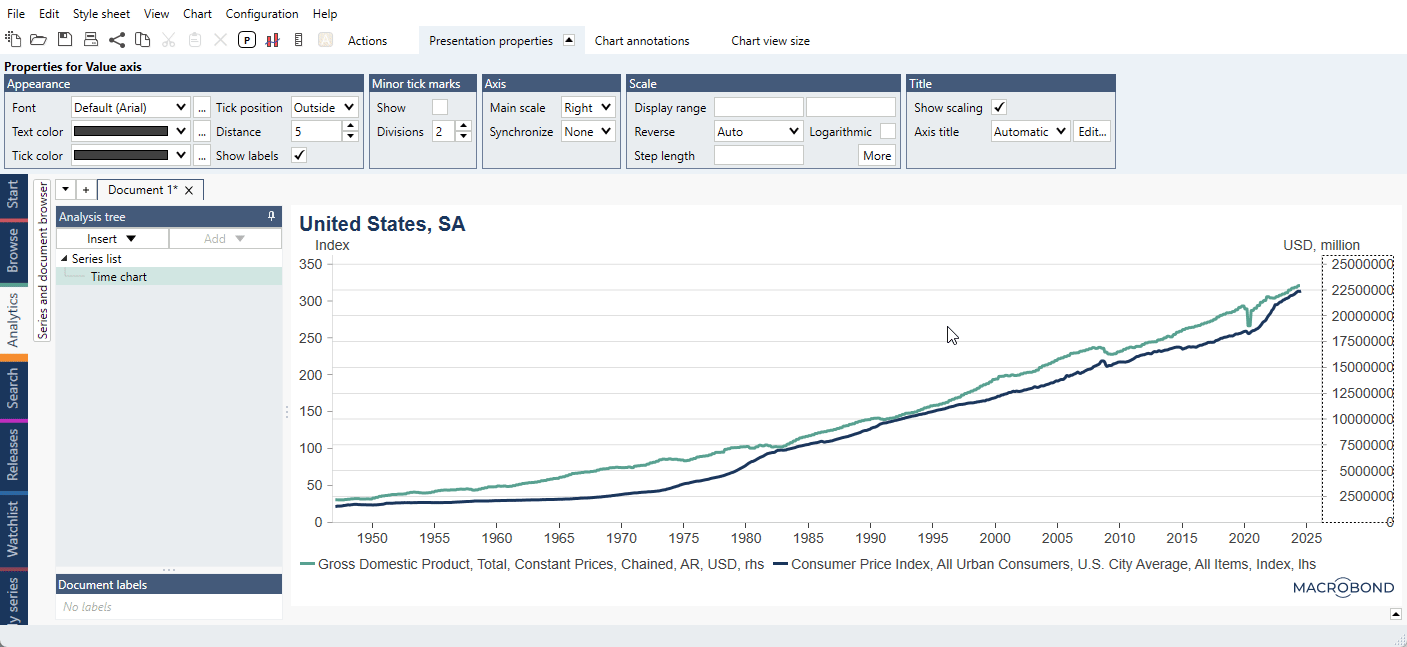
Add an alternate axis (scale) to the chart
There are two ways to add an alternate axis to a chart:
- Click on a graph in your chart, in the tab presentation properties tick the checkbox 'Use alternate scale'

- Right click in the graph area, choose Graph layout, and tick the checkbox for 'Alt. scale'

Thousand separator for values on y-axis
It is possible to use optional Thousand separator setting for the axes in the charts. It adds a separator after every third digit for numbers larger than 1,000.
- from Presentation properties
There is a Thousand separator setting for the axes in the charts. It adds a separator after every third digit for numbers larger than 1,000. You can tick Thousand separator option under Format > Language.
See here pre-1.29 version view
- from Dynamic text
It is also possible to use it in Dynamic text window

Changing the scale of y-axis when working with large numbers
When dealing with series expressed in large values, for instance billions or trillions, you can use a scientific notation for decimal precision instead of manually typing the whole number.
Let’s say you have a series that is expressed in trillions and would like to change the range of the Y-axis scale, so that it reaches 10 trillion. Instead of typing '1000000000000' in the Display range box, you can type '1e12.' The Scientific E-notation is written as: 'xey' (x times ten raised to the power of y). 70 000 000 can therefore be written as 7e7. It also works with decimals (e.g. 1.5e9, meaning 1,5 billions).
Logarithmic scale
Click on the y-axis and open the Presentation properties tab at the top of the window. In the Scale group, check the “Logarithmic” option.

You cannot set logarithmic scale from 0 as the logarithm of zero is not defined.
Display range for logarithmic scale
Logarithmic scale was designed for exponential data. The Step length setting does not work here 'as normal' - it's more of a multiplier.
- Let’s take numbers 2, 4, 6, 8, 10.
With default Step length logarithmic axis will be: 2, 4, 8, 16. - Let’s take numbers 1, 2, 3, 4, 5, 6, 7, 8, 9, 10.
With default Step length logarithmic axis will be: 0.1, 0.2, 0.4, 0.8, 1.6, 3.2, 6.4, 12.8.
As you can see the scale is exponential to work with exponential data.
Step length for logarithmic scale
For standard scale defining Step length it's 'start from lowest available point and add X to the previous number.'
For logarithmic scale defining Step length it's 'start from lowest available point and multiply by X the previous number.'
- Let’s take numbers 2, 4, 6, 8, 10.
With standard scale and Step length 2 the axis will be: 2, 4, 6, 7, 10.
With logarithmic scale and Step length 2 the axis will be: 2, 4, 8. - Let’s take numbers 1, 2, 3, 4, 5, 6, 7, 8, 9, 10.
With standard scale and Step length 2 the axis will be: 1, 3, 5, 7, 9.
With logarithmic scale and Step length 1.5 the axis will be: 1, 1.5, 2.25, 3.375, 5.0625, 7.59375.
With logarithmic scale and Step length 2 the axis will be: 1, 2, 4, 8.
With logarithmic scale and Step length 3 the axis will be: 1, 3, 9.
Synchronizing y-axes when adding alternate scale
Using the Synchronize settings will affect the way in which the alternate scale is displayed. Below we go over the outcomes of combing these settings

- Alternate Scale + Synchronize: None
Each axis has an independent scale and independent grid. - Alternate Scale + Synchronize: Grid
Each axis has an independent scale, but both axes will share the same grid. You can’t adjust the step length of the axes, only the scale range. - Alternate Scale + Synchronize: Values
Each axis will share the exact same scale and grid, which will void the outcome of applying an alternate scale.
Grading on y-axis
For certain time series, you can match the values of the y-axis to grading labels (i.e., AAA, AB+). Data from source's which use grading will automatically use this setting, but you can set it by yourself too. It can be accessed after marking y-axis.

'Reverse' with 'Auto'?
Some series contain metadata that they are best presented using a reversed value axis. By default series are set to 'Reverse: Auto' to take that metadata into consideration.
