For elements not mentioned here see Elements of the chart.
Overview
A Time chart can display graphs of series as lines or columns. The horizontal axis (x-axis) always displays time, and the vertical axis (y-axis) displays the value of the series at each point in time.
A time chart only displays series with the same frequency, i.e., the same number of observations per year. If you work with multiple series that have different original frequencies, their frequencies will be harmonized to a common one.
How to create a time chart?
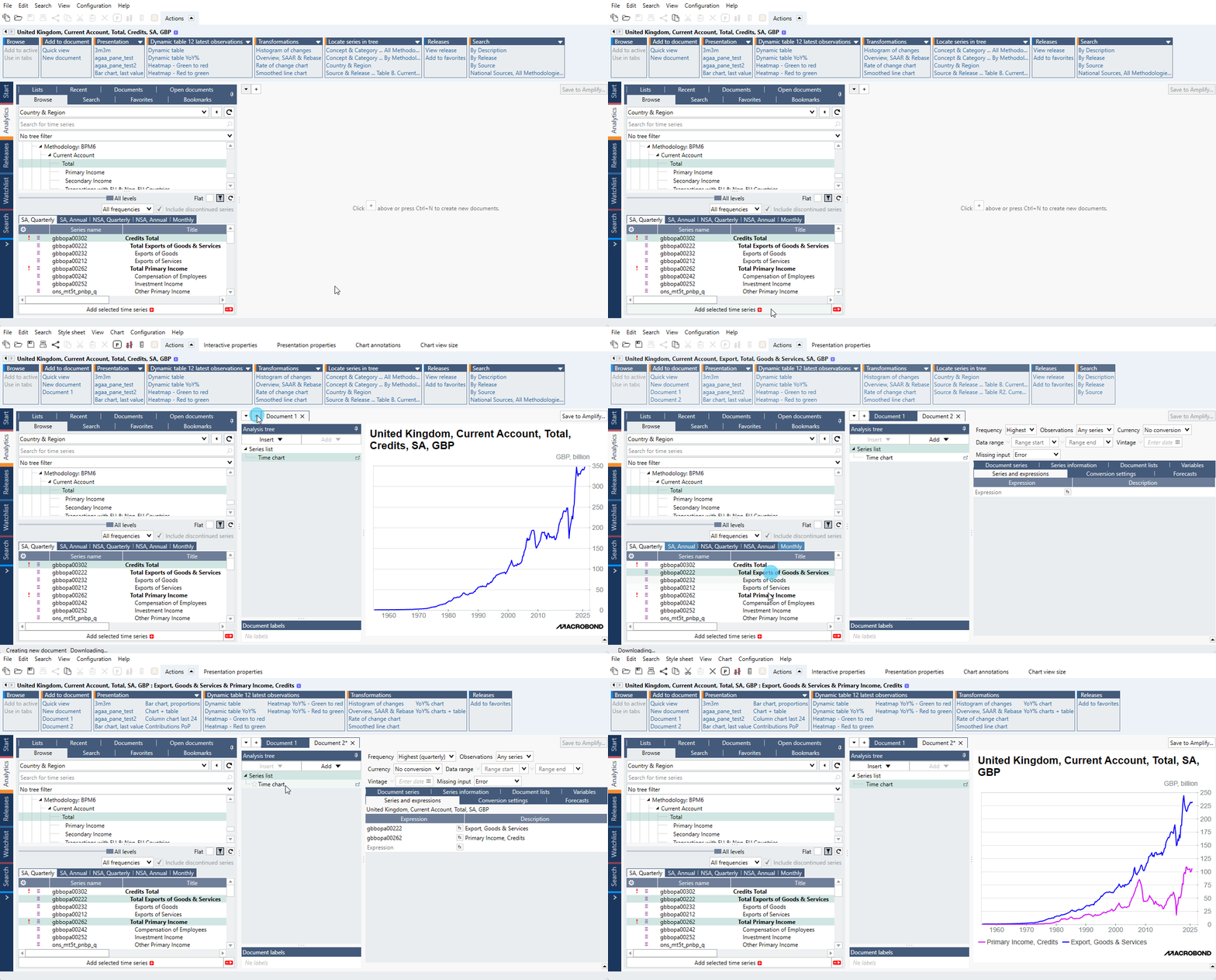
Time chart is a default element when creating new Document. You can either add series from data-tree creating Document in the same move or create Document and drop series into it.
Settings
Chart elements:
- Line/Graph
- Main title
- Graph area
- Value axis (y-axis)
- Source logo & text
- Chart background (outside chart area)
- Time axis (x-axis)
- Legend
To edit any one of these components, click on it, and the available options will appear at the top of the window, under the presentation properties tab. For more information see Editing text parts of chart.
Time axis settings
Clicking on the x-axis gives you a variety of options under presentation properties. Here are some which are specific to Time charts:
Appearance
Distance
For the chart elements: Title, Axis, Legend, and Copyright/Source, controls the distance between the element and the next element in the direction of the chart. For the axes, the setting controls the distance between the tick marks (or axis if there are no tick marks) and the label texts.
Spacing
This controls the space between the rows in the case the labels on the axis are written on two rows.
Labels
Here, you can edit the way the scale is labelled.
The Automatic setting labels the scale with the frequency that allows for the best view. Unchecking it will allow you to use the Manual step option, where you can specify another frequency for the axis labels.
Detail limit allows you to choose a date format for the labels.
When Include century is unchecked, it’ll display only the last two digits of each year.
Allow month initials will allow the application to display only the first letter of each month when the 3-letter abbreviation doesn’t fit.
Uncheck Show labels if you want to hide the axis labels altogether.
Scale
In the Scale panel you can adjust the time range displayed on the axis by specifying start and end dates.
End margin specifies the percentage of the chart that will be visible between the end of the graph and the y-axis. If you
Select Start at shortest or end at shortest, the display range of the chart will be adjusted based on the start or end date of the shortest series (if the chart includes more than one series).
For more information about scale see Axis & Scale.
Value axis settings
Appearance
Tick position
This controls the position of ticks or can turn it off. Next to this setting there is Minor tick marks panel where you can enable additional tick marks.
Distance
This setting controls the distance between the tick marks (or axis if there are no tick marks) and the label texts.
Axis
You can select here which y-axis will be the main - left or right. You can also synchronize them. For more information about it see Synchronize Axes.
Scale
In the scale group you can adjust the value range displayed on the axis by specifying the value. Note that here you must type the value in its full scale, not an abbreviated version seen on the axis. For more information about scale see Axis & Scale.
Chart settings
These settings can be accessed after clicking outside chart area.
Appearance > Margins
This panel of settings manages the distance between elements on the chart. Indentation defines the minimum distance from the leftmost/rightmost side of the chart and the left/right side of the graph area.
What analyses work with this chart type?
All types of analyses which keep time parameter.
Example
In this example we presented available types of charts.
