Overview
Shaded Quadrant chart is helpful when you want to show in an instance positions or proportions of points in each arbitrary fixed quadrant.
How to create a Quadrant chart?
- Add series and perform needed analyses.
- Add Scatter chart or Category scatter chart.
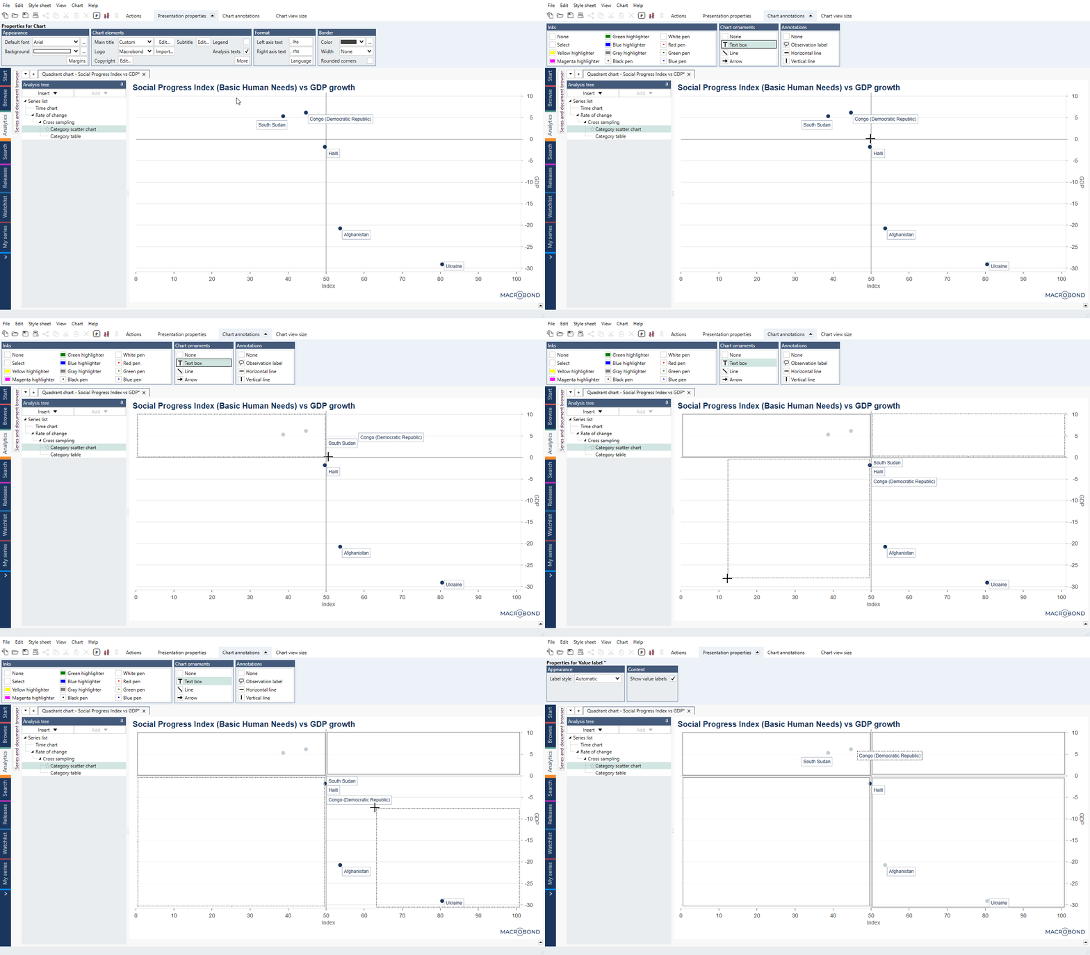
- On a chart navigate to Actions ribbon to Chart properties > Annotations and add Horizontal line and Vertical line on chart to divide your chart into four areas.
- You don't have to add it ideally on point. After adding line you can click on it and change its position by typing right value in Line > Position.
- Then navigate to Chart properties > Chart ornaments > Text box and add four Text boxes.
Setting background colors
This has to be done for each Text box separately:
- To add color for Text box click on it, go to Presentation properties and check 'Custom style'.
- Click on Presentation properties > Appearance > Background > [...] icon.
- By default color is set to 'Solid' - if you don't want to change it, just select colors for quadrants. If you want quadrants to have gradients, change Color type to 'Gradient'.
- Select colors, opacity and gradient angle, for example:
- Left-upper: #99FEA527 60%, #33FFFFFF 20%, angle 60 (orange-white),
- Right-upper: #99008000 60%, #33FFFFFF 20%, angle 120 (green-white),
- Left-down: #33FFFFFF 20%, #99B61818 60%, angle 120 (white-red),
- Right-down: #33FFFFFF 20%, #99DCCD2E 60%, angle 60 (white-yellow).
- Under Presentation properties > Border > Border width select 'None'.
Examples
In this example we showed relationship between Social Progress Index vs GDP growth.
In this example we showed relationship between Brent Oil price and US oil consumption.
Calculate Hit rate for each quadrant.
