- Customization of the date formatting in the X-axis
- Customization of the value axis with text labels
- Slice analysis: using series as date inputs
- Workflow improvement when adding new series to a document
- Filtering regions in Concept & Category
- Excel add-in: default cell positioning behavior when downloading data
- Additional calculation available in Cross Sampling
- Enhancements of the Variable feature
- New calculation types in Statistics
- Performance improvements
Customization of the date formatting in the X-axis
Macrobond Analysis 1.34 provides additional customization of the date formatting for the X-axis. Users will now have full control over the label formatting and its breakdown.
When selecting the time-axis, two settings are now displayed in Presentation Properties:
- Major label format: controls the formatting of the first / top label row
- Minor label format: controls the formatting of the secondary label row
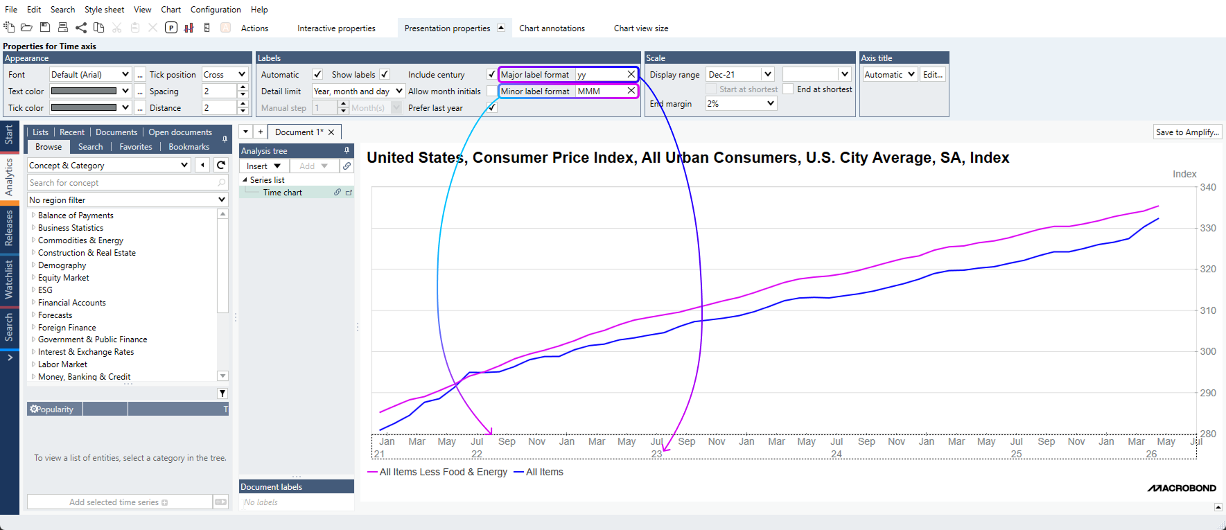
To display dates in a single row, you should only apply a ‘Major label format’.
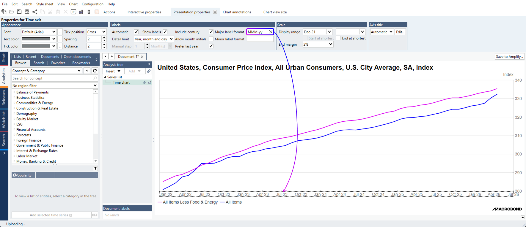
In the example below, we used the formatting ‘MMM-yy’ to format dates as ‘Jan-25’, ‘May-25’, ‘Sep-25’, etc.
To know more about the various date label formatting options, you can refer to the help documentation here.
Data formatting can be defined directly in your stylesheets, so you don’t have to apply your preferred format every single time.
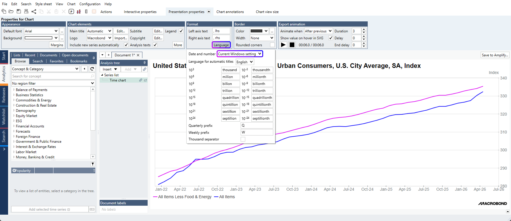
Tip: You can also set the language for date and number formatting – per document or in your stylesheet: Presentation Properties for Chart > Language > Date and Number
Customization of the value axis with text labels
This newest version also provides additional customization for the value axis: users can now add prefix and suffix before / after the values.
Prefix and suffix settings are available within the ‘More’ section of the Presentation Properties tab, after having selected the value axis:
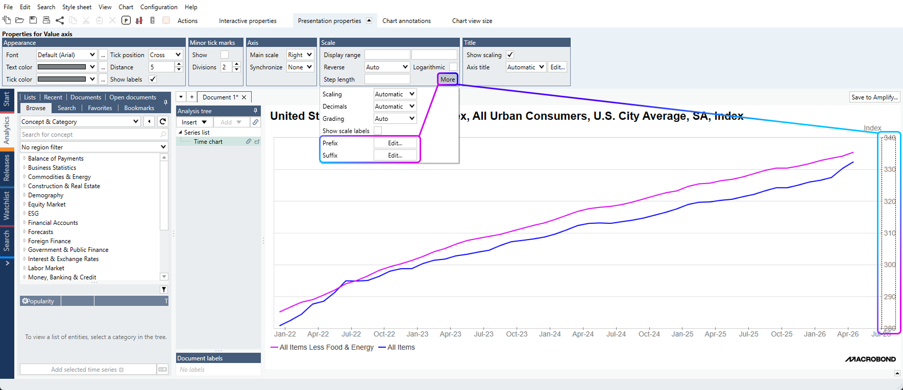
Prefix and suffix labels can be typed manually – in the example above, we inputted ‘%’ as prefix – or based on dynamic properties, typically to refer to a specific currency for instance.
Slice analysis: using series as date inputs
The Slice analysis has been enhanced, allowing users to define slicing periods based on input series. A typical use case would be to use recession series to slice data based on recession / expansion periods, eliminating the tedious exercise to input dates manually.
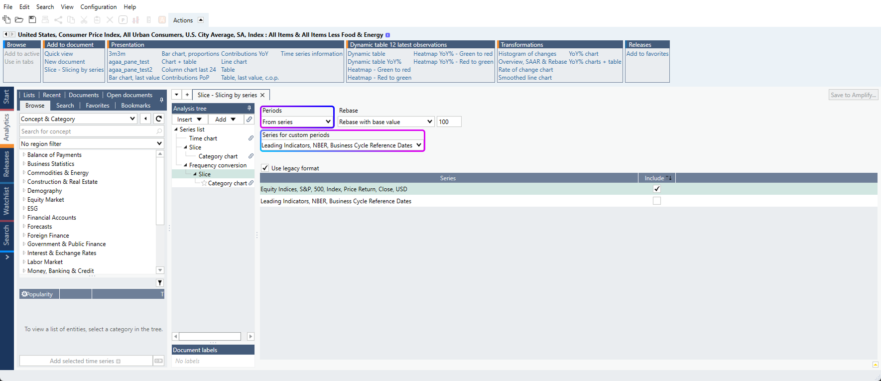
Generally speaking, Macrobond will translate the input series into slices according to the following logic:
- 0 value will represent no slice (i.e. that date will be skipped)
- Each change in value will start a new slice
- As long as values remain constant, the current slice will be extended.
In this file, users can access an example where the S&P500 has been sliced based on U.S. NBER recession periods. It took us less than a minute to generate this analysis!
Tip: to invert the slice logic, users can type ‘!’ in front of the series expression. In the example file above, inputting ‘!nber’ will result in slicing the S&P500 based on the NBER expansion periods.
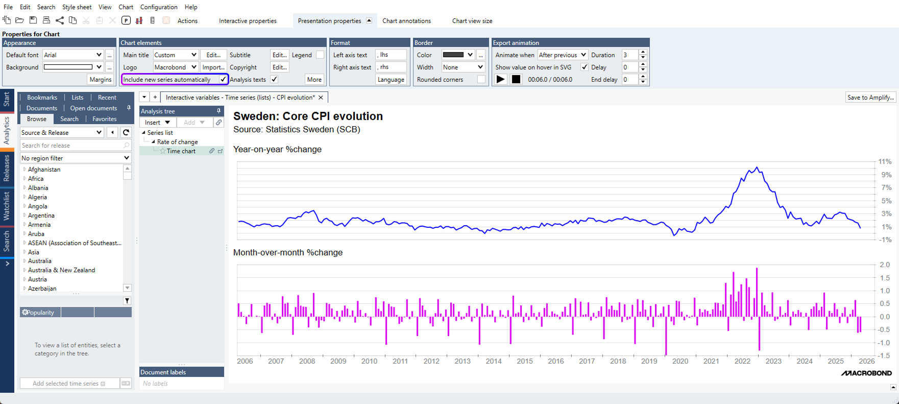
Workflow improvement when adding new series to a document
Introduction: per default, new series added to a document automatically flow into existing charts, except after specific analyses where such a control setting already exists. This default behavior is in place to ensure users can seamlessly select & view series and compare several series together.
There are however situations where users would not want new series to flow into existing charts.
This is why we’ve made more visible the ability for users to control if new series added to a document should flow into existing charts.
The control setting is now available directly in the Analysis tree, via a ‘link / unlink’ icon:
- At a chart level: will link / unlink the given chart from receiving new series
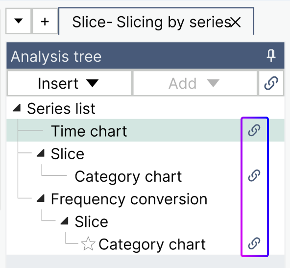
- At the analysis tree level: will link / unlink all charts in the document from receiving new series
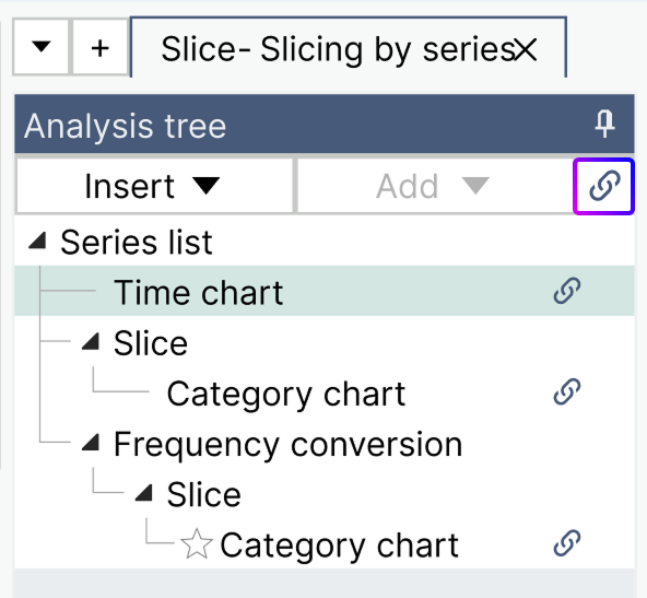
The control setting is also visible in the main Presentation Properties tab for a given chart:
Filtering regions in Concept & Category
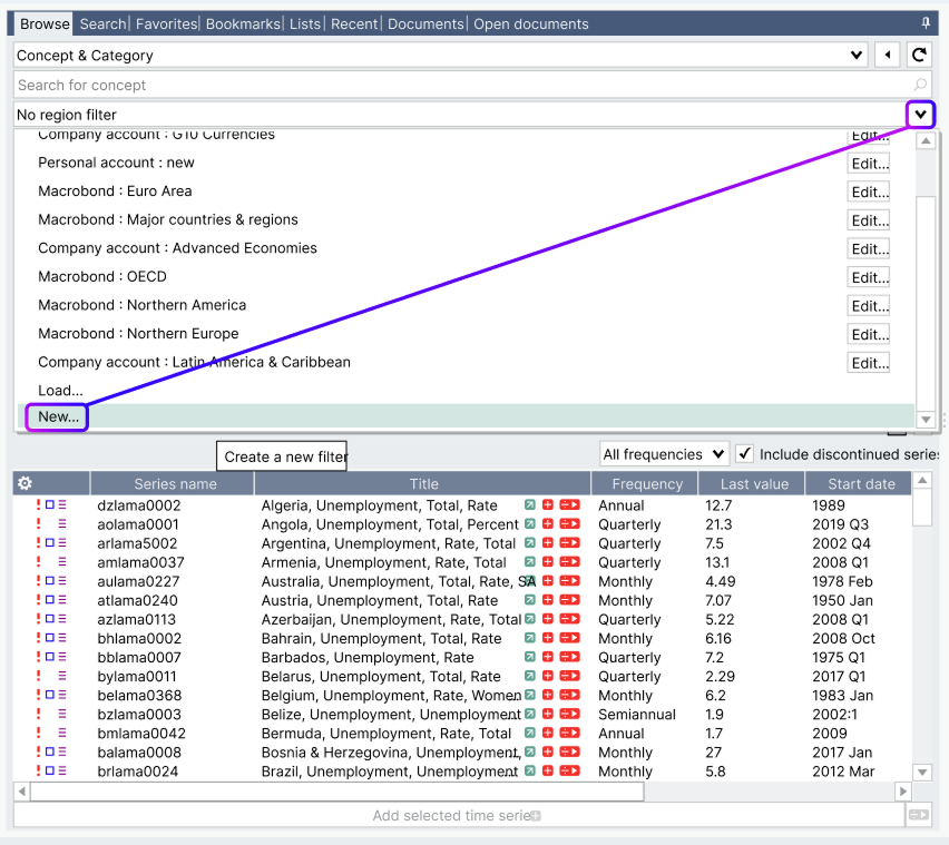
Users can now apply region filters in the ‘Concept & Category’ database entry, making it easier for users working with a predefined set of countries to select all them at once across the database universe.
As a reminder the ‘Concept & Category’ database entry is built to facilitate cross-country comparisons of similar true-to-source concepts. The database is organized per indicator, listing then one series per country, based on availability.
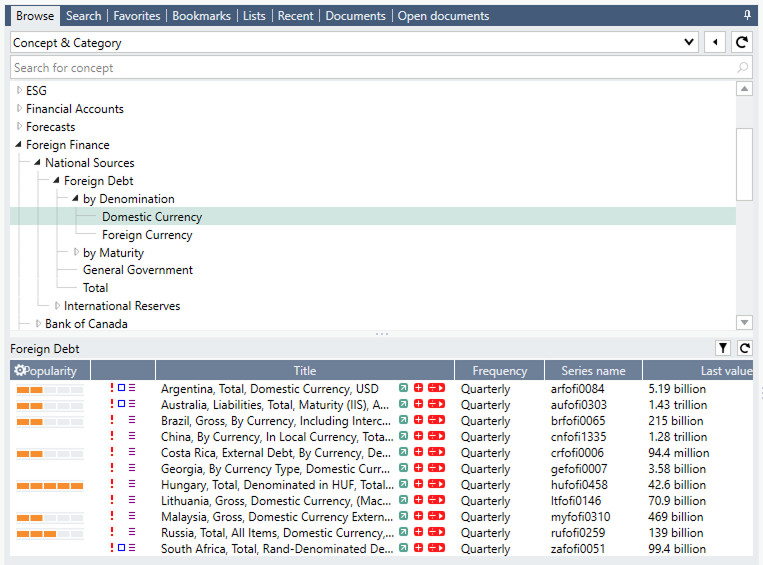
The previous view, without region filtering.
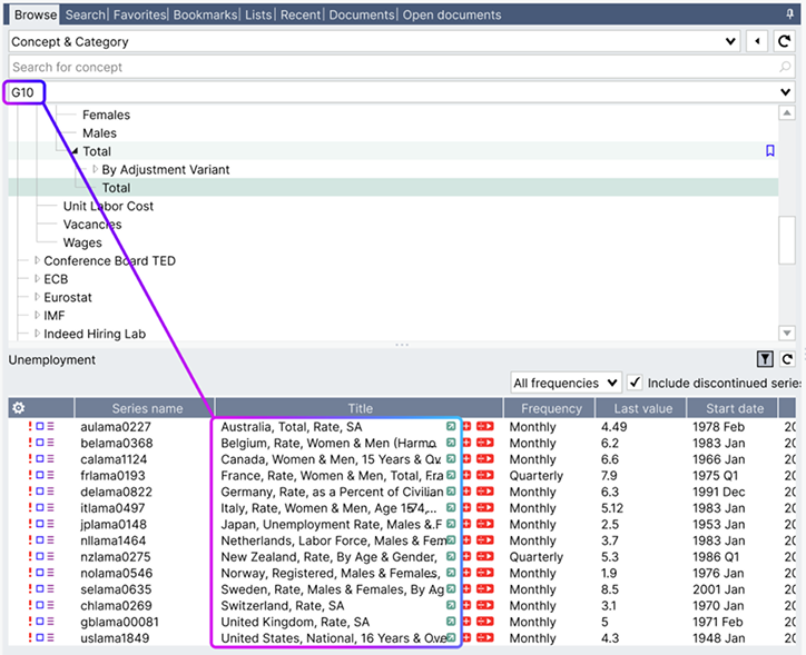
The new view, with a G10 filtering applied
The country coverage of a given concept can be broad: the example above, Total Foreign Debt, covers 123 regions. Being now able to apply a region filter will help navigate the database more intuitively, by displaying only your regions of interest.
Tip: as a reminder, you can create your own region filter by using the drop-down icon available on the region filter > New
Excel add-in: default cell positioning behavior when downloading data
The default positioning behavior of an Excel dataset has been changed to mitigate the risk of breaking links and references between cells.
When downloading series into Excel, data will be placed and locked on the cell you initially selected. The cell reference is displayed when you open the Excel add-in – see screenshot below.
As a consequence, the dataset will not follow the Macrobond red object if it is moved. If users want to link the data location to the Macrobond red object, they should tick the box “Automatic Position” in the Excel add-in dataset settings.
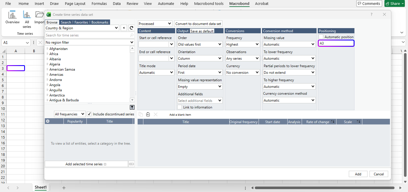
Note: in the screenshot above, the range difference between A1 and the default reference set to A3 is to allow for the positioning of the red Macrobond object storing the request. You can always edit the cell positioning to A1 if needed.
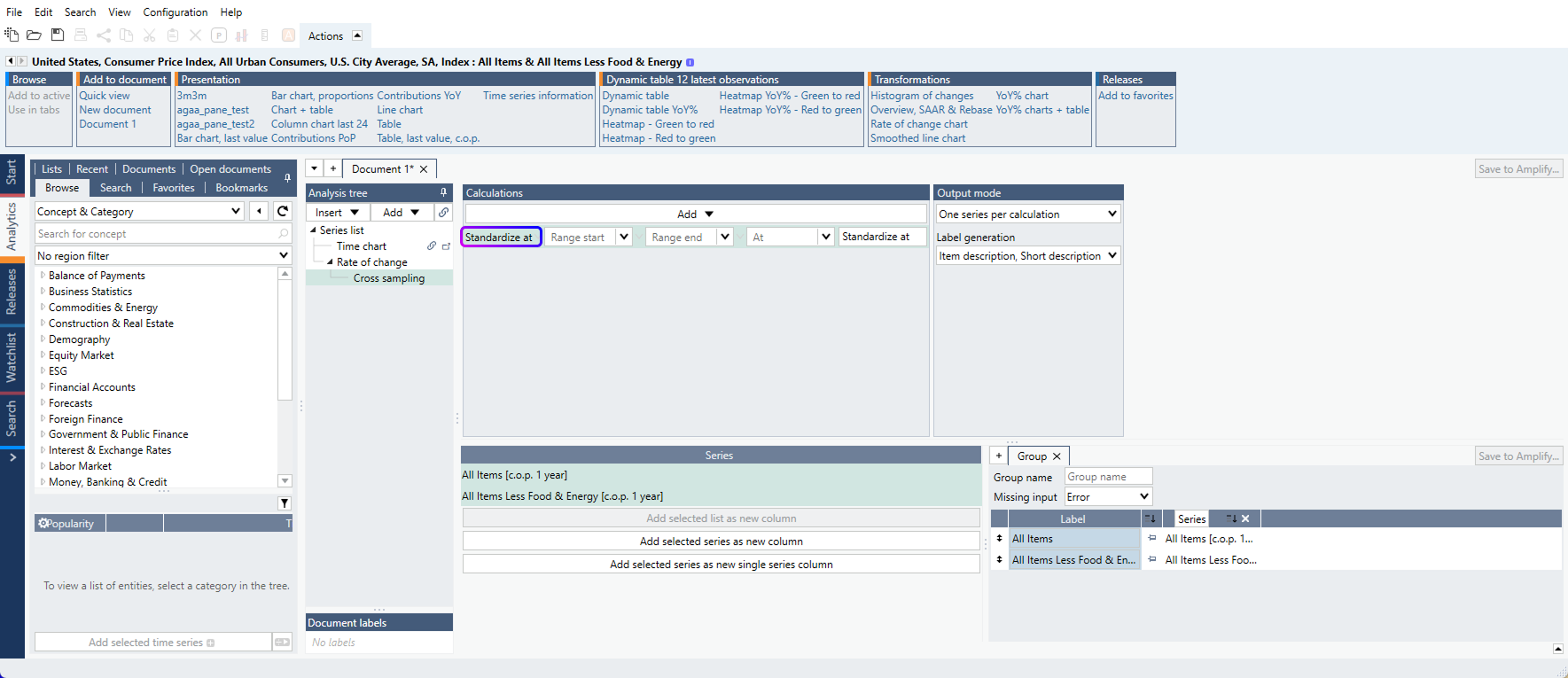
Additional calculation available in Cross Sampling
Users can now access ‘Standardize at’ as new calculation available in Cross Sampling. In technical terms, a time series will be standardized for a defined window (or full history if date ranges are left empty), and a specific ‘Value at’ (or last value if left empty) can then be retrieved from this calculation in Cross Sampling.
Enhancements of the Variable feature
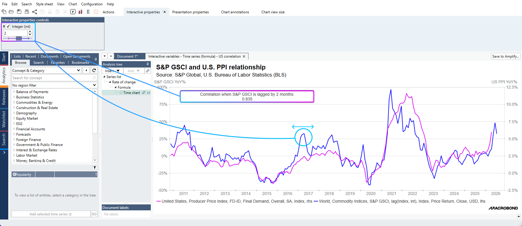
Users can now apply document variables in the formula language, unlocking new interactive capabilities.
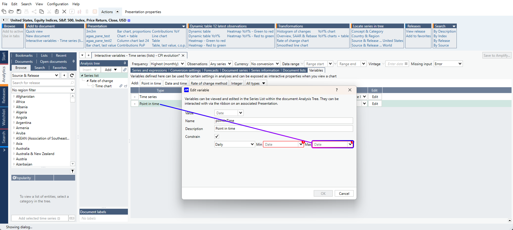
The document variables available are : int, decimal, date, bool and point in time.
In the example file here, we created an integer variable with a constraint range [-20, 20] that we integrated in the lag formula applied on the S&P Commodity Index.
As a result, we now have a slider within the ‘Interactive Properties’ of the chart, allowing users to move the series back and forth with this slider. Additionally, we created a text box referring to dynamic properties, where information updates as the slider moves.
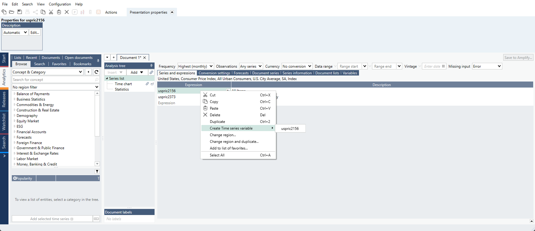
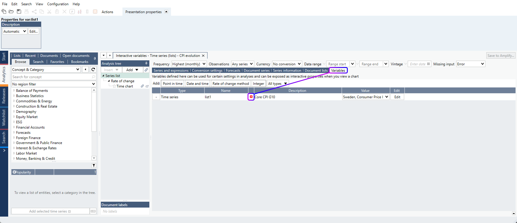
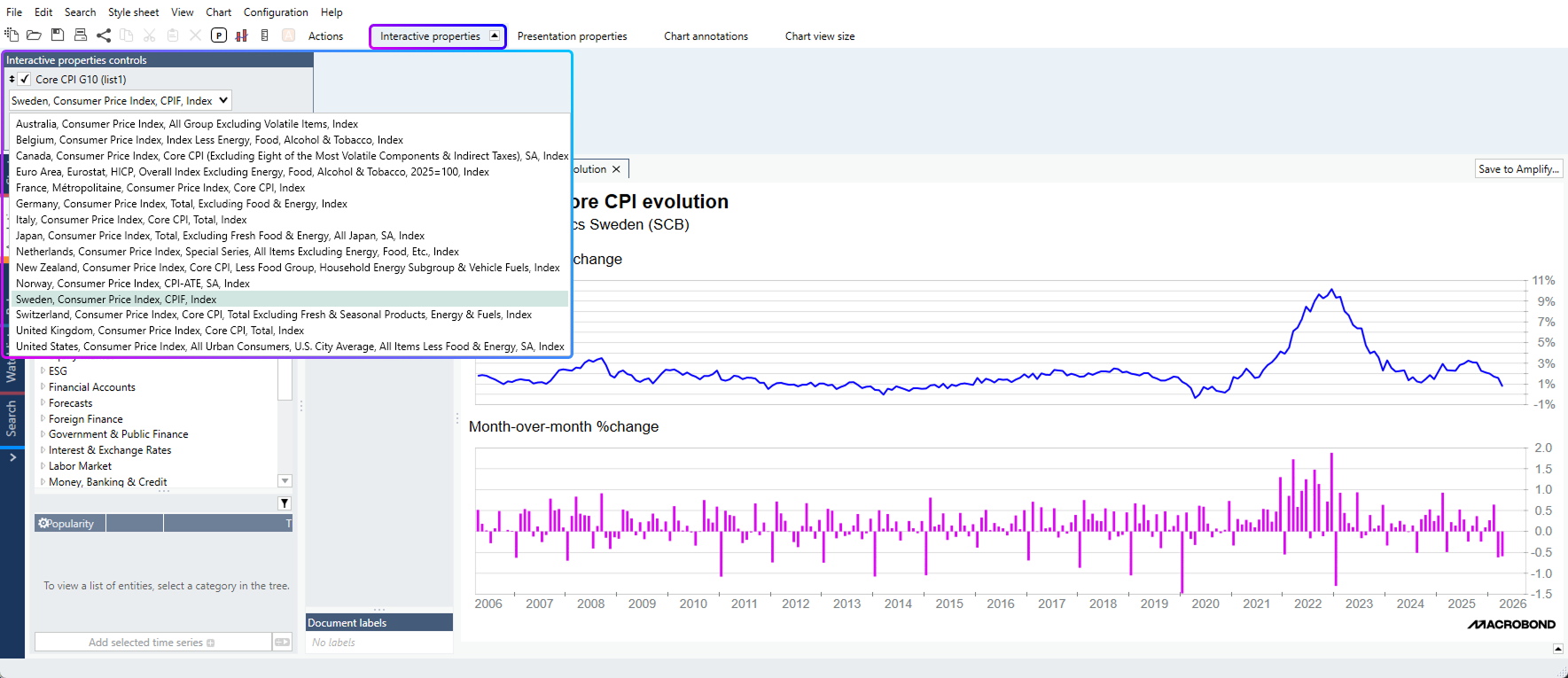
A new Variable has also been implemented in this new version: Time Series. It unlocks the ability to switch time series from within a list (or within a group of child lists) via the interactive properties available on the chart level.
Users can create a ‘Time series variable’ directly from an expression in Series List:
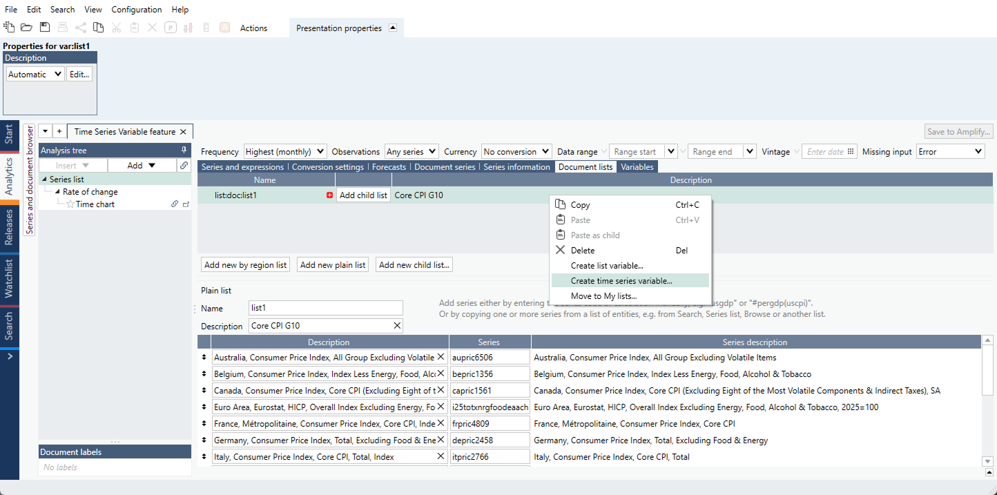
If multiple series should be part of a single ‘Time series variable’, users should instead add the corresponding as List in the ‘Document lists’ tab and create the variable there.
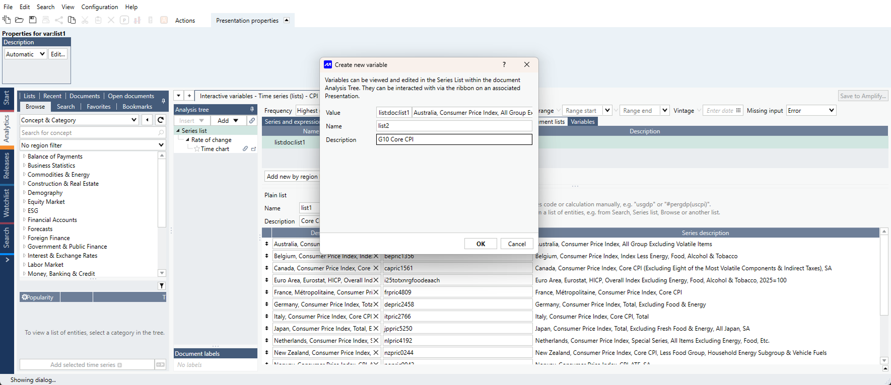
Once created, you can active the ‘Time series variable’ in the ‘Variable’ tab in Series List.
Note: you can also create a ‘Time Series variable’ straight from the ‘Variables’ tab, especially if you already stored Lists in your account.
As a result, you can now use the ‘Interactive Properties’ to switch series within a chart.
A Macrobond example document is available here.
These enhancements of the Variable features are also available when you save a Macrobond document as Asset in Amplify, enriching the interactive experience for consumers of your research published there.
Tip: A full help documentation regarding variables is available here.
We also improved the ‘Point in Time’ variable to allow for open-ended ranges, removing the constraint of updating the ‘max’ range every time a new data point comes in.
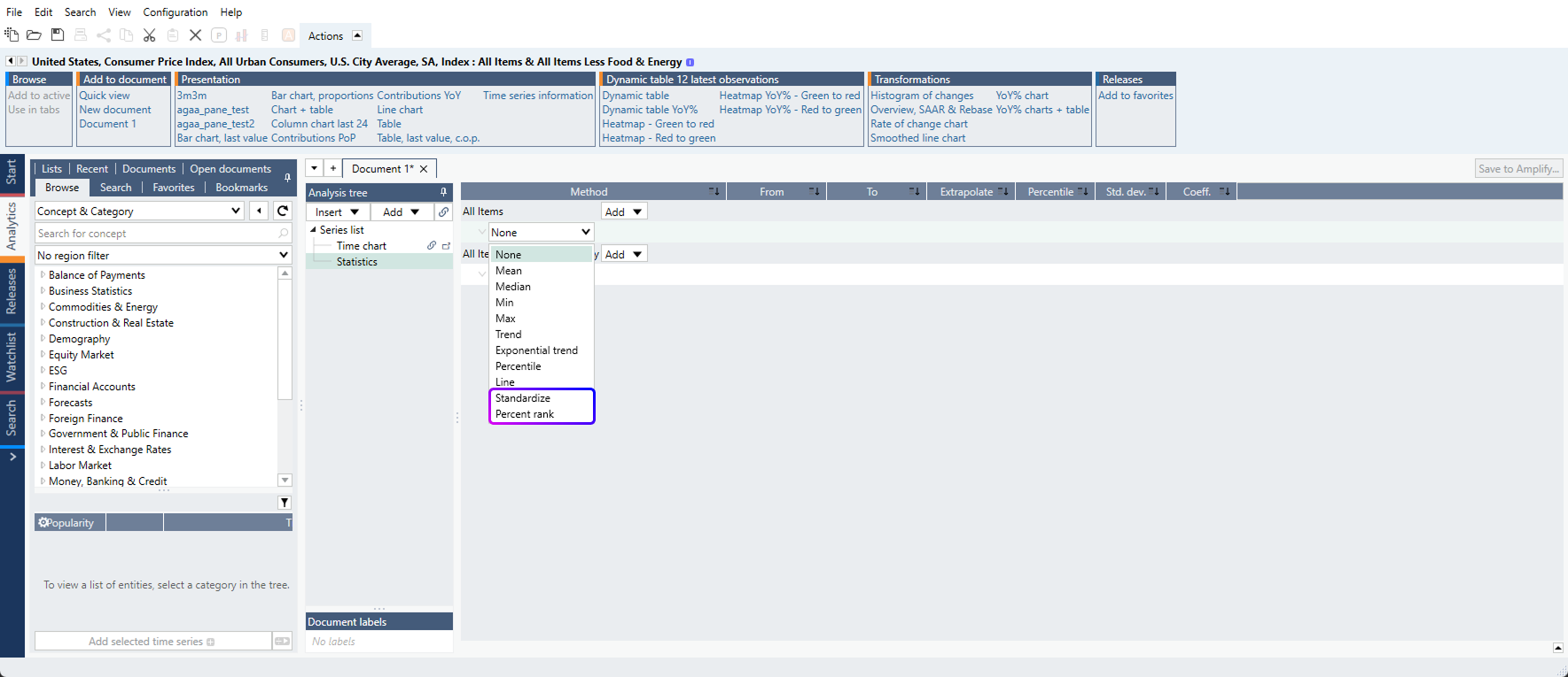
New calculation types in Statistics
Two new calculation types are now available in the Statistics analysis:
- Standardize: calculates the Z-score of a time-series, where the mean of the series equals 0 and its standard deviation equals 1.
- Percent Rank: Returns the rank (expressed in percent) of a given value within the range of observations set
Users can set a specific data range for which these calculations should be applied. The range can be static (i.e. from 2000-01-01 up until 2015-01-01) or dynamic (using relative dates like ‘-20y’).
These calculations were previously only available through the formula language.
Performance improvements
We’ve improved the application performance in situations where large Macrobond documents are recalculated, particularly when they contain nested calculated series.
We solved an issue where saving / closing a PowerPoint document with Macrobond charts could unexpectedly trigger new calculations and create a PowerPoint freeze.