- Overview
- Working with Cross sampling analysis
- Examples
- Questions
- How to add a single series column (constant series)?
- How to show date(s) of observation?
- What is the difference between 'Add selected series as new column' and 'Add selected series as new single series column'?
- What is the difference between the Rate of change analysis and selecting ‘Rate of change since’ when doing a Cross sampling analysis?
- Why annualization in Rate of change analysis works differently than in Cross sampling analysis?
- Why I can see 'Strict' option in one document and can't in other?
Overview
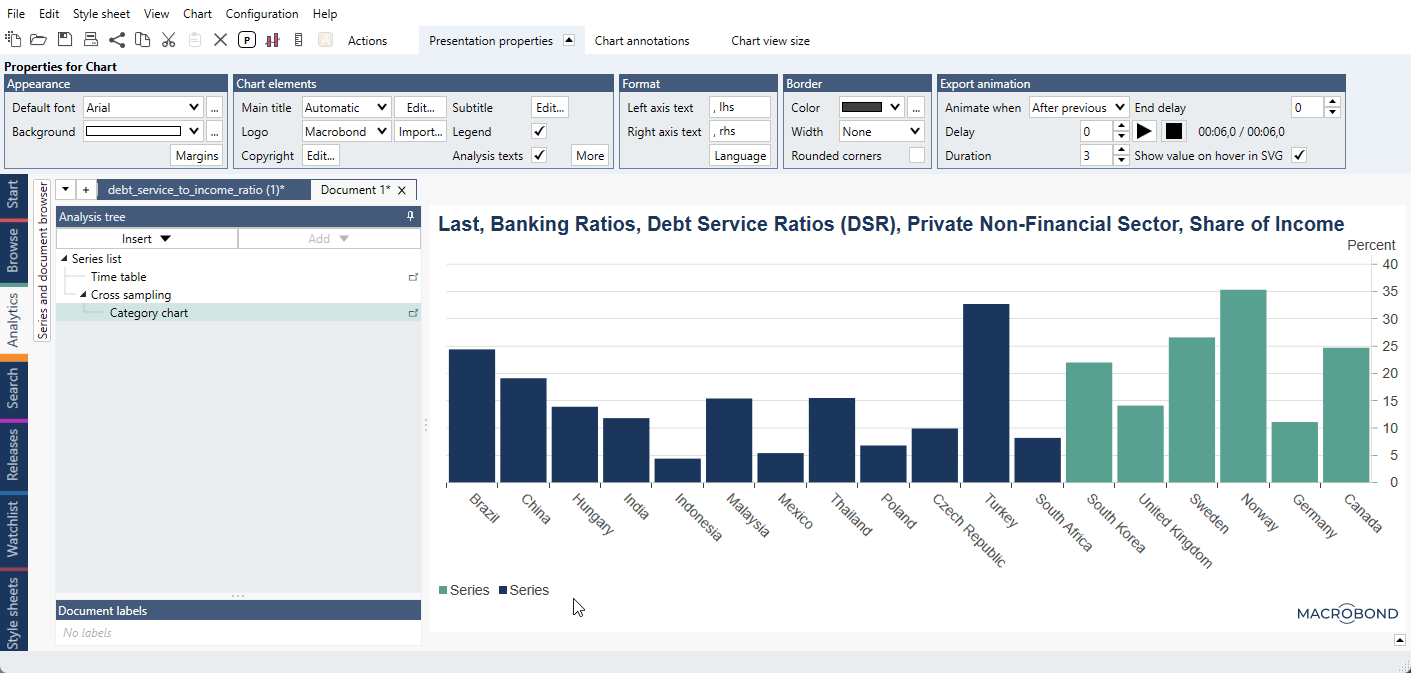
Example of general use of Cross sampling analysis generating Bar chart of median and last values for an entire data set:
The Cross sampling analysis is a tool for extracting particular values or metrics and comparing them across series. Use this analysis when you want to create a chart with categories, such as countries, along the x-axis, and columns of values on the y-axis. The Cross sampling analysis is a successor to the Scalar analysis with a new workflow that is especially tailored for lists.
The lists are pre-prepared data sets on which you can easily operate in Cross sampling (and in other analyses). To change data, you just go back to Series list and replace or add a series without rebuilding whole analysis. You can also create and share lists through My list feature.
The Cross sampling analysis can perform a variety of calculations that result in one value per input series, such as the last value, the mean in a time range, or year to date performance. The output is always a category series, meaning that the time variable is replaced by a categorical variable. You can display this output in a Category chart, Bar chart, or Category scatter chart.
Working with Cross sampling analysis
Input - Lists
All input data in this analysis go in Lists - data sets defined under Series list's tab. For more information see: Document lists (lists of series) & My lists activity tab. You can create and share lists with your colleagues through My list feature.

Settings
The settings consist of four parts. In the screenshot below, there are two lists and two series that are not part of any list to the left. On the right-hand side, the two lists have been added and can be seen as two columns.

- Select what calculations to apply to each series. Details about the calculations can be found below.
- Select how the output should be generated.
- This is the list of all input series and lists.
- Here you organize the series that should be used for the output.
Calculations
Here, you can add one or more calculations that will be performed on all selected input series. The available calculations are:
Open, Close, High, Low
The first, highest, lowest, or last value of the specified range.
Mean, Median
The mean or median of the range.
Last
The last valid value of each series.
Last common
The value at the last point in time at which all the included series have values.
Last non-forecast
The last value that is not a forecast in the series.
Value at
The value at a specific point in time. If a series is missing a value for that date, the first available value before that date will be used.
Nth last value
The nth last value of a series, where a value of 1 gives the last value, 2 gives the second value to last, 3 gives the third value to last etc.
Year, Quarter, Month, Week to date
The performance from the start of the period to the specified date. The performance is measured as the change compared to the last value of the previous period.*
Performance since
The performance between two specified dates. The performance is measured as the change compared to the last value of the previous period.*
Performance analysis works a bit different than performance calculation. In Cross sampling and Scalar program finds the first non-missing value and use that as the base value, while in Performance it gives an error if the specified start date is missing. You can use 'Strict' box to select the date.
Note that since version 1.29 the ‘Strict’ option is removed in new documents as it is always turned on for calculation.

Years, Quarters, Months, Weeks back
The change from a selected number and type of periods before the specified date.*
For years and quarters, this is the same as using the 'Rate of change since' method and specifying the start of the range as '-1y' or '-1q'.
Rate of change since
The rate of change between two points in time.*
Rates of change as value, percentage or logarithmic are calculated in the following way:
where c is the typical number of observations in one year.
Rate of change analysis works a bit different than Rate of change since calculation. In Cross sampling and Scalar program finds the first non-missing value and use that as the base value. You can use 'Strict' box to select the date.
Note that since version 1.29 the ‘Strict’ option is removed in new documents as it is always turned on for calculation.
Percentage proportion
The percentage proportion of each series compared to the sum of all series at a specified point in time.
Standard deviation
The standard deviation of the range.
Percentile
The specified percentile of the selected range.
Lower, Upper tail mean
The mean of the values in the upper or lower percentile of the range.
Trimmed mean
The mean of the middle values as specified by the percentage.
Standardize
The mean divided by the standard deviation of the range.
Note that formula Standardize() won't give same outcome. In formula we standardize the series (value - mean)/stddev for each value. While in Cross sampling we calculate a standardized value for the whole series (or a specified interval) according to mean/stddev.
Settings for calculation methods
*Relative dates
Most Cross sampling calculations require either a point in time or a time interval to be specified. You can use specific dates, but you may want the dates to update when new data is added. In that case, leaving the date box blank or using relative dates, such as '-1y' can be useful. It’s important to understand what default dates are chosen when none is specified, and how relative dates work in each context.
Point in time
First, we’ll talk about calculations that require only one point in time, such as value at. If the point in time box is left blank, the last valid value for each series will be used.
If you specify a relative date here, that date will be relative to the last calendar date, not relative to the last date for each series. If you would like the last calendar date to be used, even though not all series may have values, you should use the relative date '+0'.
Time intervals
If you leave the range start blank, the first available value for each series is used. If you leave the range end blank, the last available value for each series is used.
When you use a relative date for the range start and leave the range end blank, the end point will be the last valid value for each series and the starting point for each series will be relative to its last point, not the last calendar date.
If you use relative dates for both the range start and the range end, they will both be relative to the last calendar date.
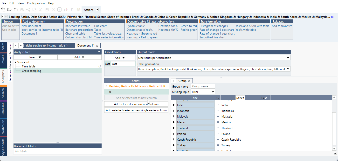
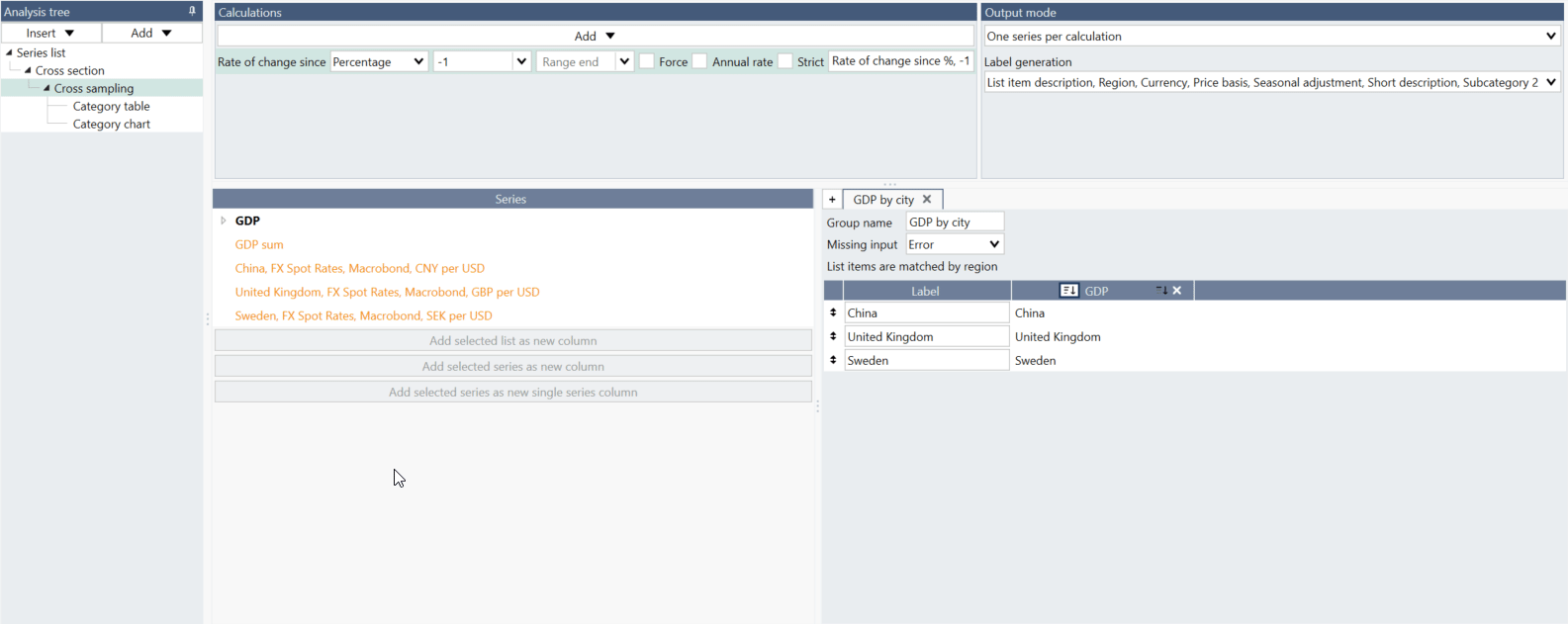
Output mode
You can select one of two ways to create the output series.
One series per calculation
For each calculation defined, there will be one series per column defined in the organization pane. In this mode you can select what metadata to use for generating the labels by selecting Label generation:

Based on the example in the screenshot above, this means that there will be one series with the GDP values and one series with the unemployment numbers.

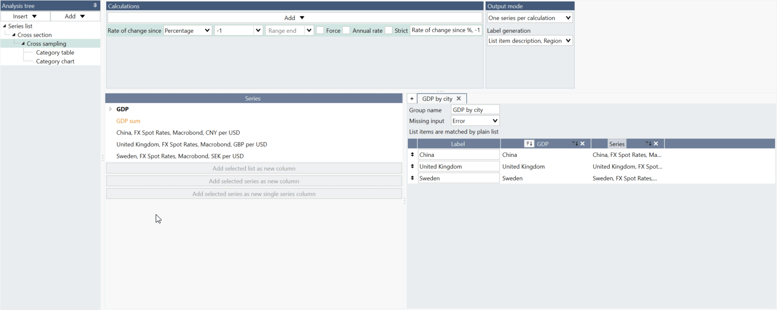
One series per input
In this case there will be one output series with all the defined calculations for each input series. For example, if you have an input like this:

you will get a category chart like this:

Organizing output
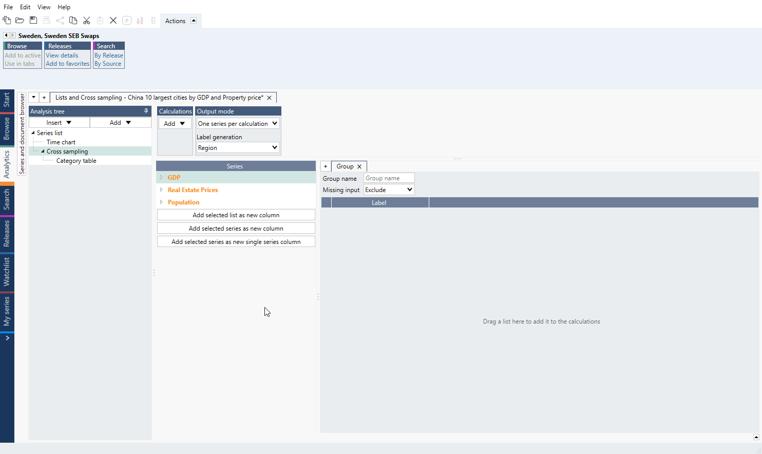
The analysis is tailored for lists of series. You organize the output by selecting a list of series on the left-hand side. In most cases, you drag a list over to the right-hand side, which will add the list to the output. If you want to change/add series, you need to do this on List in Series list.
Series will be paired automatically by sub-region metadata.
 Note you can only place lists side-by-side if the series belong to the same family or at least one of them is a list by region. The entries in the lists will be automatically aligned.
Groups
You can separate each data set in analysis by creating separate Group tabs. The effect will be same as if you added lists to one Group, but it might be easier to keep track with separate Groups.

Individual series
You can also add with drag and drop individual series (or group of them). Mark series and on the right navigate so you would see bolder horizontal line - then you can drop series and it will be added to the group.
Note, when using series from a list you cannot drag individual series like this. Instead please go to Lists tab and add series there.
Order
The order will be determined by one of the columns that is based on a list. You can select which column decides the order by clicking on the button in the column header.
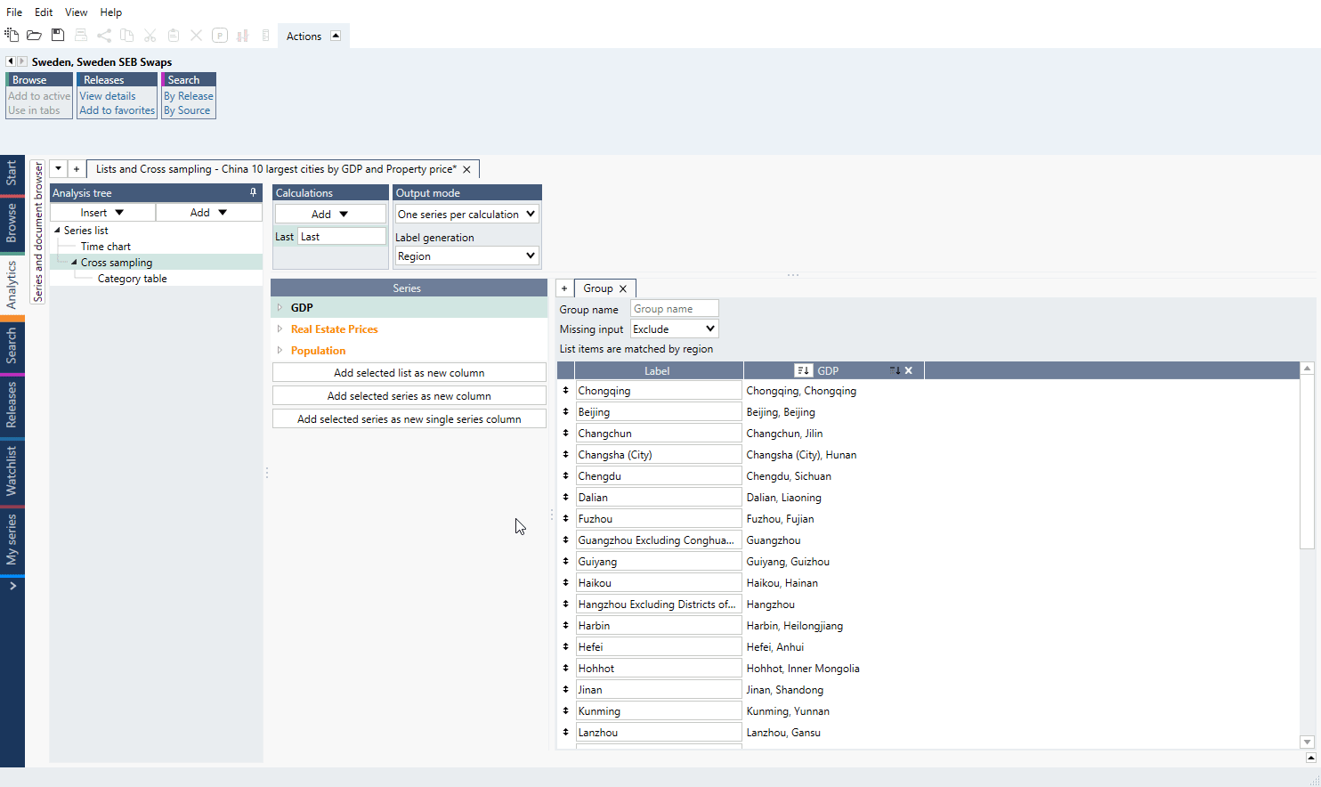
Missing input
If any of the lists have missing series, a red background will appear. A series may be missing if no series has been entered in the list for that position in a plain list or if two lists by region do not have the same set of regions.
You have a few options how to handle such missing input and you can select the strategy in the setting called 'Missing inputs'.

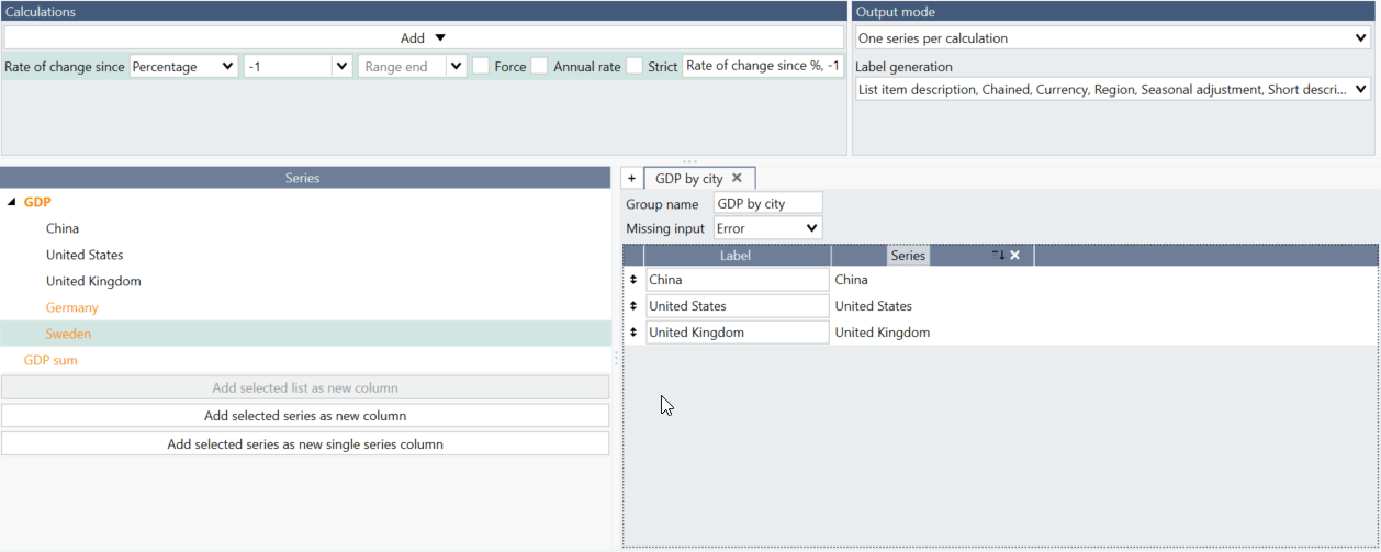
Replacing individual series
You can replace individual series by dragging a series to a position in the table to the right. This can be used for doing an exception in a list or for filling in missing entry when you do not want to change the underlying list.
Any series in a list that has been replaced, will have a yellow background and a button for reverting the change.

How to create simple chart with Cross sampling and Lists?
- Copy/Cut series you want to use.
- Go to Series list > Lists tab, use 'Add new by region list' and paste series.
- Add list to Series list.
- Add Cross sampling analysis, select calculation and Output mode.
- Drag list to from 'Series' to 'Group'.
- Add chart or table.
How to have two different colors for one List?
If you want to add a second color to a chart you can wrap selected series with flagforecast() and use separate color setting to introduce another color. But if you have a List this cannot be done. See below steps with solution. Note that the partition of series into different colors doesn't have to be even.
- Add a random extra series or constant in the Series list that you do not need. In our example,
we add a '0'. This series will be used only to construct groups of series and will be deleted at the end. In Cross Sampling, firstly add this extra series as a new column. Then add a calculation 'Last'
so we have values generated.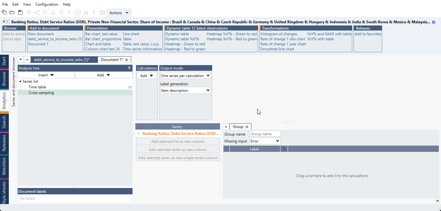
- Drag and drop the series for the first part of series under the 0 as we do below. Make sure that
you see a 'special line' below 0 as in the video so that the series stack up below 0.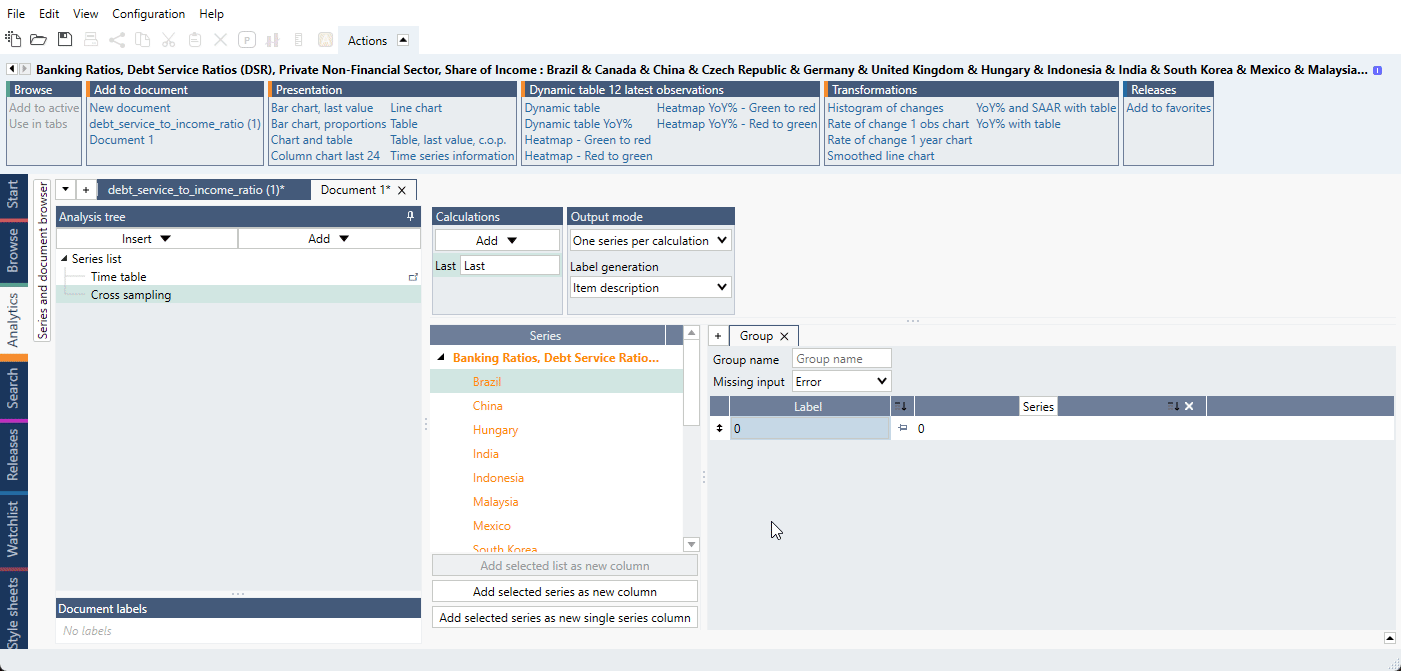
- Add 0 as a new column again so we can create the second part. Drag and drop the second part series below the last red box.
- In Group switch 'Missing input' from 'Error' to 'Missing'.
- Go into series list and delete '0' (or extra series you have added). This removes the 0 from the Cross
Sampling and we are left with only the series we want. - Add a Category Chart. To get a column look, go into Graph layout (Ctrl+L), and then change Graph type to Stacked Column.
If you want to sort the series, add the entire List as a new column. Now let’s add a Sorting analysis. Expand the 'Last.' Then sort the earlier established 'List' and give it a direction. Then sort all the other series by that List. However, in Graph layout only use the first and second group of series, and not the list. The list is only needed to sort all the series at once both parts have missing series.
For a ready-file see Different colors for two or more groups inside one list.
Using Transpose analysis after Cross sampling
With Transpose analysis you can change data's place from x-axis to y-axis and vice versa without rearranging data or rebuilding Cross sampling. See Transpose for examples.
Examples
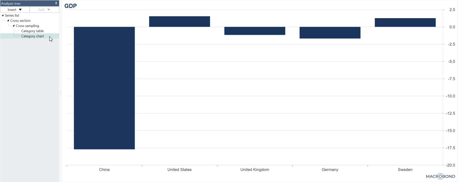
In this example, we calculated average of GDP values for several countries and plotted it together with those values.
In this document we worked on lists containing city level series for three different indicators, which then were combined in one bubble chart to compare values.
We applied conditional formatting rules to the Bar chart table created with Cross sampling analysis with use of lists.
See how to use formula to highlight chosen series or series based on a conditions.
See how to divide series from one list into two (or more) groups with different colors for each.
Create two stacked columns with different calculations for each of two countries using Cross sampling and Transpose.
Create stacked columns chart presenting data from two different points in time next to each other, grouped by country.
Questions
- How to add a single series column (constant series)?
- How to show date(s) of observation?
- What is the difference between 'Add selected series as new column' and 'Add selected series as new single series column'?
- What is the difference between the Rate of change analysis and selecting ‘Rate of change since’ when doing a Cross sampling analysis?
- Why annualization in Rate of change analysis works differently than in Cross sampling analysis?
- Why I can see 'Strict' option in one document and can't in other?
How to add a single series column (constant series)?
Sometimes you want to create a group with constant series. For example, here a sum of the GDP series has been created and this series has been added by selecting it ono the left and pressing the 'Add selected series as new single series column.' See the file under Examples: Single series column with average line.
If new series are added to the lists, the single series column will be extended to include more rows of the same series.
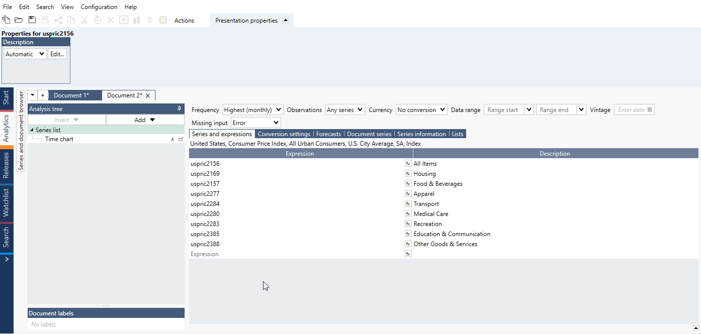
How to show date(s) of observation?
When using 'Last common' or 'Value at' calculation method you can select metadata {s .ObservationDate}
Example:

What is the difference between 'Add selected series as new column' and 'Add selected series as new single series column'?
If you are working with series not arranged in a list, you should use 'Add selected series as new column.'
If you want to have one series as a whole column select 'Add selected series as new single series column.'
What is the difference between the Rate of change analysis and selecting ‘Rate of change since’ when doing a Cross sampling analysis?
- Rate of change analysis calculates the changes from the end of each time series while
- 'Rate of change since' in Scalar/Cross sampling analysis calculates it from the end of the whole calendar. Meaning that if some series do not end at the same observation date, the calculation range will differ.
You can set the 'Range Start' and 'Range End' in the Scalar/Cross sampling analysis to make sure the calculation is done on the same range across all input series.
Example:
Why annualization in Rate of change analysis works differently than in Cross sampling analysis?
Rate of change is by default set to 'Mode: Fixed period'. There is also another mode there - 'Calendar date' - which is helpful when working with a Daily series or for when using Annual rate. Annualization is done differently when you select 'Calendar mode' since Macrobond then use the actual length of the period to do annualization. If you switch it to 'Calendar mode' you will get same value in both analyses.
Why I can see 'Strict' option in one document and can't in other?
Since version 1.29 the 'Strict' option is not available in new documents as it is always turned on for calculation. File where you can see that option was created in an older version of Macrobond.