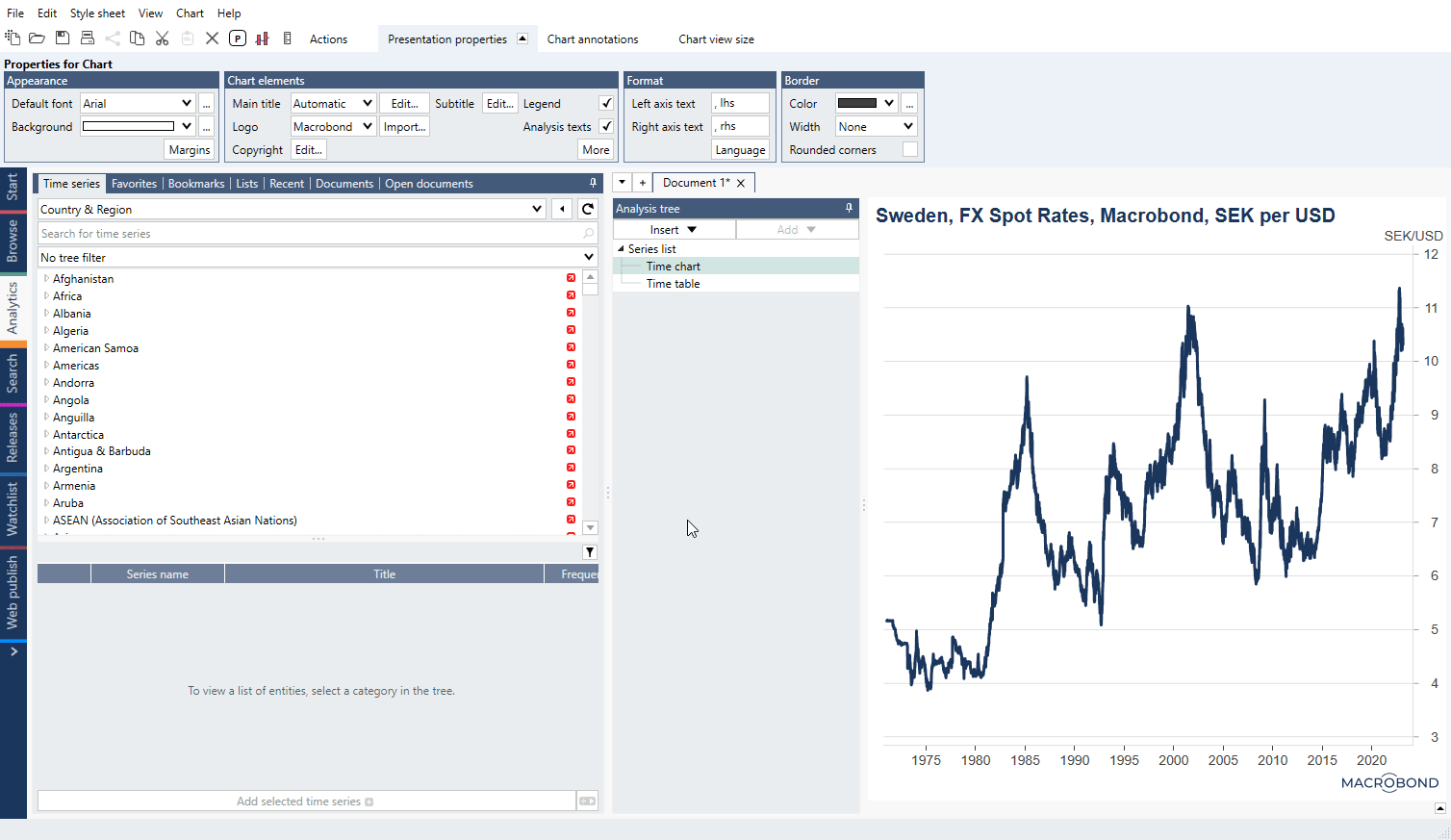
Summary: transforming data on Series list - frequency, missing values, currency, forecast
[image]
preparing data, transformation with Conversion settings + Freq conv + Currency, Forecast, Expression & Description, (Analysis tree -> Add chart)
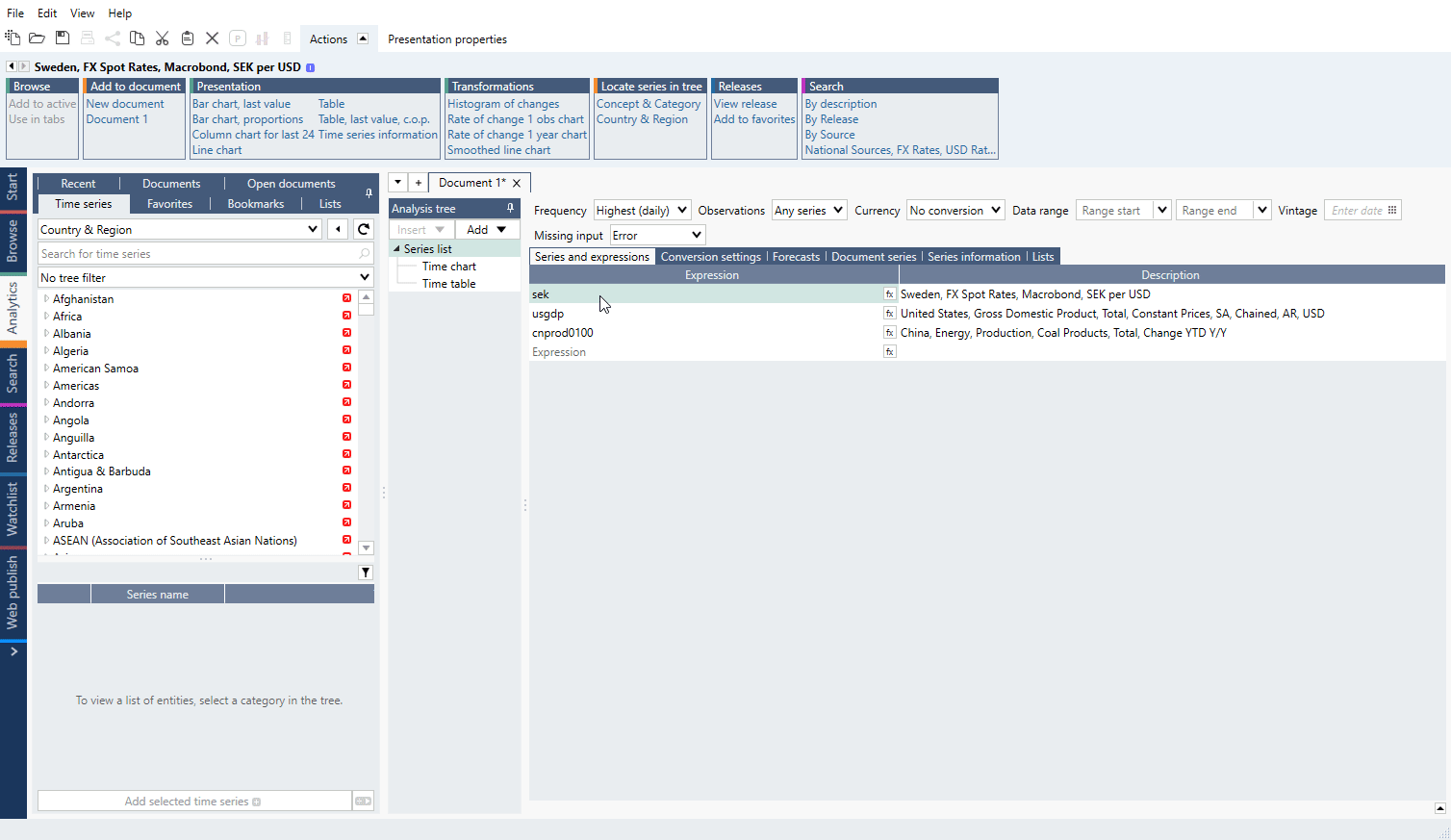
Summary: transforming data on Series list - frequency, missing values, currency, forecast
[image]
preparing data, transformation with Conversion settings + Freq conv + Currency, Forecast, Expression & Description, (Analysis tree -> Add chart)
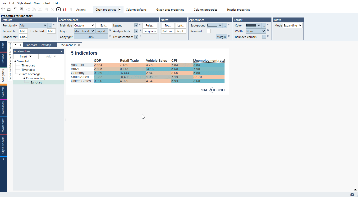
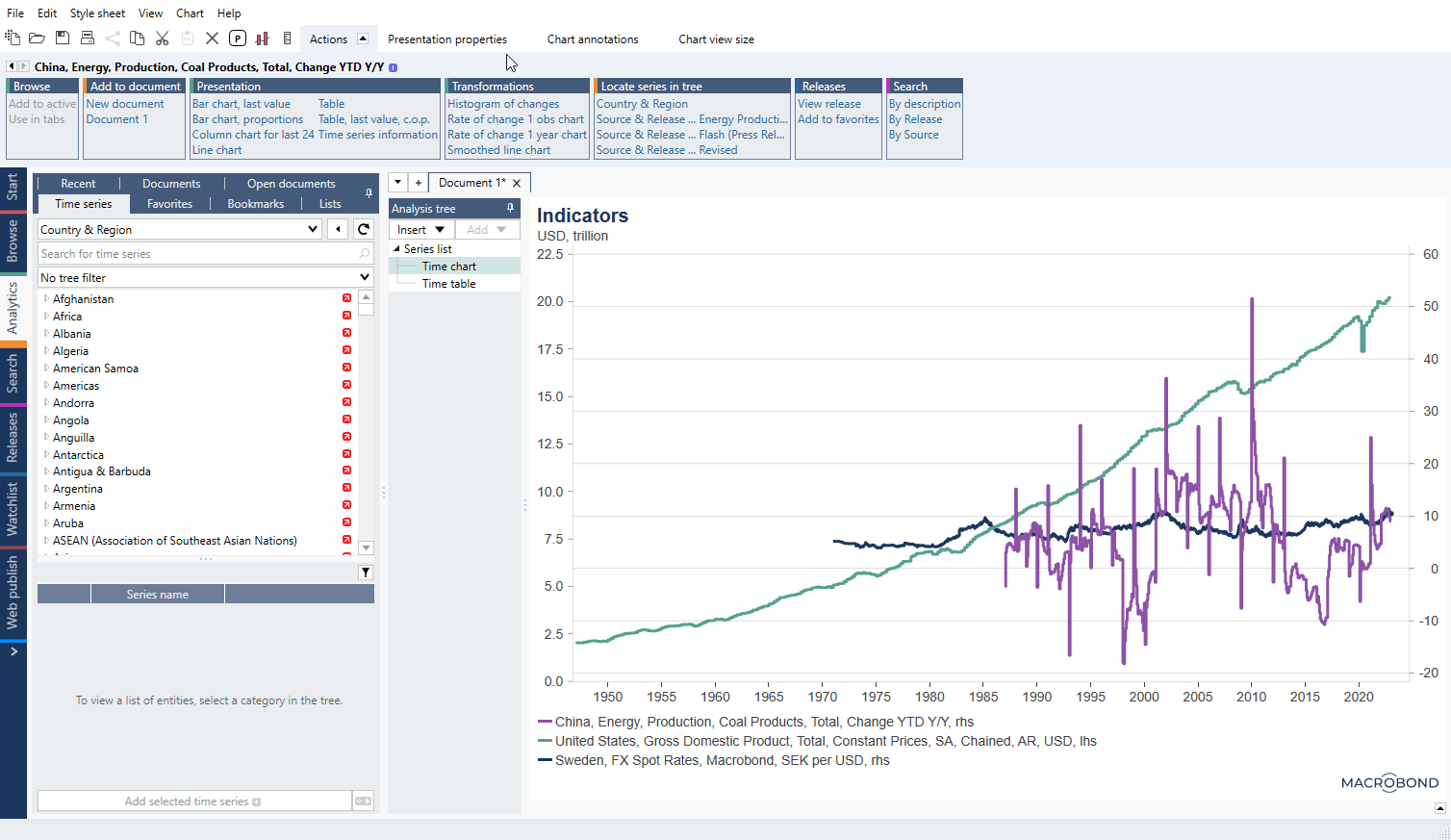
Summary: Bar chart - Dynamic table, Heatmap.
When you remove graphical elements from Bar chart you are left with series descriptions and numbers. From them you can create always-self-updating Dynamic table. And by adding colors to a table you can create Heatmap.

See our step-by-step training HERE.
Summary: Modify Bar chart into Dynamic table and Heatmap.
In this tutorial we will show you how to make a publish-ready heatmap from scratch. Here's what you will be doing in this training. LINK
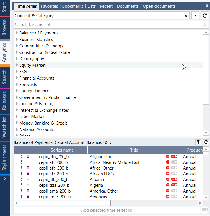
Let’s say you want to build a 5x5 heatmap with 5 indicators for 5 countries. Dive into our data-tree and navigate to Concept & Category.
We’ve decided to show GDP, Retail trade, New Cars registrations, CPIs and Unemployment rate. Below links go directly to the data-tree:
Concept & Category > National Accounts > National Sources > GDP > Constant Prices > By Adjustment Variant > Seasonally Adjusted
Concept & Category > Trade > National Sources > Domestic Trade > Retail Trade
Concept & Category > Trade > National Sources > Domestic Trade > Vehicle Registrations > New Cars
Concept & Category > Prices > National Sources > Consumer Prices > CPI > Total
Concept & Category > Labor Market > National Sources > Unemployment Rate > Total
The countries we have chosen are Australia, Brazil, Germany, South Africa and United States.
For more information about our data-tree see: Concept & Category view – comparable data in data-tree and Different views – entry-points and how to work with them.
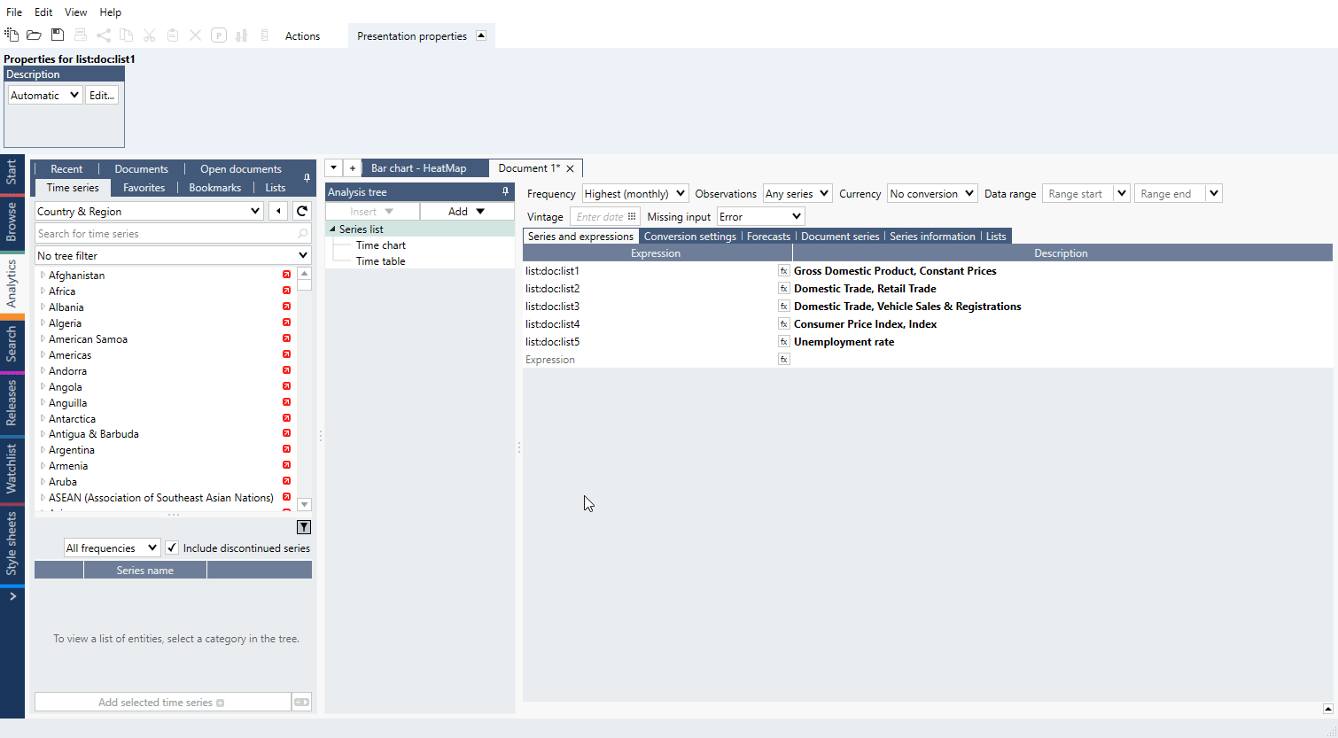
You can add all those series on Series list but we recommend using Lists functionality. It will be easier to manage larger data sets and make changes in the composition of series.
Go to Lists tab, press ‘Add new by region list’ and paste the codes:
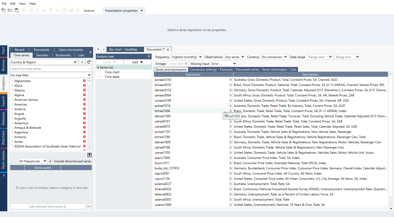
To add four more lists press ‘Add child list’ and add series:
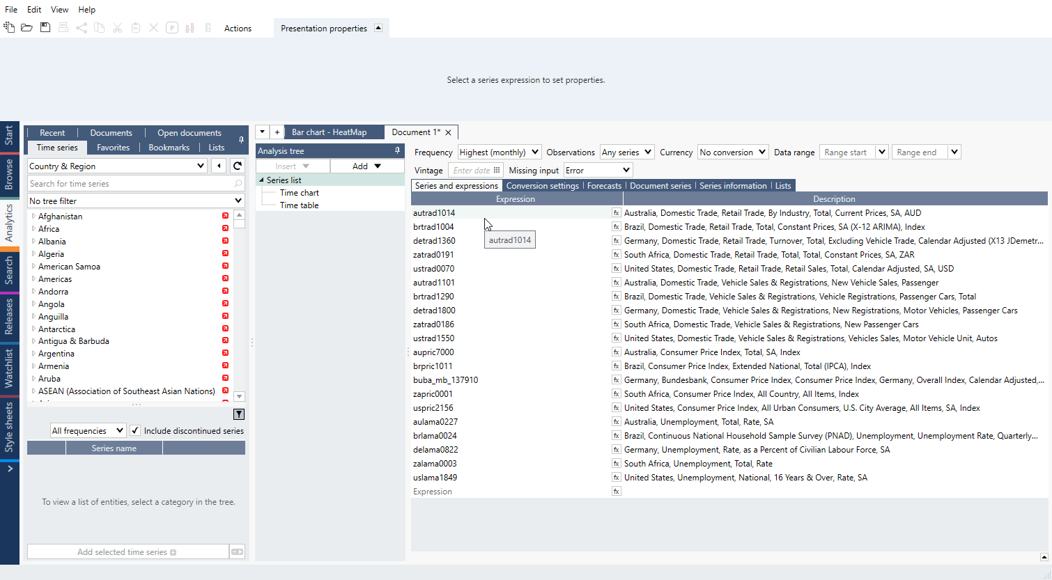
Add those lists with + sign on Series list:
You are ready to use analyses.
For more information about Lists see: Lists of series.
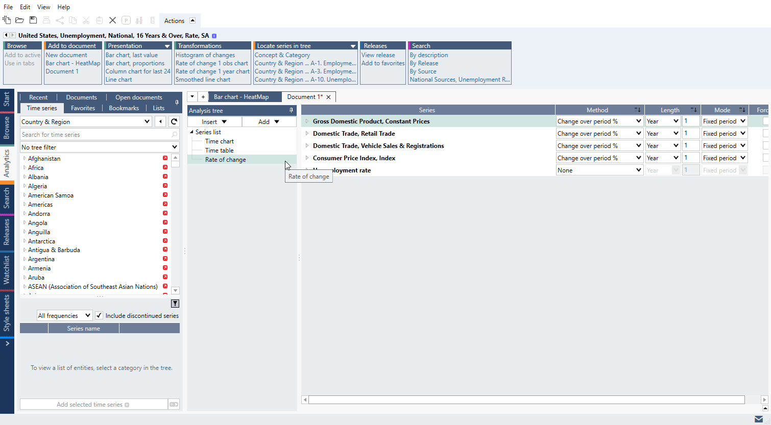
Some of our data needs to be calculated into YoY % format. We can do this swiftly with Rate of change analysis – just add it and change ‘Method’.
You can apply same settings to every item below with down arrow next to column’s title:
Series are now ready.
For more information about analysis see: Rate of change.
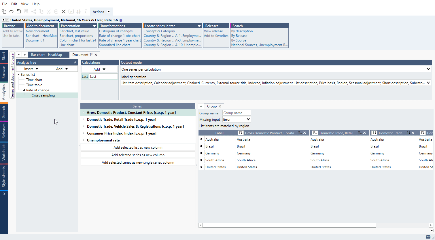
The usual case is that for a heatmap we always want the last available value. We can get it with Scalar or Cross sampling analysis. These are similar analyses, but Cross sampling was specifically designed to work perfectly with lists.
Let’s add it and select ‘Calculations: Last’, ‘Output mode: One series per calculation’. Then we drag our lists from ‘Series’ panel under ‘Group’ tab:
For more information about analyses see: Scalar, Cross sampling.
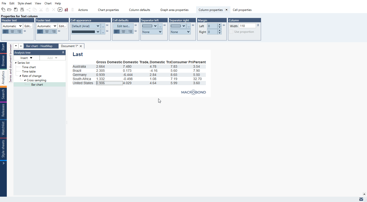
Now let’s create a base for heatmap – a table with self-updating cells – a Dynamic table.
To do this add Bar chart, go there – it doesn’t resemble table at all. We need to clean it a bit. Open Graph layout (Ctrl+L) and:
Now we need colors for those cells.
For more information about these types of graphs see: Bar chart, Dynamic table.
Go to Chart properties > Chart elements > Rules > Add rule.
Select colors.
Select to which columns it should apply (column 'Include'). The first column contains descriptions.
Press OK.
You have a heatmap!
For more information about Rules settings see: Bar chart conditional formatting rules, Heatmap.
Double-click on title and in new window type in text.
Our cells have too many decimal points. To change that in one move go to Column defaults > Text > Default cell text and type in:
{s .Value F1}
The ‘F1’ is code for ‘one decimal point’.
You can also apply different formats to different columns - go to Column properties > Cell defaults > Edit text.

For more information about formatting things on the chart see: Dynamic text.
To set column width press on any cell in it, go to Column properties > Column and type in number. Note that you have to do it for each column.

To add a source, double-click on the logo in the bottom right corner.
You can also upload your won logo. To do this click on the current one, go to Copyright properties > Logo > Import and upload a picture in SVG format.
For more information see: Logo & Copyright.
Check what charts you can make in Macrobond:
Visualize data 1
Training case A
Visualize data 2
Training case B
Visualize data 4
Training case D
Building presentations
Summary: data-tree overview, Time series information, Ratio, Search tab & filtering results
There are 3 main views of our database:
For more information about databases and its structure see The data-tree structure.
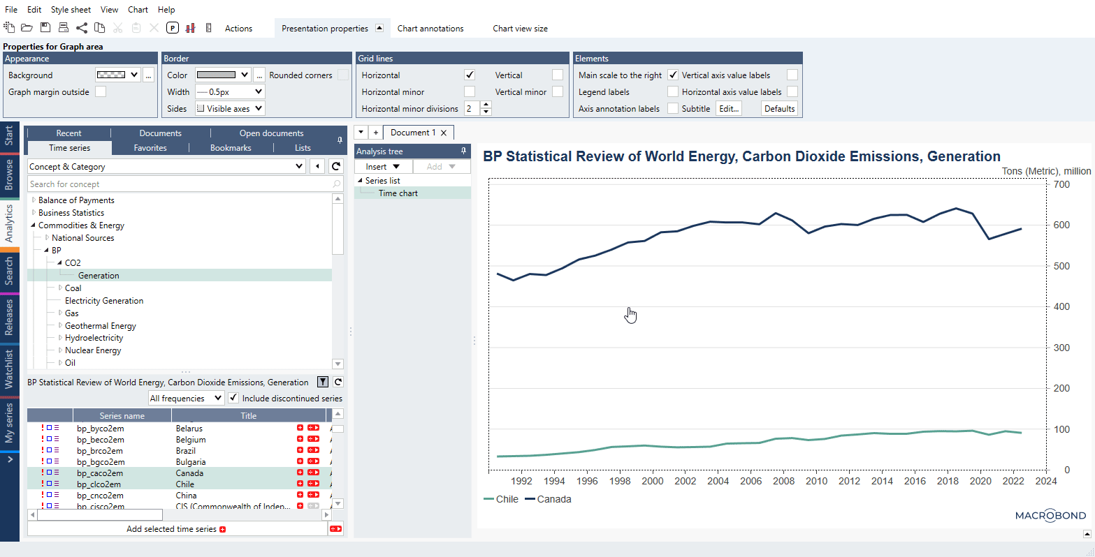
Just follow the nodes to find what you need. When you'll find it - mark series with Ctrl or Shift key and use 'Add selected time series' to add them to a document:
If you need more information about series, click on it, and from Actions ribbon select Presentation panel > Time series information. New tab will open. For more information see Time series information – accessing the metadata.
Right from the data-tree you can also add already transformed series through our Ratio functionality. Press '÷ >' sign next to series' Title and press ' + ' next to one of ratios. You will see newly added series wrapped in a ratio #(series). For more information see Ratios.
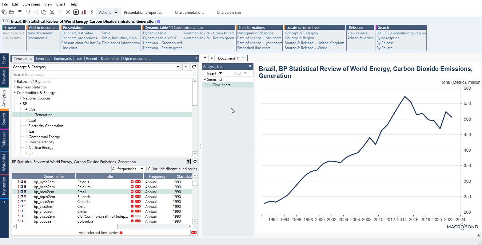
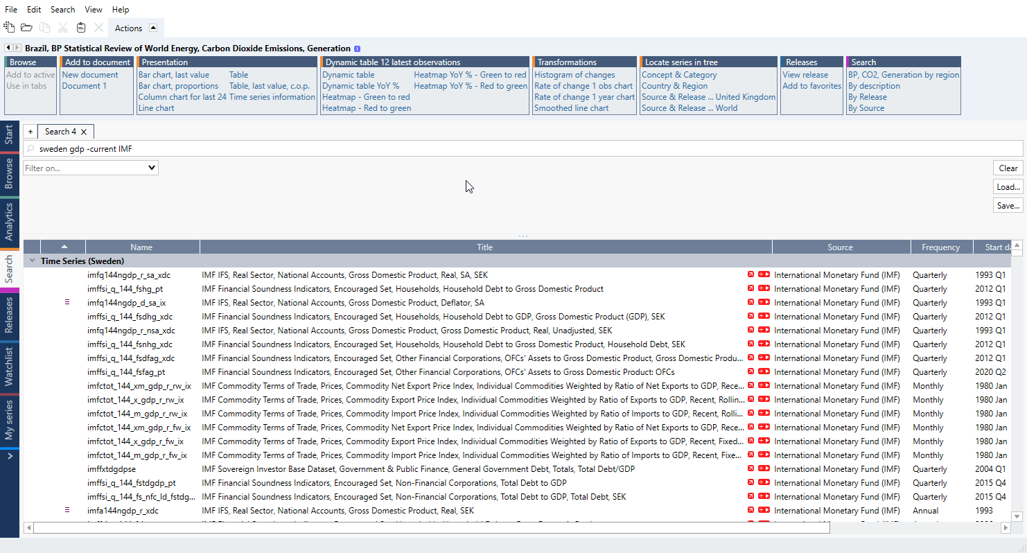
Beside having data-tree you can also search for data in a Search tab. There are few tricks you can use to narrow outcome - see In Search activity tab for more information.
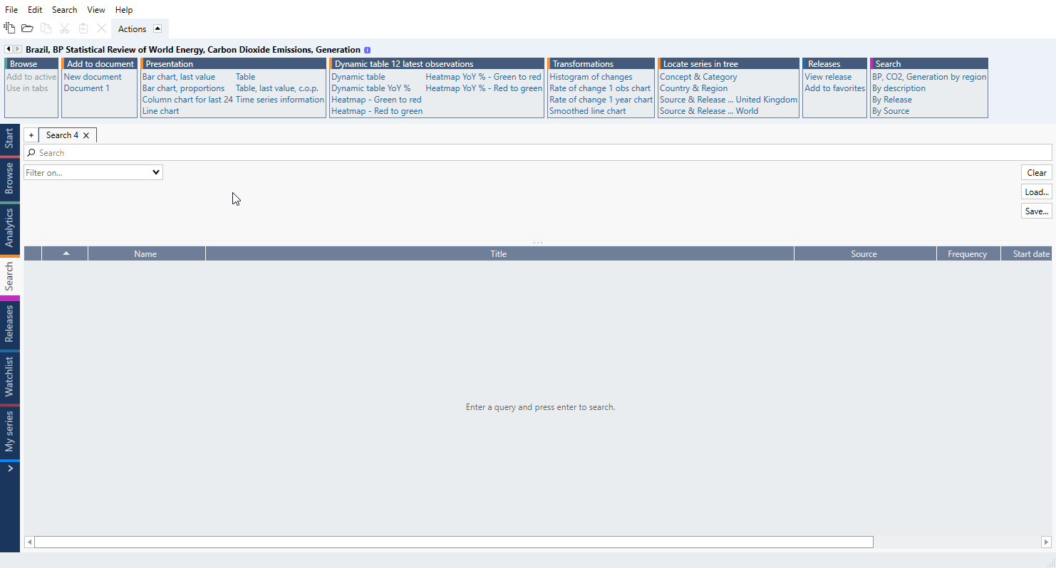
We recommend combining text methods with filters to speed up finding right series:
Summary: Start tab & Analytics tab overview, introduction to workspace, introduction to documents workflow
Welcome to Macrobond. This is where your journey begins - the Start page. The elements here are:

With Activities tabs you can switch between different Macrobond sections. There is also > sign at the end of list - it's called 'Flexi tab'. You can find additional useful activities there.
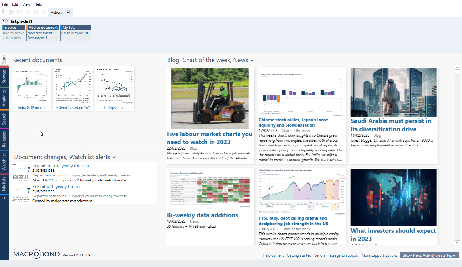
Mainly you will be working inside the Analytics tab where we have gathered all functions needed for building a chart. The elements here are:

You can change the width of panels by dragging the divider or roll the first two panels by clicking on a pin in their right-upper corner:
The Actions ribbon is available only after clicking on a series
 while Properties change depending on what element you have clicked.
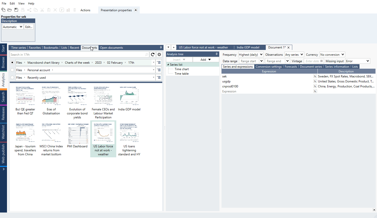
Series and document browser is used mostly for searching through data-tree or documents. Check out our prepared documents under Macrobond chart library - when you click on of them it will open inside Chart area. You can preview charts inside 'orange tab' without opening any file. When you decide that you want to keep one of them open - click on 'Open document' icon.
All currently opened documents can be found in Open documents tab. It might be easier to navigate (and close them) from there.
You want to start? See these course, they will show you the basics of moving around our application:
Getting started with Macrobond
Transforming data with Series list
Transforming data with analyses 1
Visualize data 1
Collaborate & share
Welcome to our step-by step e-learning portal. You can choose from one of the paths:
or see individual courses: