For elements not mentioned here see Elements of the chart.
Overview
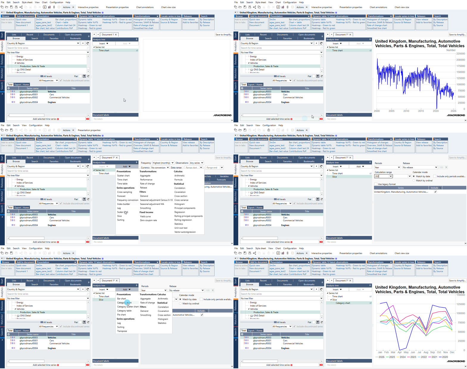
A Category chart displays category series in columns, which are usually created by analyses such as Cross sampling, Scalar and Slice. Category series don’t have a time variable, but instead have category variables, such as countries. The x-axis of a category chart, therefore, displays the categories of the series in the chart.
How to create a category chart?
- Add series.
- Add analysis and calculations. To show data in Category chart you need to convert time series into category series. See What analyses work with this chart type? for all analyses which works with Category chart.
- Add Category chart.
Settings
Chart elements:
- Columns/Graph
- Main title
- Graph area
- Value axis (y-axis)
- Source logo & text
- Chart background (outside chart area)
- Category axis (x-axis)
- Legend
To edit any one of these components, click on it, and the available options will appear at the top of the window, under the presentation properties tab. For more information see Editing text parts of chart.
Category axis settings
Clicking on the x-axis gives you a variety of options under presentation properties. Here are some which are specific to category charts:
Appearance
Distance
For the chart elements: Title, Axis, Legend, and Copyright/Source, controls the distance between the element and the next element in the direction of the chart. For the axes, the setting controls the distance between the tick marks (or axis if there are no tick marks) and the label texts.
Spacing
This controls the space between the rows in the case the labels on the axis are written on two rows.
Labels
Here you can edit the way the scale is labelled.
The order of the categories on the x-axis depends on the analysis that produced the series. Unchecking automatic will allow you to use the Manual step option, where you can specify the number of visible category labels.
Uncheck Show value labels if you want to hide the category labels defined in the Scalar or Slice analysis.
Uncheck Show labels if you want to hide the x-axis labels altogether.
Scale
In a category chart, Scale adjusts what categories are displayed on the chart. Instead of typing dates into the display range, you should type absolute or relative index values such as #1 or -1. If you select Start at shortest or End at shortest, the display range of the chart will be adjusted based on the categories for which all series have values (if the chart includes more than one series).
For more information about scale please see Axis & Scale.
Value axis settings
Appearance
Tick position
This controls the position of ticks or can turn it off. Next to this setting there is Minor tick marks panel where you can enable additional tick marks.
Distance
This setting controls the distance between the tick marks (or axis if there are no tick marks) and the label texts.
Axis
You can select here which y-axis will be the main - left or right. You can also synchronize them. For more information about it see Synchronize Axes.
Scale
In the scale group you can adjust the value range displayed on the axis by specifying the value. Note that here you must type the value in its full scale, not a abbreviated version seen on the axis. For more information about scale see Axis & Scale.
Chart settings
These settings can be accessed after clicking outside chart area.
Appearance > Margins
This panel of settings manages the distance between elements on the chart. Indentation defines the minimum distance from the leftmost/rightmost side of the chart and the left/right side of the graph area.
What analyses work with this chart type?
All types of analyses which remove time parameter and turn series into category series or use such series.
Example
In this example we presented available types of charts.
