Overview
There is no dedicated chart type for Slope charts. However, with Scalar/Cross sampling analyses you can create slopes out of Category chart.

How to create a Slope chart?
- Use Scalar (or Cross sampling) with 'Calculations: Value at' for two (or more) points in time.
- Set 'Output series' to 'One series per input'.
- Rename 'Value labels'.
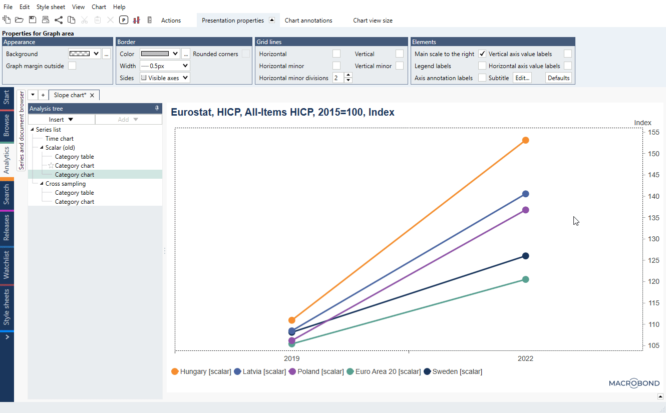
- Add Category chart.
- Add points on each end:
- click on each line and under Presentation properties > Appearance > Graph style select 'Custom' select 'Marker style',
- repeat that for all lines.
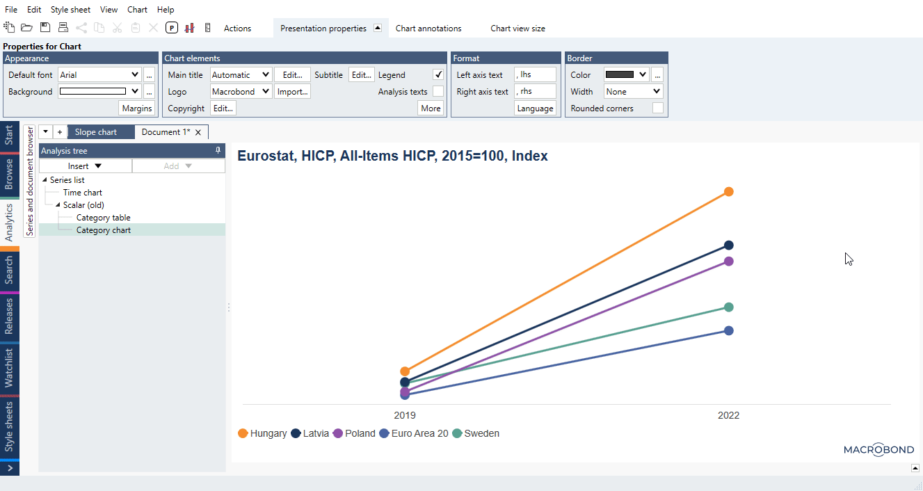
Cleaning graphical elements
- To remove '[scalar]' from legend's descriptions click outside chart area and under Presentation properties >Chart elements untick 'Analysis text'.
- Some things cannot be disabled but you can select for them 'transparent color', those are:
- click on Y-axis, under Presentation properties > Appearance > Text color,
- click on Y-axis, under Presentation properties > Appearance > Tick color,
- click on Y-axis' description , under Presentation properties > Appearance > Text color,
- click on X-axis, under Presentation properties > Appearance > Tick color.
- Disable other graphic elements from chart:
- click on any grid line, under Presentation properties untick 'Show grid lines',
- click inside chart area, under Presentation properties > Border > Sides select 'Bottom'.
Adding value labels on chart
- To add value label right-click on any dot, select 'Add observation label'.
- Click on it, under Presentation properties check Custom style:
- under Anchor line > Width select 'None',
- under Anchor appearance > Style select 'None'.
- Double-click on label's text. Leave only {s .Value}.
Now you can copy the label with Ctrl+c keys, click on any other dot, and paste label with Ctrl+v. It will keep the style of first label.
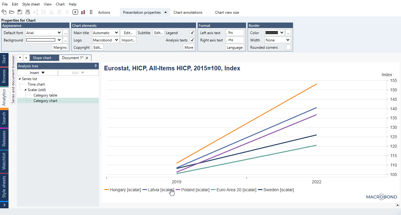
Example
In this example we calculated annual average CPI and showed its level on years 2019 and 2022.