- How to access?
- Adjusting graph
- How to show series on more than one chart?
- Adding/removing chart panes
Adding series to Series list is first step. If Series list is like a basket, then Graph layout is command center for your chart.
How to access?
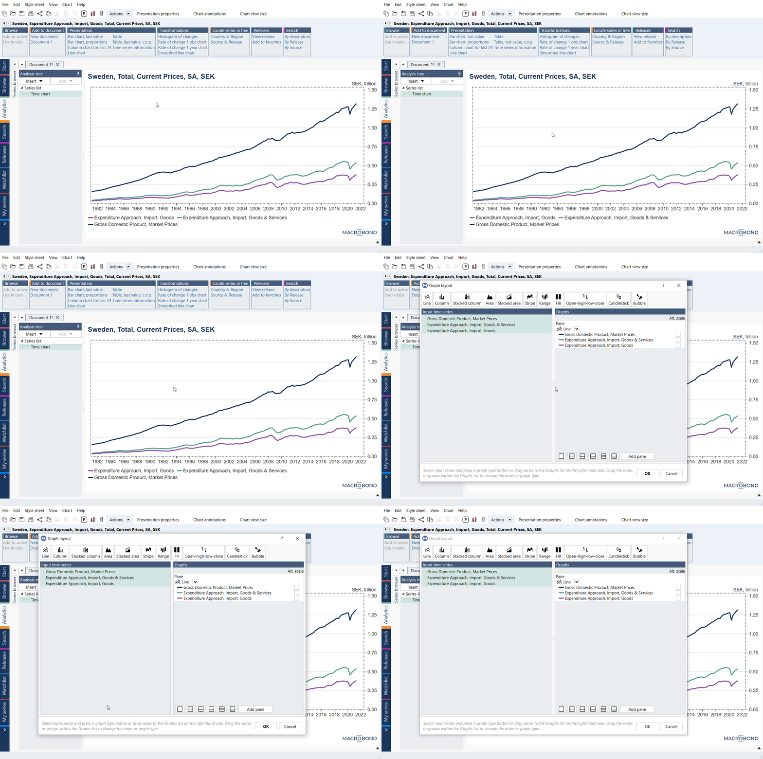
There are three ways to access the Graph layout settings, you can:
- click on the 'Layout' button

- use the keyboard shortcut CTRL + L

- right-click on the chart and select Graph layout from the context menu

From here you can manage the appearance of your chart. On the left is a list of all the series from the document that you can add. On the right you can see which series are currently being displayed, the order they are displayed in and what graph style is used for each.
Adjusting graph
Graph styles
At the top of the window, you can choose from a list of graph styles. To change the style of a series, click on it and then select a graph style, for more information about available styles see Graph layout’s charts.
If you have a number of series listed under one graph style, the drop-down list is a simple way to change them all at once.
Alternate scale
Check Alt. scale in case you want the graph drawn relative to the main or alternate scale.
Order of series
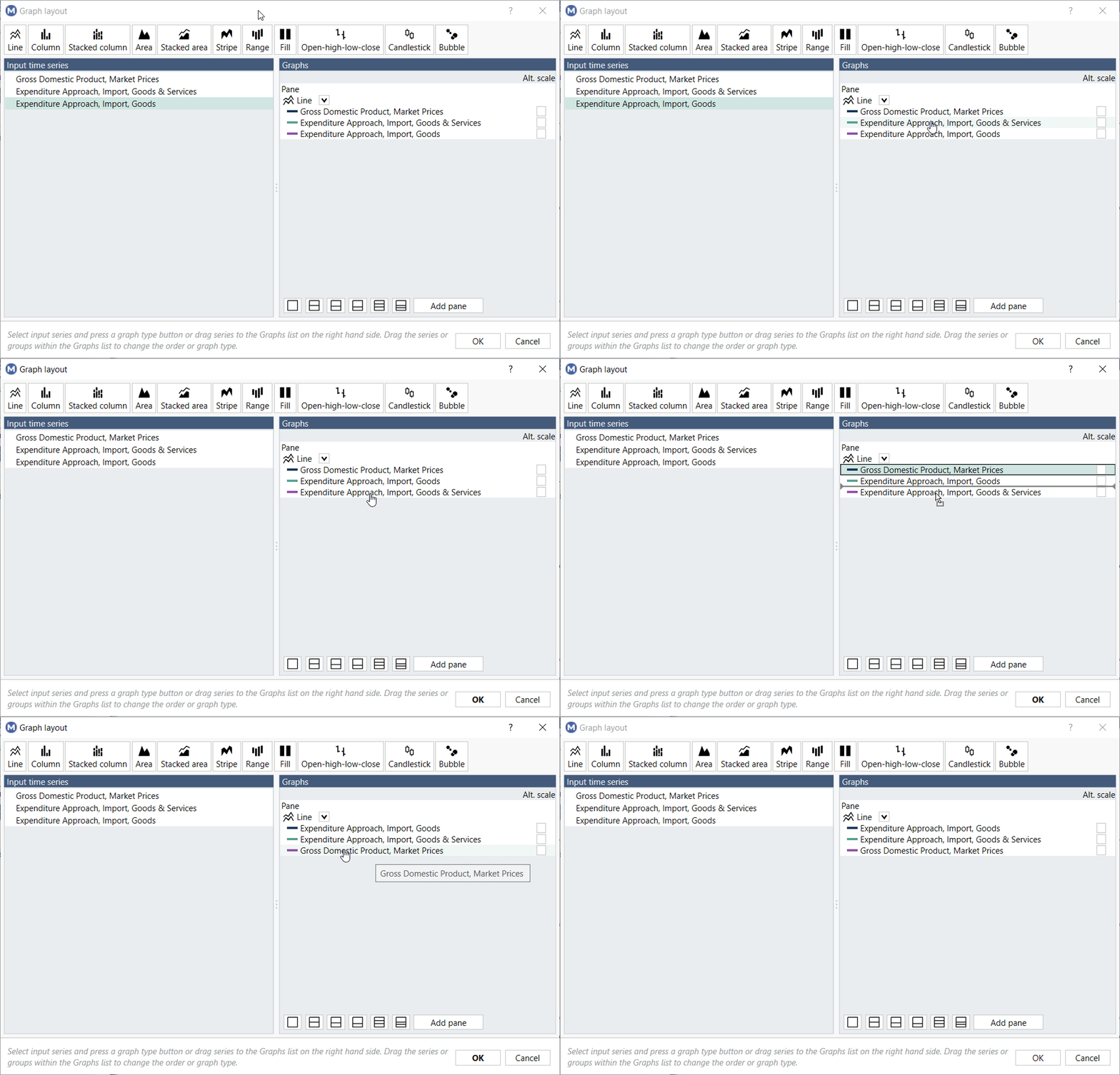
You can manually change order of series, just drag, and drop series to desired places. What's at the bottom of the list is drawn in the front on chart. But with one 'tick' you can reverse the legend's order - see more about it on Reversing the order of the legend.

Deleting series
Only time series shown in the Graphs section will be visible on the chart. So, if you don’t want a series displayed, simply remove it by selecting Delete from the context menu. You can also click on series and press Delete.
Uniform pane size
This feature is available in Macrobond Analysis 1.30 and later.
This will make all panes in a chart the same size, regardless of how many panes you use, and the size of titles and footers.
This feature is available in the Graph layout as well as in Graph area's Presentation properties (also in Style Sheet).
Margins
This feature is available in Macrobond Analysis 1.30 and later.
It gives you full control over margin indentations from top, left, right, and bottom under Properties for Chart > Margins. It allows to control the positioning of the edge of the chart, regardless of the size and position of other elements like titles.
How to show series on more than one chart?
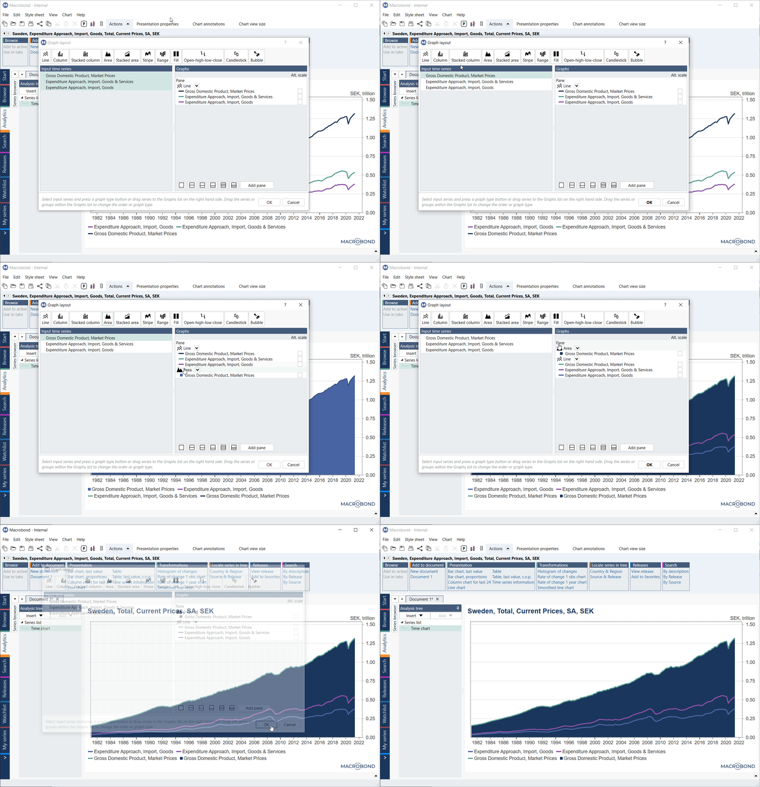
Visualizing a series more than once, and applying a different graph style, can help you to emphasize a particular point in the data. All the series in the Input list on the left can be added to the chart multiple times.

Adding/removing chart panes
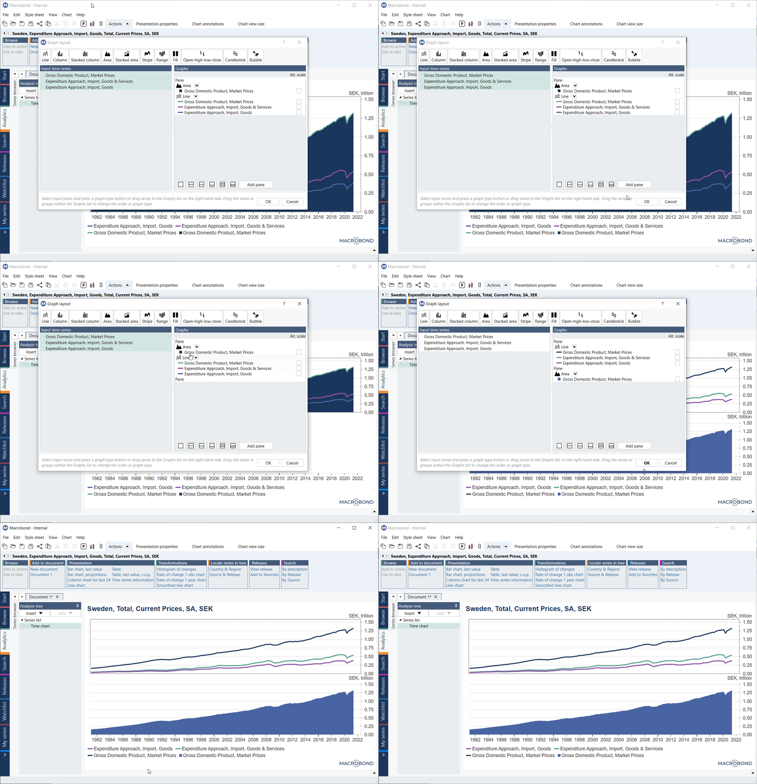
If you want to display your series separately, add a new pane. Adding panes divide chart area into smaller units. Select from the predefined pane layouts available or adjust the panes manually by dragging them up or down. See more about this on Working with panes.
