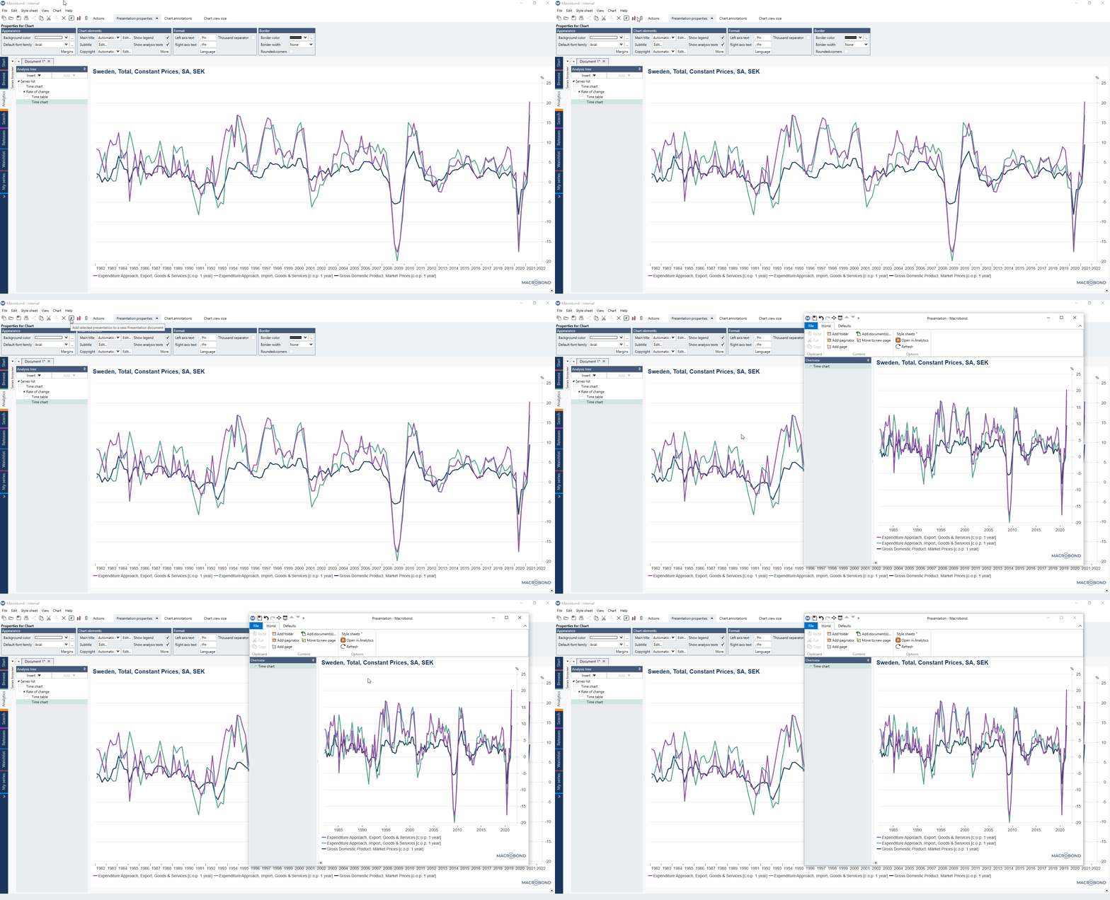
This lifehack can be used to see analysis and chart side-by-side when changing settings.
In the command bar of the application, you’ll see a button with a P on it - this allows you to present charts in a separate window.
Besides being the first step in compiling a presentation of charts there are two other benefits that it had.
You can use it to quickly open and compare a number of different charts. Moreover, it is also possible to use it as a viewing pane to monitor the changes to your chart as you make adjustments to time series calculations.
Opening a chart in a separate window
To do this you just need to click on the presentation button in the command bar or use the Ctrl+Q keyboard shortcut.

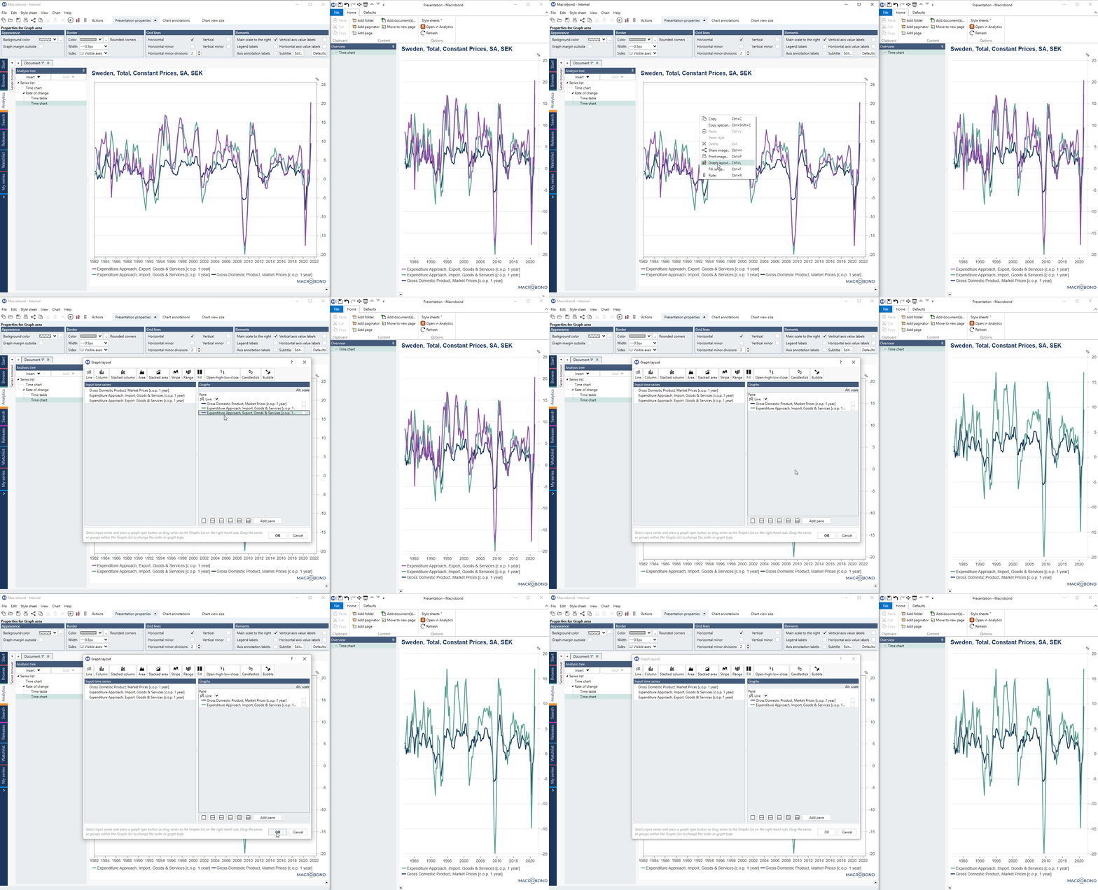
Performing changes in the analysis using information from the second window
With the chart open in a Presentation window, we can see how the visualization is affected as we make changes in any settings.

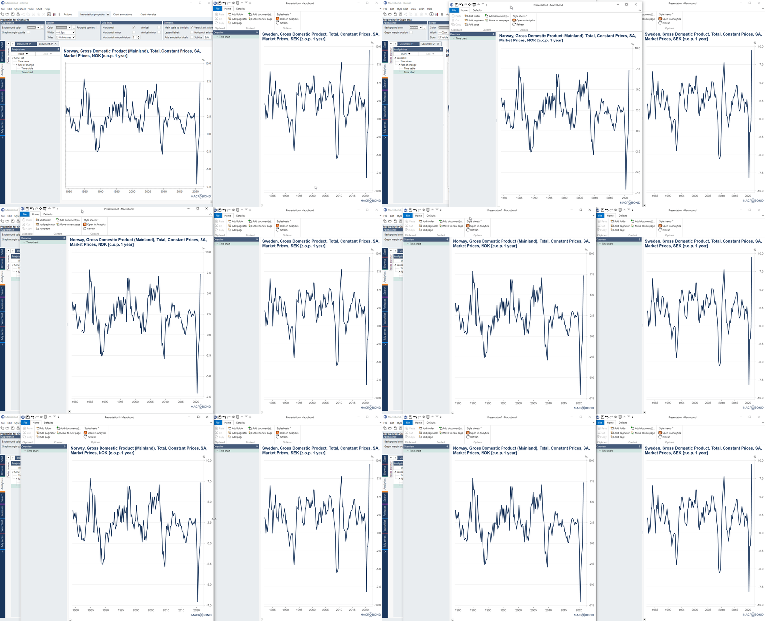
Comparing charts in two windows
Using Presentation button additionally allows to compare two charts with each other. Simply open the relevant documents in two different Presentation windows.

As you can see, there are a many ways to use the 'Presentation' button to make it easier to work with charts. For more information about used feature see Presentations documents.