- How to quickly display a series as a chart or table?
- How to add more series to a chart in Browse?
- How to move chart to Analytics?
This feature is useful when you want to quickly review the data a series contains, without having to create a document or when you want to confirm that you’ve selected the correct series before adding it to a document you’re working on.
How to quickly display a series as a chart or table?
- Select one, or multiple series to visualize. This can be done from any of the activity tabs.

- Navigate to the command bar, and make sure the Actions tab is selected and displaying the actions.

- Look under the group called Presentations, and click on one of the options available. The browse activity will automatically open to display the presentation you selected.
Click on the activity you were in before to return to what you were doing, or use the analytics actions to start working with the data.
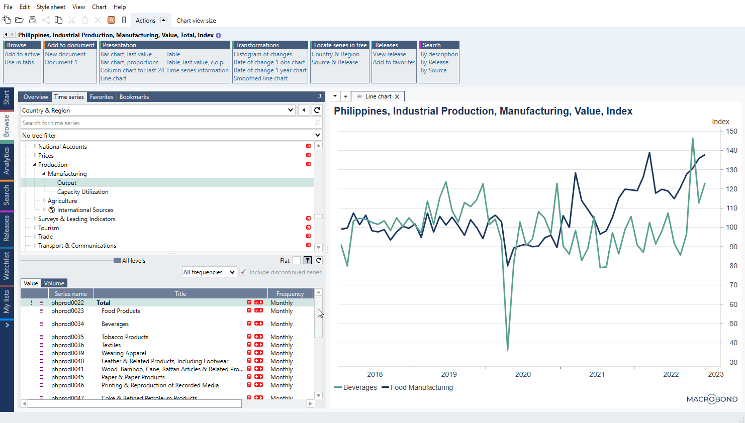
How to add more series to a chart in Browse?
If you want to add other series to a chart in Browse then:
- Make sure series is highlighted
- Go to Actions ribbon see Browse and press Add to active
How to move chart to Analytics?
You can move created chart to Analytics tab to analyze data further. Click on an orange A icon above Actions ribbon and it will appear under Analytics tab.
