Macrobond 1.16


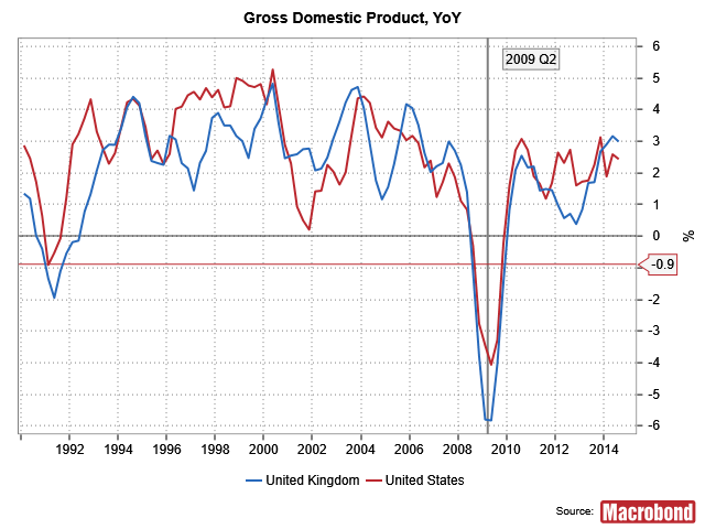
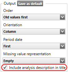
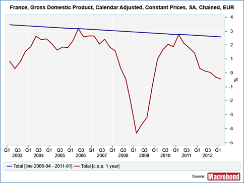
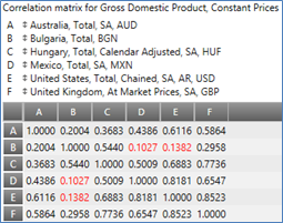
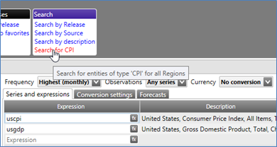
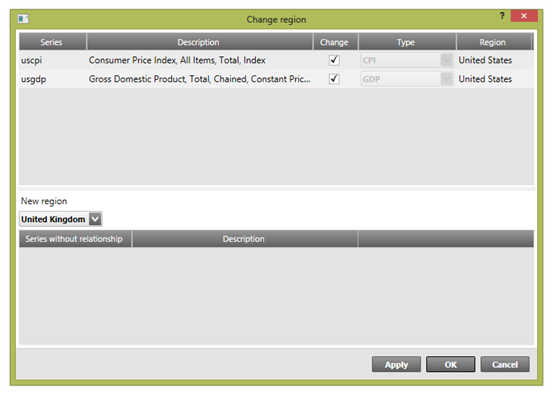
With version 1.16 of the application you will find that working with documentation & charts is much simpler and more efficient. From creating dynamic presentations to tweeting charts, making use of your work product easily, in a variety of contexts, has been a central focus of this update.

The following text will guide you through these & other changes: what they are, where you can find them, and the different ways you can make use of them.

Click on the link for How to upgrade in the Overview section below if you would like more information.

Overview of what’s new

Presentation documents, Analytics & charting, Exporting & sharing charts, Navigating the application, Document handling, How to upgrade

Presentation documents

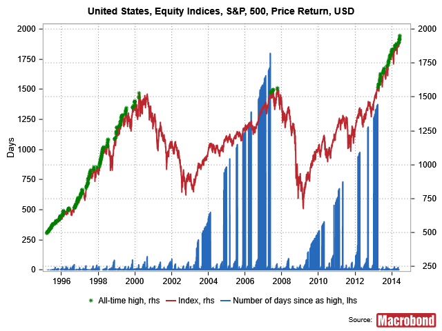
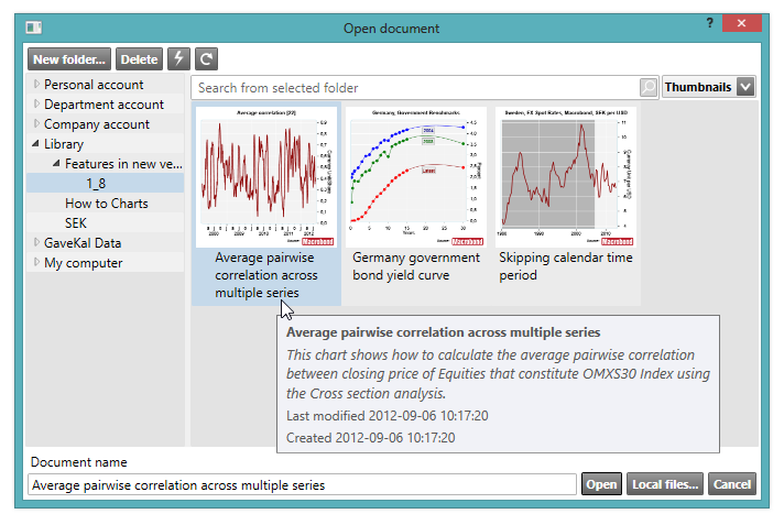
As the name suggests, presentation documents are used to organize charts and tables so that you can easily and professionally showcase an overview of your work. The Presentation documents window opens outside the application to give you more flexibility for working with, sharing and presenting charts. Charts can be organized by pages and in folders.

Macrobond Presentation Document

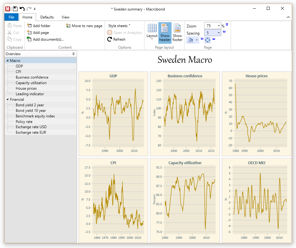
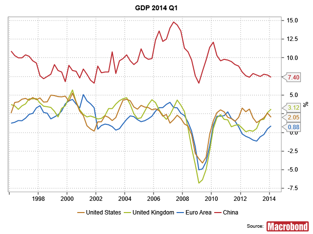
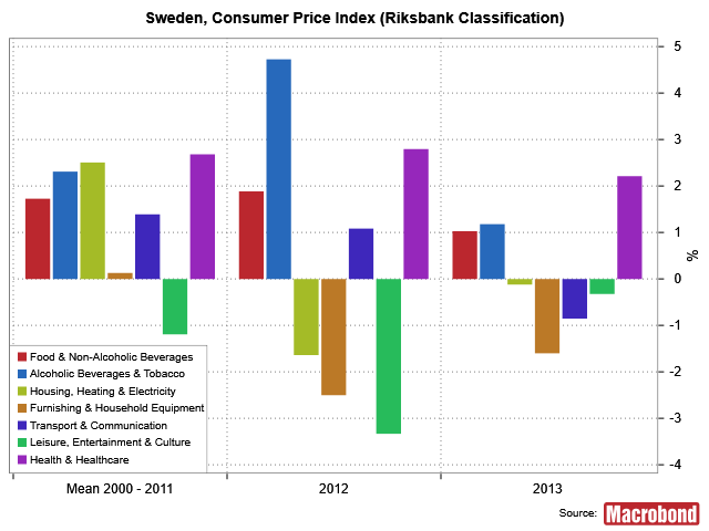
An example of two pages in Presentation documents, containing six charts each.

Benefits of Presentation documents

  • Get an overview of multiple charts at once. You can make changes to the charts in the application and see this reflected in the presentation document in real-time. The Presentation documents window can be viewed on a second monitor to enhance your ability to work with multiple charts efficiently.
  • Add and organize an unlimited number of charts from different documents in one place. Save presentation documents for your personal use or for sharing with others. You can browse through the pages using the Page Down and Page Up keys on your keyboard.
  • Print or export a presentation document with a number of charts (in this version PDF creation only works on Win10). This will then work as an alternative to PowerPoint.

A simple, dynamic alternative to PowerPoint

While Presentation documents does not have the same formatting options as PowerPoint, it does contain some simple editing options. It also allows you to present dynamic charts. For example, you can easily:

  • Create presentations with a multitude of charts. Simple header and footer options are available for adding text, as well as formatting columns for chart display. Style sheet options include selecting text positioning, size, color, font, and background color.
  • Easily share presentations in the application. By using your company account, for example, just like you do with other Macrobond documents.
  • Avoid broken links between the application and your presentation documents. You will be warned before deleting documents that are linked. See which documents are being used for presentations, and in which presentations documents they are being used.

We plan to make it possible to view these documents on the web based Macrobond.NET in the future.

To get started with Presentation documents have a look at this easy-to-follow help guide.

If you have already installed the new version click on this link to see a sample presentation document: Macrobond chart library : What’s new/1.16/Presentation/Sweden summary.

If you have not updated yet click on the yellow ribbon that you’ll see when you open the Macrobond application.

Exporting & sharing charts

Twitter

To help you share your insights quickly with a larger audience, you can now send charts directly to Twitter from the Macrobond application. You can select the size of the image (which affects the amount of characters used) as well as add an accompanying text.

Sending tweets from the Macrobond application

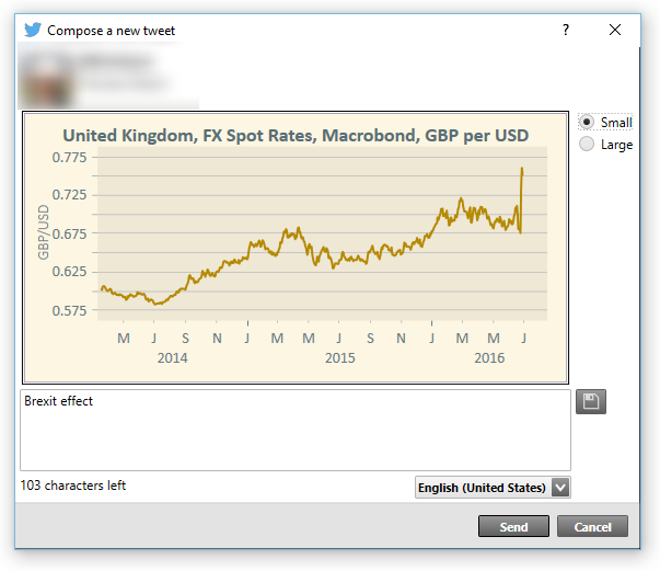
An example of how the Twitter dialog box will appear in the application.

When you have a chart open, go to File and select Send to Twitter. The first time you use this feature, you’ll be asked to log in to your twitter account via the Macrobond application, in order to approve access.

If you want to revoke the application’s access to your Twitter account. You can do so on the Twitter “Applications” page.

For a more detailed explanation see the help page.

SVG

Use SVG to smoothly export your charts and tables to the web, or programs such as Adobe Illustrator and InDesign. In addition to PNG (bitmap) and EMF (metafile) we now offer a format called SVG via the export, web publish and copy to clipboard functions. To adjust the way text and fonts are handled in SVG go to Edit | Settings | SVG, in the top menu bar.

See the help page for this feature here.

Share

On the same topic of reaching a broader audience more easily, if you run Windows 10 you can now send images of Macrobond charts to Windows apps. Sharing is as simple as opening the relevant chart, and selecting one of the multiple ways to share the image: via the File menu, the toolbar, context menu, or with the Ctrl+H shortcut. There is also a Share button in the Web publish activity in the Macrobond application.

Macrobond charts sent via Windows10 Share feature

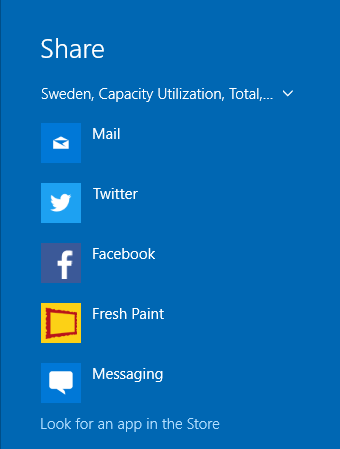
The Share feature will bring up the standard Windows 10 share options similar to this.

Document handling

Document revisions

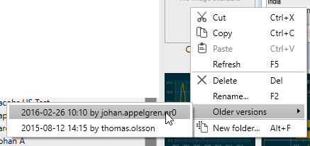
To give you greater control over your work product it is now possible to revert to older versions of a document. For documents stored in one of the account storages, you can access the last 10 versions. These versions will be available for up to one year. This feature is also available for Style sheets.

Right click on a document in the File, Open dialog and you will see an item called Older versions:
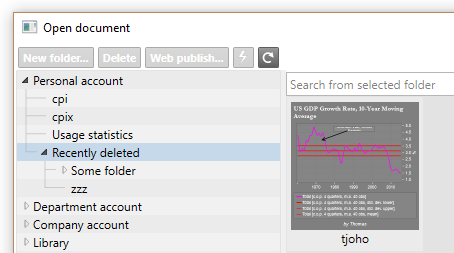
Accessing previous file versions in the Macrobond application

Recently deleted

To make sure you don’t accidentally lose valuable documents, all deleted documents or folders stored in a company account will be moved to a folder called Recently deleted. Documents will be stored here for a few months, allowing you to retrieve them.

This folder will always be last in your list of folders. The folder will be created automatically the first time you delete something, but you may need to press refresh to view it immediately.

Documents will automatically be deleted from the “Recently deleted” folder after a few months.

Accessing the recently deleted files and folders

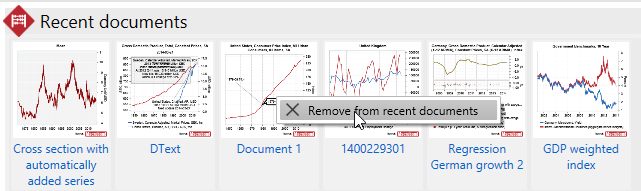
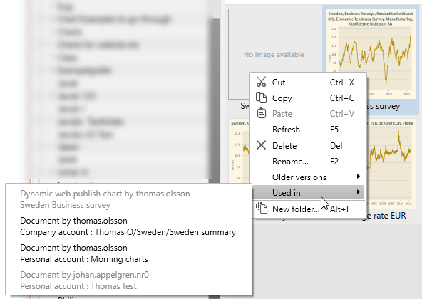
Referenced documents

You can see if a document is used in Presentation documents or published on the web using the Web publish feature by selecting Used in from the context menu of a document. You can open presentation documents from this menu if you have access to them.
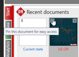
Checking where the Macrobond chart was used in

Pin documents

For documents you need to access quickly or frequently, you can now pin to the top of the start activity. Pinned documents will always the first of the recently opened documents shown. Hovering your mouse over the document will activate the pin symbol. Simply click on it to pin the document.

Pinning certain documents to the Macrobond's start activity

Analytics & charting

Confidence bands in VAR

We have added an option for generating series for the confidence band in the VAR analysis. You can select whether you want to include the parameter uncertainty or not. This could potentially be a heavy calculation.

Trend output from X13

There is a new option called Calculate trend in the Seasonal Adjustment Census X-13 analysis. This will produce an extra time series containing the trend output from the seasonal adjustment model.

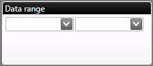
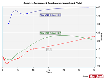
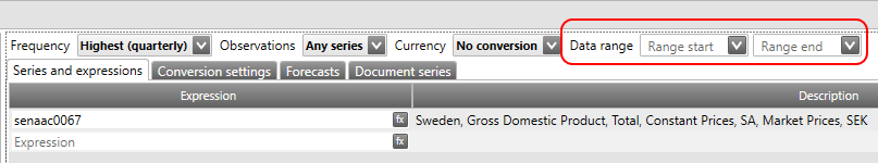
Data range in the series list

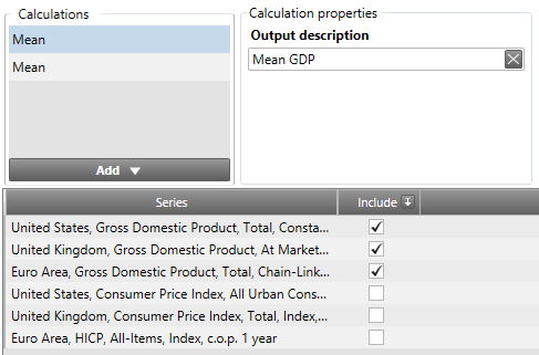
You can specify an optional data range in the series list if you want to limit the time series used in the document. The range is applied to the series before any other operations, such as frequency conversion.

Setting a data-range for a Macrobond document

Hold shift key to lock annotations

Holding the shift key down when drawing line or arrow annotations will ensure that your lines are perfectly horizontal or vertical.

Holding the shift key down when changing the size of text boxes will constrain the text box to square proportions.
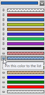
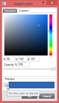
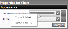
Copy/paste colors

You can now copy a selected color using the copy and paste commands, and apply this to the color settings for other segments of the chart.

Copying a color in Macrobond

Navigating the application

Always show start page

The start activity will now be shown by default when you open the application. If you would like start with the most recently used activity, uncheck the option Always show this activity when starting, in the lower right corner of the start activity.

Always show this activity when starting Macrobond

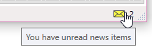
Unread news notification

There is a new indicator in the status bar that tells you if there are any unread news items. This is where you can find out about new data added to the application database, new features and fixes to the application, and posts such as the Development team’s blog. Click the links in the notifications to read the news on our website.

Unread news indicator

How To Upgrade

The new version can be installed directly via the Macrobond application by clicking the yellow ribbon, which appears on the screen, or by selecting Check for update on the Help menu. If you need assistance, a description of how to upgrade may be found here.

In Macrobond 1.16 we have dropped support for Windows XP, Windows Vista, Windows Server 2003 and Windows Server 2008. The minimum requirements are now Windows 7 or Windows Server 2008 R2.

If you are running a version of Windows not supported by this version of Macrobond, you can continue to run the older version until support ends for that version. Those dates can be found here: https://help.macrobond.com/additional-materials/product-versions/

Please note that this upgrade requires admin rights, so you may need to ask your IT department for assistance.

If you are unable to make use of automatic updates or use the setup program on https://redir.macrobond.com/go/installation, then please note that upgrades to 1.16 cannot be done by simply installing a patch (MSP file). You need to install the base installation (MSI file) and the corresponding patch (MSP file).

Macrobond 1.15


The new version can be installed directly via the Macrobond platform by clicking the yellow line which appears on the screen or by selecting Check for update on the Help menu. If you need assistance, a description of how to upgrade may be found here. You might need additional help from your IT-department.

Selection of new functionality

Bar charts

There is a new type of chart called “Bar charts.” They are not time charts, but show “items” as rows. The columns can be text or graphs

The name “bar chart” is perhaps a bit misleading since they can contain more than just bars and you can actually omit all bars.

Here is an example with three columns; one text column and two bar graph columns.

image

Bar charts can be copied and updated in Office documents and through the Web publishing feature, just like other charts. You can find documentation about Bar charts here or by pressing F1 in the application when you have a Bar chart on the screen.
Accompanying the new chart type are some new Actions that you can execute after selecting some time series. These presentations can be used as a quick overview or, by selecting Open in Analytics, as a convenient starting point for your own charts.

Bar chart, last value

This will show the last value as the proportion of the total for each series as a percentage. The values are sorted in descending order.

image

Bar chart, proportions

This will show the last value as the proportion of the total for each series as a percentage. The values are sorted in descending order.

image

Table, last value, c.o.p.

This will actually use a Bar chart presentation, but without presenting any bars. Instead it will show a summary with the last value, the change since the last period and the change since one year back.

image

Vector Auto Regression analysis

The Vector Auto Regression analysis estimates a linear dynamic system containing a number of equations. The analysis can produce fitted values and forecasts for a number of and a number of statistics.

image

Support for several models in the Principal component analysis

image

New calculation in Scalar

There is a new method in the Scalar analysis called “Percentage proportion” that for each series calculates the proportion of the sum at a specified point in time. This is used by the Bar chart, proportions Action.
When specifying a point in time there is a new type of relative reference that allows you to specify a relative length in the unit of the frequency that the series had before it was converted to a higher frequency. For instance, in a document with monthly data, specifying “-1n” for a quarterly series will refer to the value three months from the end. This is used by the Table, last value, c.o.p. Action.

Display range for tables

You can now specify the display range for table presentations.

image

Selection of date in time tables

For frequencies other than daily, you can select if you want “labels” such as “2011 Q1” or dates for the observations.

image

Structured lists of series for some sources

We have added the capability to show lists of series in the data browser with more structure. This will primarily be used to present data more like the source in the “Economics – by source” view. We have started to add structure to some important sources such as

Economics – by source > Federal Reserve > H.8 – Assets and Liabilities of Commercial Banks in the United States > Commercial Banks

image

You can use the slider at the top to show all or only the top levels of the structure. The checkbox “Flat” will show the series in a long list as it used to be in older versions of the application.

Discontinued series

When there are discontinued series in a document, you can bring up the Discontinued series dialog. For some series there may be information on why it has been discontinued. For some series there might even be suggestions for alternate series and you can choose to make a replacement.

image

Convert Macrobond Excel Data set to Macrobond Document Data set

In the Excel add-in you can now easily convert an ordinary Macrobond Data set to a Data set that contains an embedded Macrobond document. This makes it easier to use all the power of the Macrobond application, such as seasonal adjustment, for the data that you export to Excel.

image

Locate in tree in Macrobond Data set

image

Links to Time series information for downloaded series in Excel

When downloading time series by using the Macrobond Excel add-in, you can now select to make the series title a link to the Time series information in the Macrobond application.

image

Missing value method “Next value”

There is a new method that can be used for filling in missing values called “Next value.” It fills in the missing value with the next valid value.

Macrobond process as 64-bit

The 64-bit version of Macrobond now not only supports 64-bit versions of Office, MATLAB and EViews, but the Macrobond program also runs in 64-bit mode. This means that the application can take advantage of more than 2 GB RAM.

Other

  • Copy or move account in-house series
  • Option for drawing the graph area border only at the bottom in time charts
  • Option for “Insert blank item above/below” on the context menu in the Data set dialog in the Macrobond Excel add-in

Macrobond 1.14


The new version can be installed directly via the Macrobond platform by clicking the yellow line which appears on the screen or by selecting Check for update on the Help menu. If you need assistance, a description of how to upgrade may be found here. You might need additional help from your IT-department.

Selection of new functionality

Horizontal and vertical lines in charts

The lines, called axis annotations, are associated with a value or date on the axis. There can be labels that are displayed either in the graph area or as axis value labels.

screenshot

There is an example in the chart library.

New user interface for the Smoothing analysis

You can now specify several methods per series. There are also a couple of new filter types: Baxter-King and Christiano-Fitzgerald band pass filters.

screenshot

There is an example in the chart library.

Added option to store snapshot of in-house series

The application can now store a snapshot of all in-house series in a document, which is useful when sharing documents.

This is enabled in the new Document properties dialog that can be found on the File menu,

screenshot

There is also a corresponding option when sending support messages. By including in-house data in the document, the support team can address your query more efficiently.

screenshot

Per document series

You can now define series that are available only in the current document. This is useful if you have some data that you will only use once. The “Paste document series…” button will paste the result of a copied document series or text consisting of one date and one value column

screenshot

Document keywords

You can specify one or more keywords for a document. These keywords can then be used when searching for documents in the File Open/Save dialog.

The keywords are specified in the Document properties dialog.

Seasonal adjustment using Census X-13

There is a new analysis that allows you to do seasonal adjustment using the Census X-13-ARIMA-SEATS program. This is a superset of the X-11 and X-12-ARIMA programs.

screenshot

There is an example in the chart library.

Principle components analysis

The Principle components analysis allows you to calculate a set of linearly uncorrelated series, or components, from a set of possibly correlated series. The calculated series are calculated using an orthogonal transform so that the first series captures the highest possible variance of the original set of series. Each successive series captures the highest possible remaining variance under the constraint that it is orthogonal to the preceding series.

The analysis also presents the eigenvectors, as a matrix, and the eigenvalues as a category series.

screenshot

There is an example in the chart library.

Multiple tabs in the Search activity

Sometimes it is convenient to retain the result from a previous search when doing a new search. Now you can do another search in a new tab.

screenshot

Specifying the window length unit in more places

We have added the option to specify the unit, such as year, in a number of places where a period length is specified:

screenshot

New formula functions

Some new formula functions have been added:

BkFilter, CfRandomWalkFilter, CfStationaryFilter, CorrelationBestLag, Drawdown, LowObs, HighObs, EndOfWeekAhead, StartOfWeek

Additional fields for series in the Excel add-in

You can select additional fields to be included when importing data into an Excel sheet. The set of fields will depend on the series that you have selected

screenshot

Multiple local document stores

You can now specify several local directories for documents that will be displayed in the File Open/Save dialog.

screenshot

Misc

  • Improved tooltips in Series browser tree to include information about the location in the tree.
  • A Search tab has been added when you browse for series in the EViews add-in. We have also added support for pasting a list of series names.
  • Lines in tree controls, such as the analysis tree, makes it easier to see the relations.
  • Keyboard navigation for Add/Insert analysis. You can type the beginning of the analysis name to select and then press enter to execute.
  • You can now duplicate a branch of the analysis tree by selecting Duplicate on Edit or context the menu or by pressing Ctrl+2.
  • You can duplicate a set of expressions in the Series list by selecting them and then select Duplicate on the Edit or context menu or by pressing Ctrl+2.
  • You can turn off the labels on the x and y axes in charts so that the text is not presented.
  • There are now settings for each graph to use the alternate scale setting in the graph layout dialog.

Macrobond 1.13


The new version can be installed directly via the Macrobond platform by clicking the yellow line that appears on the screen or by selecting “Check for update” on the Help menu. If you need assistance, a description of how to upgrade may be found here. You might need additional help from your IT-department.

Selection of new functionality

Dynamic text

All texts in charts can now use Dynamic text in order to reference values and metadata of time series.

For instance, you can have a textbox with a text like “The last value is 2.33“, where the number 2.33 comes from a time series and is automatically updated.

The part of the text that is dynamic is written within curly brackets. The example above might have been written like “The last value is “. The text within the brackets will be processed and replaced with the result in the output.

You can have any number of dynamic text elements in a text. For example: “The value at is “, which could result in something like “The value at 2009 Q2 is -4.09”

screenshot

You may also reference metadata, such as the region. In this example, the default legend text is set to “”:

screenshot

In order to make it easier to enter Dynamic text as part of the text, we have introduced a new text editor dialog that is used when you edit any text in a chart. There are also two new shortcuts for this dialog: double click on a chart element that is associated with a text or select it and then press Ctrl+E.

The editor presents lists of available dynamic text properties, gives you syntax highlighting, useful tooltips and suggestions of dynamic text properties as you type.

screenshot

You can read much more about Dynamic text on the help site.

Axis value labels

We have added a new type of labels called Axis value labels. These labels are always presented to the right of the chart and are primarily intended to show the last value:

screenshot

The text can be customized and by using Dynamic text you can, for instance, include the region and unit of each time series:

screenshot

New standard style sheets

The default Macrobond style sheet has been updated with a new look. You will also find that the location of the default style sheet has been changed so that it is found in a specific location called Macrobond. Macrobond can now provide more than one style sheet and there are currently two variations available:

screenshot

The new Statics analysis allows you to add several statistics for each series. You can specify the estimation sample range for each calculation and also determine if the resulting time series should cover the whole range or only the estimation range.

Links to documents, series folders and series

You can create links to documents, series folders and series that you can click on to open them in the Macrobond application. For instance, here is a link to a Macrobond document:

Macrobond chart library : Examples/Financial/Investment strategy

You can create such a link by selecting Copy for a document in the File Open/Save dialog. You can then paste the link into an Office document or e-mail.

This is a link to a folder:

Economics – by country > United States > Prices > Consumer Price Index > All Urban Consumers > Totals

Links to series folders can be created by selecting Copy for a folder in the Series browser.

Here is a link to a series:

United States, Consumer Price Index, All Urban Consumers, All Items

Links to series can be created by selecting Copy for a series in the Series browser.

This is a link to a Release:

Japan, Corporate Goods Price Index

It can be created by selecting Copy for an item in the list of releases in the Release Activity.

New buttons for adding/inserting analyses

We have improved the user interface for adding/inserting analyses. There are now two buttons, called Add and Insert that will show a structured menu of the analyses:

screenshot

New setting in the Scalar analysis: One series per input

Traditionally the Scalar analysis produces one series per calculation. We have now introduced a new option, called “One series per input”, that will produce one series per input series where each series contains all the calculations. This can be used to produce a chart like this:

screenshot

Pin favorite colors

You can pin colors to the list of recently used colors so that they are always presented at the top:

screenshot
screenshot
screenshot

Selection of series in Cross section analysis per calculation

In the Cross section analysis you can now specify a description of each calculation and the selection of what series to include is also per calculation.

screenshot

The list of most recently used documents is per account

If you use the same Macrobond account on several computers you will notice that list of most recently used documents, which you can find in the Start activity and on the File menu, is synchronized between your devices.

Delete from the list of most recently used documents

You can remove an item from the list of most recently used documents by selecting “Remove from recent documents” from the context menu (right click) on an item in the Start activity:

screenshot

Rolling regression

With the Rolling regression analysis you can calculate how the result from a linear regression model varies over time.

screenshot

Data range for graphs in scatter charts

When selecting a graph in a scatter chart, you can limit the data range to include in the chart:

screenshot

Select a graph via the menu

Usually you select a graph by clicking on it with the mouse. There are cases when this is difficult though. Such as if you have made the graph completely transparent or selected a display range that does not include any values. For this purpose you can now select a graph from the Chart menu:

screenshot

Search for related series

We have started to add hierarchical relationships to some of our series. You can see this as new Search Actions for series such as US GDP:

screenshot

New formula functions

There are some new formula functions:

NextGreaterOrEqual, NextLessOrEqual, PreviousGreaterOrEqual, PreviousLessOrEqual, FirstGreaterOrEqual, LastGreaterOrEqual, RunLength

Here is an example that uses the PreviousGreaterOrEqual function:

screenshot

Macrobond 1.12


The new version can be installed directly via the Macrobond platform by clicking the yellow line that appears on the screen or by selecting “Check for update” from the Help menu. If you need assistance, a description of how to upgrade is provided by the IT-department, which may be found here.

Selection of new functionality

Support for 64-bit add-ins

The major new feature of 1.12 is that Macrobond now supports 64-bit versions of Microsoft Office, EViews and MATLAB.

There are now two installation packages:

  • The 32-bit installation package contains only the 32-bit versions of the add-ins. You have to install this package if you run on 32-bit versions of Windows.
  • The new 64-bit installation package contains both the 32-bit and 64-bit versions of the add-ins and we recommend that you always use this package on 64-bit versions of Windows.

If you use the automatic upgrade functionality, you will always continue to use the same type of installation as before. To switch from the 32-bit to the 64-bit installation package, you need to run Setup as described on https://redir.macrobond.com/go/installation.

Note of important series

There is a new column in the lists of series results called “Notes” that shows an exclamation mark for important series.

screenshot

You can move it or turn it off in the “Edit|Select columns” dialog.

New way to group in the Scalar analysis

We have added a new way of grouping series in the Scalar analysis called “Partition into”. There is also a new column called “Group” in the list of input series that illustrates which group each series goes into.

The new Statics analysis allows you to add several statistics for each series. You can specify the estimation sample range for each calculation and also determine if the resulting time series should cover the whole range or only the estimation range.

screenshot

Disable month initials on chart x-axis

There is a new setting that controls if month initials, such as J, F and M, can be used when showing month labels on the x-axis:

screenshot

Log change in Rate of change

There is a new setting in the Rate of change analysis for calculating the logarithmic change:

screenshot

This calculates 100 x (Ln(xi)-Ln(xi-t))

Information about 5% tail in Histogram report

We have added another section to the report from the Histogram analysis containing not only the 1% but also the 5% tail expectations. This can be used to estimate Value at Risk (VaR) and Expected shortfall (ES).

screenshot

No intercept in the Regression analysis

There is a new setting in the Regression analysis called “No intercept”. When this option is selected, the model is solved without a constant.

Macrobond 1.11


The new version can be installed directly via the Macrobond platform by clicking the yellow line which appears on the screen or by selecting Check for update on the Help menu. If you need assistance, a description of how to upgrade is provided by our IT-department, which may be found here.

Selection of new functionality

MATLAB API

You can now download as well as upload Macrobond time series in MATLAB.

screenshot

There is documentation with examples and requirements on our website.

Enhancements in the Regression analysis

The Regression analysis now supports the creation of several models within one instance of the analysis. Each model has separate settings.

screenshot

The report will contain information about all the models.

The covariance matrix has been moved from the report and can be viewed by using the Matrix presentation. This also makes it possible to copy a Macrobond Excel Data set with the matrix data. The matrix is calculated only for the first model.

There is a new option for adding residuals for forecasted values to the series of residuals. The Standard error of the forecasts is presented in the report.

screenshot

Chart enhancements

You can select the position of the legend to be below, above, on the sides or floating. When not floating, the alignment can be set. There is a new setting for the margin around the text of the legend.

screenshot

In the chart above we have also made use of the new settings for the margin between columns , hi-lo-close and stripe graphs. For column charts, you can also set the relative size between groups which emphasises what columns that go together.

screenshot

We have also introduced a setting for the margin between panes .

screenshot
screenshot

Another new type of margin that you can set is an extra end margin called “End margin”. This will add some extra margin to the right of the x-axis when you are at the end of the time series.

screenshot

You can see what this looks like in the chart below. This margin will only be applied when no end date has been set for the display margin.

screenshot

In the chart above, you can also see that the years are written without the century. This is accomplished by changing the new setting called “Include century”:

screenshot

As you can see from the same settings panel, you can now turn off the automatic step length logic for the time axis and specify your own step length. In the example below, the step length has been set to 5 years.

screenshot

In this chart you might also notice that the tick marks are inside the graph area . This is accomplished by the new setting called “Tick position”, which is available for both x and y axes.

screenshot

The last new chart setting we have introduced in this version is called “Include new series automatically”. It is turned on by default. By turning it off, new series will not be automatically added to the chart. You can still add them in the Graph layout dialog (Ctrl+L).

screenshot

Sort analysis

With the new Sort analysis, you can sort values in either an ascending or descending order. The most common usage is to sort the values after the Scalar analysis, which can be seen in the example below.

screenshot

Histogram analysis

The Histogram analysis can calculate the empirical distribution of a series as the density or cumulative distribution. There are two kernels to choose from. This can then be presented in a chart as a histogram. You can compare with a normal distribution as shown in the chart below.

screenshot

The report contains common statistics such as skewness and kurtosis.

You can find comprehensive documentation on our website.

New calculations

We have added functions for calculating the mean value of the upper and lower tails to the Scalar analysis, Cross section analysis and also as formula functions.

The method Average absolute correlation has been added to the Cross section analysis as a complement to the Average correlation method.

Some new formula functions have been added: DateAtOrAfter, Kurtosis, Skewness, LowerTailMean and UpperTailMean. There is also a new version of the PercentRank function that takes a window length.

Recent searches

When entering text in the search field, you now get suggestions based on earlier searches. You can select among the previous searches by using the arrow down key and enter or clicking using the mouse.

screenshot

Forecast editor supporting scale

You can now set the scale when you enter the forecasts:

screenshot

Enhancements in the Excel add-in

When importing time series you can set the default output options:

screenshot

When importing the result from a Macrobond document in a Macrobond Excel Data set, there is a new setting for the analysis description text:

screenshot

Selection of new content

Consensus estimates from Consensus Economics

Minor additions

  • Basic macro coverage initiated for Middle Eastern countries
  • Australian surveys from the Melbourne Institute
  • NBER Macro History database
  • The Conference Board TED database
  • Chinese property data from SouFun-CREIS

Soon to be released

Property indices for Scandinavia and the U.K. from IPD as an add-on database.

Macrobond 1.10


The new version can be installed directly via the Macrobond platform by clicking the yellow line that appears on the screen or by selecting Check for update on the Help menu. If you need assistance, a description of how to upgrade is provided by the IT-department, which may be found here. Simply click Upgrade for further instructions.

Selection of new functionality

Multiple chart panes

Charts can now have multiple panes. Each pane has a separate y-axis, but a shared x-axis.

screenshot

You can add and remove panes in the Graph layout dialog.

Calculated series

You can now take any time series calculated in a Macrobond document and define an in-house series based on those calculations. When you use the time series in a document, the observations will be calculated based on the current data.

To create a calculated time series, select a series in a Time table and chose “Save calculation as in-house series…” from the Edit or context menu. The calculations will be stored as a special copy of the document.

screenshot

When you edit a calculated time series, you will see the document where the series is defined. You can then make changes to the document and also define several time series to be published from the same document.

New Statistics and Detrend analyses

We have renamed the analysis formerly known as “Statistics” to “Statistics (old)”, which you might still find in old documents, and replaced it with two new analyses: Statistics and Detrend.

The new Statics analysis allows you to add several statistics for each series. You can specify the estimation sample range for each calculation and also determine if the resulting time series should cover the whole range or only the estimation range.

screenshot

There is also a new method in Statistics where you can draw a line between two points on a graph.

screenshot

The Detrend analysis can remove components such as the linear trend, exponential trend and the mean.

The new Cross variance analysis

With the Cross variance analysis you can calculate one of three matrices: Covariance, Correlation or Regression slope. The elements of the matrix are the pairwise calculation of the selected method.

In the Matrix presentation, you can highlight the lowest and highest values. You can also reorder the rows and columns.

screenshot

Search for similar series in other regions

There is a new Action that can be used to search for corresponding series in other regions. This works for series that are identified as region key series in our database.

screenshot

Change regions

When you use series that are identified as region key series in our database, there is a new feature that helps you replace the series in a document with the corresponding series for another region.

The command “Change region…” on the File menu will bring up a dialog where you can change to another region.

screenshot

Additional modes in the Yield curve analysis

With the option called “Rates at a future time” we calculate forward rates that start at the point of the maturity length that you provide. This will, in essence, give you a view of the yield curve at a future point in time relative the observations.

For instance, this chart shows what the yield curve of January 2013 looked like in January 2011, 2012 and 2013.

screenshot

The second option allows you to calculate the forward rates between the instruments.

Improved relative points in time

In earlier versions you could specify a relative point in time like -36, which is interpreted as 36 observations before the end. The drawback is that the actual length is then dependent on the frequency.

We have now added support for writing expressions such as: -3y, -3q, -3m, -3w and -3d. There is also a new user interface to help you out.

screenshot

Select columns visibility, order and formatting in the Table presentation

In the new “Change table layout” dialog, you can select what columns that should be visible, in what order to show them and how numbers are formatted.

screenshot

Warning about discontinued series

Discontinued series are now marked with red in the Series list and formula editor. The tooltip contains information that it is discontinued.

screenshot

When a document contains one or more series that have become discontinued, there will be a yellow stripe notification. You can dismiss this warning by clicking on it. If more series becomes discontinued in the document, the warning will be displayed again.

screenshot

Specify the DPI when exporting a chart image

When exporting a chart bitmap image (PNG) you can specify another DPI than 96, which is what is used on the screen. By using a higher DPI you get an image with higher resolution, which might make it look better when scaled or printed. The drawback is that the image file will be larger.

screenshot

Excel UDF functions

We have added three functions that can be used in Excel spreadsheet formulas: MbndGet, MbndDate and MbndMeta. These can be used when you want to get a few values from a time series, such as the last value. For example, to retrieve the last value or the “eur” time series, you can use this expression in Excel:

=MbndGet(“eur”)

If you want to download large parts of a time series, you should use the Macrobond Data sets as before.

For more details, see the Getting started document.

Source, Unit and Region as optional data in Excel

You can now select to include information about the source, region and unit when downloading data in Excel.

screenshot

Selection of new content

World Oil data from JODI

JODI Oil consists of data from more than 90 countries or regions and the members of the six pioneer organizations (APEC, EUROSTAT, IEA, OLADE, OPEC and UNSD) that participate represent over 90% of global oil supply and demand. For more information about JODI please visit http://www.jodidata.org

The database consists of:

  • Ten product categories: Crude Oil, NGL, LPG, Naphtha, Gasoline, Kerosene, Kerosene Type Jet Fuel, Diesel Oil, Fuel Oil and Total Oil
  • Seven flows: Production, Demand, Refinery Intake, Imports, Exports and Closing Stock Levels
  • Data in three different units: barrels, barrels per day and tons
  • Data for more than 90 participating countries
  • Data from January 2002

The series have been integrated in the existing Tree structure for each country under for instance Foreign Trade or Stock Levels/Inventories. It is also available in: Economics – by source > JODI (Joint Organizations Data Initiative).

Financial Instruments from ICAP

World class data for the G7 countries and the Nordic region available in our new ICAP add-on database. The database covers a multitude of OTC interest rate instruments, with an emphasis on interest rate swaps, denominated in eight currencies and priced in several different geographical locations as well as other types of data like FX spot and FX forwards. The almost 35 000 available daily frequency time series have extensive history and are updated throughout the day as different markets closes.

The database includes:

  • Bonds – corporate, sovereign and US agency
  • Currency spot and forward rates
  • Deposit rates, FRAs and repos
  • Basis swaps and cross currency basis swaps
  • Inflation swaps
  • Interest rate swaps
  • Swaptions, straddles and cap/floor
  • Overnight indexed swaps
  • Swap spreads

Minor additions

Increased coverage for Kazakhstan, Mongolia, Georgia and Colombia. Added Milwaukee PMI, selected items from the ECB SAFE Survey, BIS private credit data, the CFTC TFF report and increased coverage of investment fund balance sheet data from ECB.

Soon to be released

Consensus estimates from Consensus Economics as an add-on database.

Macrobond 1.9


The new version can be installed directly via the Macrobond platform by clicking the yellow line that appears on the screen or by selecting Check for update on the Help menu. If you need assistance, a description of how to upgrade is provided by the IT-department, which may be found here. Simply click Upgrade for further instructions.

Selection of new functionality

Web publish

The purpose of the Web publish feature is to simplify the process of publishing Macrobond charts in on-line publications, such as a blog, a content management system (CMS) on your intranet or on the Internet or when using social services such as Facebook and Twitter.

Improvements in analyses

  • We have implemented a one-sided HP filter in the Smoothing analysis and as a formula function.
  • It is now possible to define a range for the “Performance since” operation in the Scalar analysis.
  • You input which date you want to look at.
  • The following analyses now supports category series: Aggregate, Correlation, Covariation, Rate of change, Smoothing and Statistics. This means that they can be used after analyses such as Slice and Scalar.
  • You can now specify a maturity date instead of a maturity length for an instrument in the Scalar analysis.

More ways to search for related series

We have added some new Actions that make it easier to find other series that belong to the same Index, Source, Security or Release:

screenshot

Action for navigating directly to the Release

There is now an action for going directly to the information in the Release Activity for a time series:

screenshot

Go back to a previously selected entity for Actions

There is a new list of what entities that were previously used in the Action bar and you can navigate back to a previous selection:

screenshot

Thumbnails for the most recently opened documents

You will now find thumbnails for the documents in the list of most recently opened documents in the Start Activity:

screenshot

Information about creation date and creator of a document

In the File Open/Save dialog, we have added information about when and by whom a document was created. The name of the creator is only available for documents created since 2013.

screenshot

Performance improvements

We have improved the performance in many places. The most visible changes are:

  • Faster Table presentation when you have a large sets of series.
  • Faster copy/move in the File Open/Save dialog when many folders or documents are selected.
  • Faster display of the list of documents in the File Open/Save dialog when there are a lot of documents.
  • Snappier operation when expanding folders in the File Open/Save dialog and in the database Browser.
  • Faster Average correlation calculation in the Cross section analysis.
  • Faster application start since some non-critical things are delayed and done in the background when the application is idle.

Additional metadata in the SQL DB Connector

There are a few more pieces of metadata that can be specified in the Macrobond SQL DB Connector: ForecastCutoffDate, MaturityDate, MaturityDays and RateMethod.

There is more information in the documentation.

Selection of new content

Foreign Direct Investment data from UNCTAD

Data for inward and outward flows and stocks for countries and regions has been added and is available here:

Economics – by region > World > Foreign Finance > Foreign Direct Investment

Economics – by source > UNCTAD United Nations Conference on Trade & Development > UNCTAD Foreign Direct Investment.

OECD Long Term Baseline Projections

The OECD Long Term Baseline analyzes the major economic trends beyond the OECD short-term projections. For all OECD economies, and the major non-OECD economies, it provides coverage of components of potential growth, fiscal balances and debt accumulation, domestic saving and investment balances, and external balances (through the current account). It also includes interest rates consistent with those projections.

The database contains annual data to 2060. Variables are defined in such a way that they are as homogenous as possible for the countries covered. Breaks in underlying series are corrected as far as possible. Sources for the historical data are publications of national statistical agencies and OECD statistical publications such as the Annual National Accounts, the International Monetary Fund, the United Nations, and Eurostat.

The series are available in: Economics – by country major > (country name) > Forecasts > OECD Economic Outlook > Long-Term Baseline Projections

IMF’s Fiscal Monitor

The IMF Fiscal Monitor contains estimates for items such as government expenditure, revenues, balance and debt in relation to GDP. Current estimates go to 2017 and are available for a wide selection of countries and regions.

The data can be found here:

Economics – by source > International Monetary Fund (IMF) > IMF Fiscal Monitor

It is also available under forecasts for individual countries in the by country tree.

Unrevised data

Over 1 million time series from the St. Louis Fed ALFRED database added. It allows you to retrieve vintage versions of economic data that were available on specific dates in history.

It contains primarily U.S. data but also some international items. Note that some U.S. data is available under international data and that the more specific U.S. items have their own categories in the ALFRED tree.

The data is presented in three ways:

Initial release – The data is presented as a normal time series but does only contain the first released data for each time period.

By vintage – The time series is presented like it looked at a specific point in time, the vintage date, which is the date included in the series title.

For reference period – This allows you to see the revisions over time for a specific reference period, like Q4-2012, which is the date included in the series title. Unlike the two variants above the series observation date is the date it was revised.

Macrobond 1.8


The new version can be installed directly via the Macrobond platform by clicking the yellow line that appears on the screen or by selecting Check for update on the Help menu. If you need assistance, a description of how to upgrade is provided by the IT-department, which may be found here. Simply click Upgrade for further instructions.

Selection of new functionality

Yield curve analysis

With the Yield curve analysis you can produce charts showing yield curves, where one axis shows the maturity length and the other the yield.

It works like this:

  1. As input it takes a number of series with interest rates of different maturity lengths.
  2. You input the maturity lengths and type of rate (simple or effective). For some series there might be information in the database about this and it will then be filled in automatically. Right now, very few series have this information, but we are working on that.
  3. You input which date you want to look at.
  4. The analysis will produce two time series for each yield curve: one series which contains the maturity lengths expressed as years and one series with the interest rate at the specified point in time for the corresponding maturity.
  5. If you plot these two series in a scatter chart and combine the dots with lines, you will get a yield curve with “years” on one axis and “%” in the other.
  6. In the analysis you can select to combine the lines with a natural cubic spline, which will give you a smooth yield curve. When this setting is turned on, a rate will be calculated for each month.

You can calculate several curves at the same time. Either at different dates or with different settings or selection of series. If you select the special date called “Latest”, the last date where there are observations for the majority of the series is used.

A tip is to add two curves, where one calculates splines and one does not. You can then configure the chart to draw one of them as lines, without labels and the other as just markers, but including labels. It will then look something like this:

screenshot

Here is an example showing several yield curves at different points in time:

screenshot

Frequency conversion analysis

The Frequency conversion analysis can perform the same frequency conversions as in the Series list, but since it is an analysis, the conversion can be done after other calculations.

The analysis also lets you specify a list of date ranges to include in the calendar. This can be used to include or exclude certain time periods from the series. In the chart below, 2006-2007 has been excluded.

screenshot

Analysis comments

You can now enter a comment for each analysis in a document.

screenshot

The comment field can be expanded/collapsed by the small arrow in the lower right corner. The arrow will be highlight in yellow if there is a comment in the field. There are some options for controlling when the comment field should be visible in the menu at “View|Analysis comment”.

Thumbnails and comments in File Open/Save dialog

When a document is saved to any of the accounts, a small-scale version of the current chart is saved together with the comment. You can view the thumbnail and comment in the dialog when opening a document. Currently this does not work with documents save to My computer.

The File Open/Save dialog now has three modes:

  • Basic list – this shows a list of documents with the columns Title, Last modified and Modified by. The tooltip shows the thumbnail and comment.
  • Thumbnails – Show the documents as thumbnails with a title below. The tooltip shows further details such as the comment.
  • Details – Show the thumbnail and details of the selected document.
screenshot

Bloomberg “overrides”

Bloomberg has a concept called “overrides” which is a parameter you can pass to data requests that influences the data. There is now support for specifying such “overrides” in Macrobond by adding a colon followed by “override=value” in the series name. For instance “ih:bl:nky Index:BEST_PE_RATIO:eqy_consolidated=N”.

Average correlation

There is a new method in the Cross section analysis called Average correlation. It calculates the average of the pairwise correlations between the series. It only includes the off-diagonal elements of the correlation matrix.

New formula functions

There are two new formula functions:

  • PercentRank(series, value) – Returns the rank of a value in a series as a percentage (0..100) of the values in the series.
  • Round(value, decimals) – The value is rounded to the closest value with the specified number of decimals. If the value is exactly in between two values, it is rounded to the value that ends with an even digit

SQL DB Connector with dynamic depth of trees

The SQL DB Connector now supports browse trees of varying depth. See the section “Trees of varying depths” in the documentation at https://redir.macrobond.com/go/technicalInfo.

Selection of new content

Colombia and Morocco

Two new countries have been added recently to Macrobond: Colombia and Morocco. The primary sourced data is available in the Economics view in Macrobond.

The Penn World Table

The Penn World Table (PWT) is a national accounts economic time series, with annual frequency, covering majority of countries. Its expenditure entries are denominated in a common set of prices and common currency so that real quantity comparisons can be made, both between countries and over time. The database also provides information on relative prices within and between countries, as well as demographic data and capital stock estimates.

The Penn World Table can be found directly in the Penn World Table view in Macrobond.

The Royal Institution of Chartered Surveyors (RICS) Market Surveys

Addition of Market Surveys published by the Royal Institution of Chartered Surveyors– RICS Rural Market, Commercial Market, Construction and Residential Market surveys so now Macrobond carries a complete RICS data suite. All the newly-added surveys together with UK Housing Market Survey analyze the UK economy whereas Portuguese Housing Market Survey, prepared in partnership with Confidencial Imobiliário (a Portuguese real estate information publisher), is Portugal oriented.

The series are available in the Economics – by country major > United Kingdom > Business Surveys > RICS, or Economics – by country major > Portugal > Business Surveys > RICS

Expansion of Eurostat data – MIP Scoreboard, Demography > Population projections

Macrobond continues to expand its data coverage from Eurostat. Macroeconomic Imbalance Procedure Scoreboard, Demography > Population projections sections have been recently integrated with our database.

Data can be found under:

Eurostat > Select area > Macroeconomic Imbalance Procedure Scoreboard

Eurostat > Select area > Population

Additional indices from EuroMTS

We have increased our coverage of Euro Area bond indices from EuroMTS.

The data is available under: Economics – by country major > Euro Area > Interest > Exchange Rates > Fixed Income Indices

The Conference Board U.S. Business Cycle indicators

Addition of the U.S. Business Cycle Indicators provided by the Conference Board. U.S. BCI database includes the full history for each series, including revisions, along with the latest data. The historical data series goes back as far as 1945, most start in the late 1950s.

These series are available in the Economics – by country major > United States > Leading Indicators > Conference Board

Canada – CANSIM

Major methodological change for Canadian index-based indicators within National Accounts and Balance of Payments, following recent switch to 2007 base year introduced by CANSIM. As a result approx. 1000 further new series will be introduced by the end of this week.

Macrobond 1.7


The new version can be installed directly via the Macrobond platform by clicking the yellow line that appears on the screen or by selecting Check for update on the Help menu. If you need assistance, a description of how to upgrade is provided by the IT-department, which may be found here. Simply click Upgrade for further instructions.

Selection of new functionality

Bloomberg connector

If you are running Bloomberg Terminal on the same computer as the Macrobond application, you can use historical time series from Bloomberg in the application.

screenshot

You can find more information about this connector on the Getting started web page.

Formula analysis

The Formula analysis makes it possible to use the powerful formula language after some other analysis in the Analysis tree.

screenshot2

Locate series in tree

When you select a time series, there is now a group of actions in the Action bar called “Locate series in tree”.

screenshot

Selecting one of the actions will open the location of the series in the time series tree in the Browse activity.

Regression coefficients as series

The Regression analysis now produces the estimated coefficients as a category series. This means that you can easily view them in a chart or export them to Excel.

screenshot

Category series in the Arithmetic analysis

The Arithmetic analysis can now be used with category series. This means that it can, for example, be used after the Slice analysis.

Selection of new content

Increased coverage of European banks

Company report data for about 20 major European banks added.

Additional banking data from BIS

We have added more data on banking from BIS, foreign claims on an ultimate risk basis. The best way to access all the new data is through here, tables 9D to 9E:

Economics – by source > BIS (The Bank for International Settlements) > BIS Banking Statistics

Emerging Market data from IIF

Investment flows, current account items and some other interesting items for emerging markets added and available here:

Economics – by region > Emerging Markets > Forecasts > Institute of International Finance

The ONS database

Macrobond can now offer the complete ONS database which includes an extensive range of economic time series for the United Kingdom. The Office for National Statistics (ONS) is the UK Government’s main survey organisation and its main producer of official statistics.

The ONS is responsible for the production of a wide range of economic and social statistics, including:

  • the UK’s National Accounts (such as Gross Domestic Product, National Income and Expenditure)
  • the UK Balance of Payments
  • government output and activity
  • business output and activity
  • prices (such as consumer and producer)
  • the labour market (such as employment, unemployment and earnings)

The ONS database can be found directly in the ONS view. The time series are available at various frequencies, both in seasonally, calendar, trend adjusted and non-adjusted forms. The data can be browsed by publication with structure of components directly following the source’s pattern, which should make it easy to find and identify certain series. It is also possible to search for series by their ONS identifiers as they were incorporated into IDs of corresponding series in the Macrobond database. All ONS series previously available are still listed in the Economics view in Macrobond.