Overview
Symbol charts in a form of mini pie charts are a feature available within Bar chart. They are designed to show the proportions of two series or magnitude of one value on a scale 0-100.

Settings
When you click on any element of the chart, several tabs appear in the ribbon area with different properties that you can edit. General settings are the same as in Bar chart.
Changing default settings
Most properties have a default setting that is applied to the whole chart. You can override a default setting by editing specific elements. The new setting will make field pinned and will no longer use the default value. You can go back to use the default value by unpinning the setting - 'blue pin' will be shown then vertically.

Graph layout
To add symbol chart open Graph layout (Ctrl+L), select series and on the right choose ‘Add new Symbol column’ button. It will be added as a separate column.
Graph properties
When you click on a mini pie chart you will see new tab with settings. You can change the text, color, and size of the pie.

Style sheet
To set the background color for mini pie charts go to Bar chart tab and select ‘Back Color’ on each Graph style.
Examples
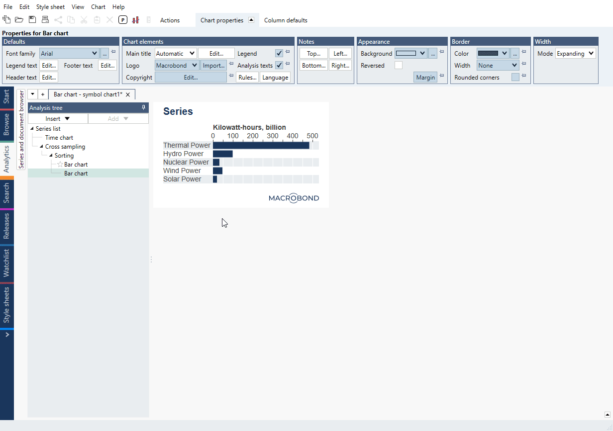
It shows proportions of two series. With Cross sampling we have created mini pie charts from each of energy-series and a total series.
Simple mini pie charts showing percentage on a scale 0-100.
We have created a list with series and used Cross sampling to compare last value with the one from 10 year ago. Additionally, there’s a column with value for difference. We applied colors based on Rules to it.