
|
Meghna Shah Macro Strategist & Chief Economist Macrobond |
Rate cycles seem peakish – though forward guidance from the central bankers at the Federal Reserve’s Jackson Hole symposium were testament to conveying “data dependency”: they’ll be monitoring how economic data will evolve and be revised, and thus keeping rate optionality open. Inflation remains the dominant factor driving policy stances, but these stances vary by country.
Recently, China cut its central bank’s reserve ratio requirement by 25 basis points following dovish data releases. By contrast, last week the European Central Bank raised rates by 25 basis points to curb inflationary pressures. The ECB signaled (and the market assumes) this was likely the end of the rate-tightening cycle, but again made reference to data dependency, theoretically keeping the door open for another hike.
As we begin a policy-heavy week – with the Fed, Bank of England and Bank of Japan announcing rate decisions between September 20 and 22 – how have economic data in these countries evolved?
Data releases and market positioning point towards a September pause from the Fed, a 25-basis-point hike by the Bank of England, and a further relaxation in Japan’s yield curve control policy.
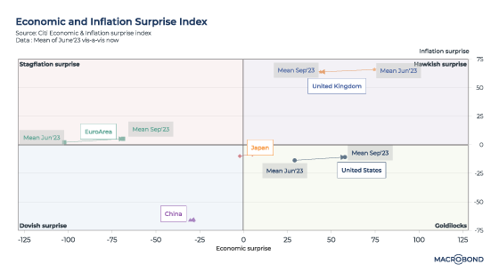
The following chart looks at “surprise” indices from Citigroup that track whether economic or inflation data releases are beating or trailing expectations.1 A broad classification for countries can have data indicating: “stagflation surprise,” “hawkish surprise,” “dovish surprise” or “Goldilocks” scenario:

Over the last three months, the US has seen an increased number of upside economic surprises, as has Japan. (Both nations are now in “Goldilocks.”) The UK has had markedly fewer hawkish surprises. China’s data remained dovish.

United States
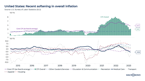
A weaker US labour market is not a concern yet. Non-farm payrolls rose by 187,000 in August. JOLTS (Job Opening and Labor Turnover Survey) data has held up, with the seasonally adjusted job openings rate at 5.3 percent.
Core inflation has remained sticky. The core consumer price index (CPI) inched up 0.3 percent month on month, and core headline inflation was 4.3 percent for August. Energy had been pulling down inflation prints, but with higher crude prices, there could be an upward push ahead. The 2 percent CPI target remains far away.
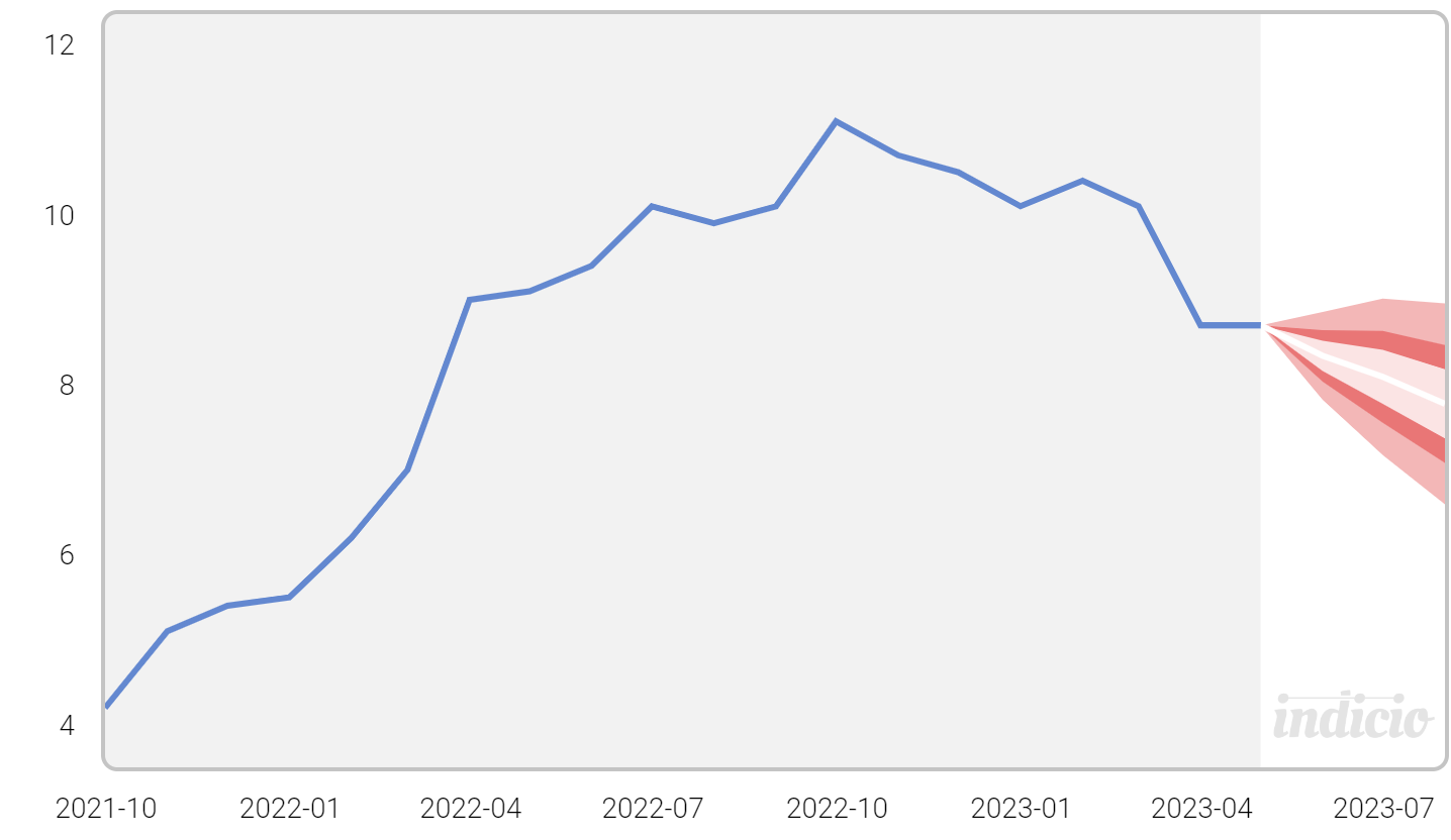
As 2023 progressed, the Fed “pivot” that was widely anticipated was deferred further into the future. As the next chart shows, the futures market currently suggests that the Fed will “pause” this week, hike by another 25 basis points before the end of the year, and not start cutting until the second half of 2024.

United Kingdom
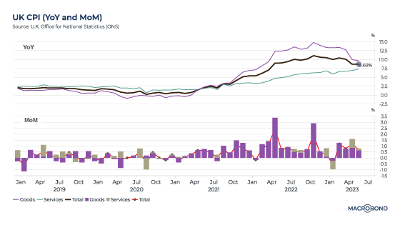
Inflation remains relatively high in Britain versus other economies: CPI stood at 6.8 percent for July. The labour market is losing steam, with unemployment climbing to 4.3 percent – the highest rate since 2021 -- though cost-of-living pressures are easing as wage growth catches up with inflation.
This stubborn wage growth – a median of 6.7 percent, on a three-month moving average – could well push core inflation higher and keep it above the 2 percent target. The next chart shows how wage increases are distributed across Britain, with London trailing other regions.

Japan
The Bank of Japan tweaked policy in July, allowing a greater range of government bond yield tolerance. This was followed by positive economic data surprises: stronger purchasing managers index prints (services PMI was 54.3), higher services inflation (which breached 2 percent), the highest pay increases in 30 years (an increase of about 4 percent announced by the government during labour negotiations) and the USD/JPY exchange rate reaching levels that last led to a Bank of Japan intervention in 2022.
Most data points suggest a gradual move towards policy normalisation from the current ultra-accommodative policies; relaxing the yield curve control cap further might well be considered.
1 Citi Inflation Surprise Indices are quantitative measures of inflation releases relative to market expectations. A positive reading of the Inflation Surprise Index suggests that inflation has on balance been higher than expected in recent history.
Citi Economic Surprise Indices are objective and quantitative measures of economic news. A positive reading of the Economic Surprise Index suggests that economic releases have on balance been beating consensus.


.svg)


%20employment%20to%20population%20ratios.svg)

.svg)
.svg)


.svg)