Macrobond has partnered with one of the leading Content Management System firms to simplify the publishing workflow for users of both tools.
Through a simple configuration in Brightspot, your publishing teams can browse your Macrobond document library and import charts directly into Brightspot. This avoids the manual steps needed to send each other files over email, simplifying workflow, adhering to versioning and permissions to ultimately get your content out to consumers quickly.
Contact your account manager if you are an existing Brightspot and Macrobond user and would like to access your Macrobond content directly.
In Brightspot, simply search for your Macrobond assets in the search bar. Narrow down the search by using the filters on the left. Then click on the link to take you to the asset directly in your publishing process.
Chart Output API
We have introduced a new endpoint in Chart Server API called CalculatePath. It returns both the data and the settings’ data powering your chart. This response will facilitate the integration of the documents you initially created in Macrobond into other systems, should you need to take the data somewhere else.
CalculatePath works in a similar fashion to RenderPath whereby the request expects to receive a path towards an .mbnd document and a presentation string (optional) in case you have multiple charts in your documents.
The API call will return a json file containing chart settings alongside observation dates and values for each component of your charts.
Screenshot of overall document settings:
Screenshot of truncated observation values
Note: This new endpoint is not bundled into the Chart Server API current version, as it requires further licensing.
These notes support user with deeper and more specific information on the features and updates in the release. Once read, the user should have the knowledge required to understand the new features or updates and know how to best use them.
In-App Inter-Company Document Sharing
Would you like the ability to share your documents with your clients in Macrobond? If your client is also a Macrobond user, then you can now share your work with them directly while adhering to your security requirements and retaining your IP.
This feature provides a richer, deeper and simpler content sharing experience for both Macrobond producers and consumers. It enables you to collaborate with your peers and clients in Macrobond just as you do today with your internal colleagues.
You can now create a shared read only repository and collaborate directly with your peers and clients. If you would like to collaborate on a document, simply save it to your own library and edit it directly.
Once set up, users will see a new repository in the Macrobond application:
This feature is now available upon request. Please contact your account manager to enable it and start sharing!
Animated Charts in PowerPoint
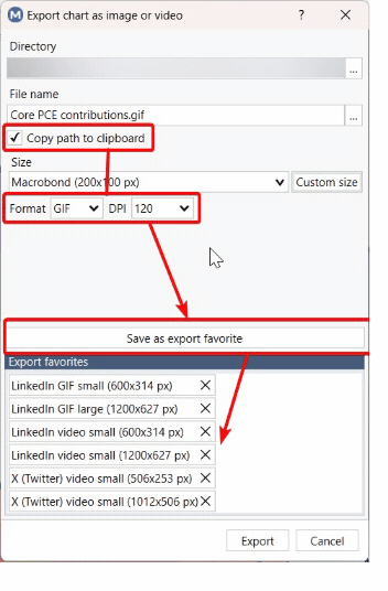
Following the recent hype around animated charts to support your analysis and storytelling in the Macrobond application, we are taking it one step further by allowing you to export these animated charts directly into Microsoft PowerPoint or Word.
We now support the export of the documents you have created in the application as videos, not only images: two formats are currently supported, GIF or video.
Tick the “copy path to clipboard” box and paste the item in PowerPoint or Word, without having to browse your local folders to find the video.
Relative Revision History
Have you always wanted to automatically and dynamically overlay the latest version of a time series with its previous versions? This is now possible in the Macrobond application. To date, you could have been requesting the revision number nth for every observation of a time series or a particular vintage as of a specific point in time. But you could not query the “version before last” vintage.
We have introduced in your document builder this relative method that supplements the hardcoded vintage date:
Three different methods are now available to set relative vintages.
Relative to:
The most recent revision: {now, +/- # observations}
A specific series vintage: {vintage date, +/- # observations}
The document vintage date: {doc, +/- # observations}
For the last two expressions, the relative number of observations can be positive, referring to next vintages.
LinkedIn Posting
Sharing your insights in your digital world?
We have now made this super easy with various options to copy or export your documents.
Copy: copy a Macrobond embedded object to the clipboard
Copy Special: choose the format you desire and then copy to the clipboard. This is where you can also set your favorite formats.
Copy special favorites: find your set favorites here from the previous step
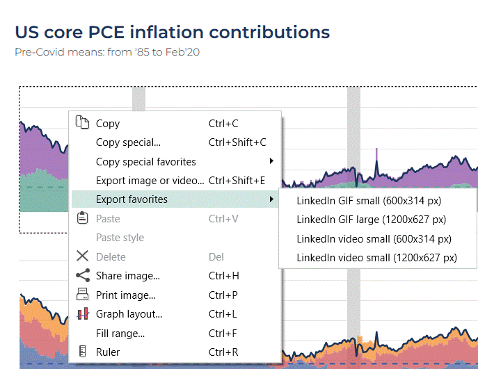
Export an image or video: chose your settings and save to your local file. This is where you can also set your favorite formats.
Export favorites: find your set favorites here from the previous step
We’ve enhanced the "Send to LinkedIn" feature in the File menu too:
Increased the character limit to 3,000.
Added an additional format option for posting animated charts in GIF or video formats (Note that LinkedIn has a limitation of 20 seconds for animations).
Introduced an option to send your post as a draft, allowing you to preview and edit prior to posting.
For those of you who prefer creating and tailoring your posts directly in the LinkedIn web browser, we’ve also implemented new settings, saving you time in the content creation process.
You can now predefine your favorite copy or export formats, whether it is for static images or animated gif or videos. They will be accessible in your clipboard in one click, and all you need to do is paste them directly into your post.
The preconfigured format options for LinkedIn and X (Twitter) are now set so you can use them directly.
Chart images
For static images, you can use the “copy special” feature, and define your favorite format which you can then save (and later rename by double-clicking).
Animated charts, with GIF or video format
Contrary to images which can be stored in a clipboard, GIF and video formats require a file to be stored locally.
For such formats, you should use the “Export image or video” option. By creating a favorite template, the process is now faster for any future item as you can access the export option directly in the right-click context menu.
We recommend ticking the “copy path to clipboard” box, so that you don’t have to locate and find the actual file when creating your post.
Once created, the “export favorite” menu will appear when you right-click on a chart. Select it and paste your chart in the LinkedIn post (either by pasting a GIF from the clipboard, or by importing a locally saved video).
Note: Only available to Core and Data+ users.
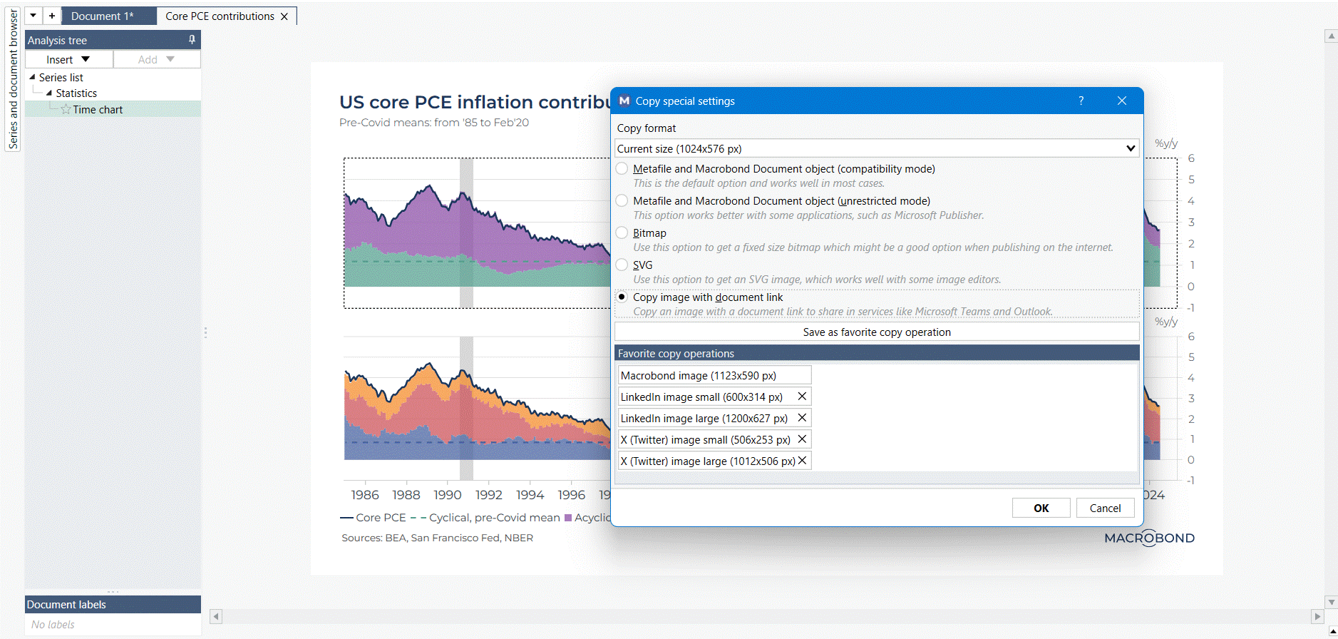
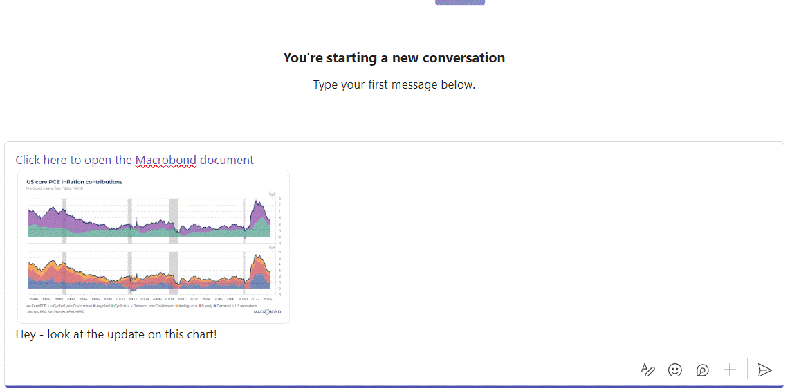
Sharing a chart and its link
Do you spend a lot of time on Teams calls discussing your research and exchanging ideas on Macrobond charts? Then this feature will make internal collaboration with your team easier!
In one click you can now copy the picture of a chart together with its hyperlink and paste it in an email or into our favorite communication platform, like Teams or Slack. Any colleague also using Macrobond will be able to open the file instantly.
Using the “Copy Special feature”, you will now see the option “Copy image with document link”.
Side notes:
The document needs to be saved in a folder for this feature to be available.
If you plan to use this feature frequently, you can also save it as a “favorite copy operation”.
Additional graph types available for animated charts
If you fond of the animated charts feature, we now have extended this feature to all graph types with the exception Bar Charts and Pie Charts.
For example, the animation on the chart below is broken down to first display individually the movements of the three main CPI components: Housing, Food & Beverages, and Transport. The other components are then animated together, and to finish the headline CPI – displayed as line – comes animated.
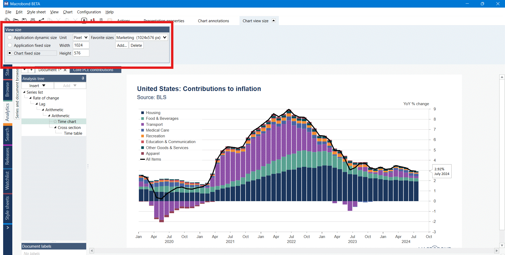
Chart sizes stored within a document
To facilitate the preparation and maintenance of your publications, you will now be able to store individual chart sizes within a document.
Three settings are now available:
Application dynamic size: using the size that maximizes the space available on the charting area
Application fixed size: applies a unique chart size across all documents currently opened in Analytics
Chart fixed size: this new setting will store the chart size within the document. Anytime you open the file, the size saved will be applied on the chart.
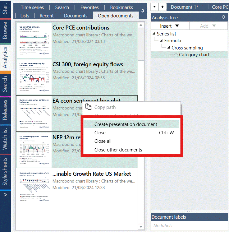
Additional options with open documents in Analytics
We’ve added several options to improve the user experience when working with multiple open documents in Analytics.
In the “Open Documents” tab, you can now select multiple Macrobond documents, and:
Close
Close all other
Create Presentation Document, which will include all the charts previewed and selected in the list in one presentation document.
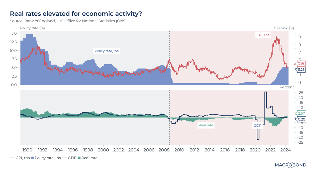
UK policy rate decision scheduled for 20 June will be influenced by two upcoming inflation reports. Current consensus and market pricing indicate a 60% probability of a rate cut. However, this decision remains a close call, contingent on the data from these two inflations releases.
Meghna Shah
Macro Strategist & Chief Economist
Macrobond
All opinions expressed in this content are those of the contributor(s) and do not reflect the views of Macrobond Financial AB. All written and electronic communication from Macrobond Financial AB is for information or marketing purposes and does not qualify as substantive research.
Macro backdrop
Recent macroeconomic data for the UK economy have shown some softening in the labour market with the unemployment rate rising to 4.3% in Q1 2024 from 3.8% in October-December 2023. Wage growth remains elevated at 5.9%, which does not provide sufficient comfort for a rate easing.
Real rates turned positive starting in October 2023 and economic activity has since decelerated sharply, with Q4 2023 GDP contracting by 0.2% year-over-year.
Focus of the Week
The UK CPI release this week is likely to show a sharp deceleration in the headline figure, bringing it closer to the expected target. This would result in even higher real rates, potentially further dragging on sentiment, as has been observed since the Global Financial Crisis.
Inflation Drivers for April’s release
The April CPI is forecasted to be around 2.2%, down from 3.2% in March, with the consensus at 2.1%. A significant factor in this sharp decline is the announced reduction in the Ofgem price cap for energy prices. This 12% reduction in the cap is expected to lower both the electricity and gas price indices.
A gradual slowdown in inflationary pressures is also evident from high-frequency debit and credit card spending, which are key indicators of economic sentiment and inflation trends.
'Delayable' spending currently at ~75 (with pre-COVID levels set at 100) is significantly lower than the average of 88 seen in 2021 and 2022, even after accounting for seasonality. The higher levels in 2021 and 2022 reflected greater confidence in the economic situation, supporting discretionary spending and contributing to demand-led inflation.
Conversely, 'staples' spending had remained elevated in 2021 and 2022, indicating sustained cost pressures, particularly in food and energy prices. The current level at 113 can also be an indicator of ‘staples’ impinging on ‘delayable’ spends amidst the economic slowdown.
Indicio model forecasting for CPI
Taking into account multiple hard data points, soft survey lead indicators, and high-frequency alternative data related to wage growth, consumer confidence, and cost price pressures, we run several multivariate models on the underlying data to forecast CPI. The individual estimates from the various models range from 1.65% to 3.5%.
We consider the top three models evaluated for having the lowest RMSE (Root Mean Square Error) measurements. An accuracy-based weighting assigned to these top three models predicts a CPI release of 2.2% for April 2024. The sharp drop in Ofgem prices helps bring the headline CPI closer to the expected target. However, the reversal of base effects in H2 2024 keeps the market skeptical. This skepticism is reflected in the yield curve at the shorter end where 1-year and 2-year yields, though inverted, remain elevated.
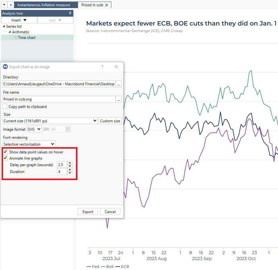
Charts exported from the Application as SVG format can now be animated. Two features are introduced in this new version:
Data popup labels: allowing you to hover your mouse over a data point and see the date and value as popup. The label style can be formatted in the stylesheet editor.
Animation: you can choose the delay between several line graphs and the duration of the animation. In this version, animation only works for line graphs.
This feature works when SVG images are in a browser, and intended to be used when published on the web, typically through some Content Management System.
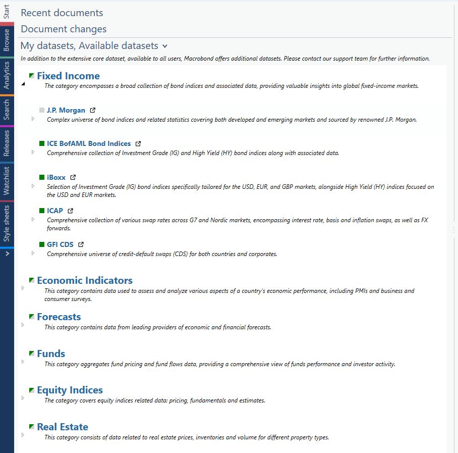
Additions to the Start Page
List of available and enabled datasets in your license
The Start page of the Application has been revamped to facilitate the management of the datasets you subscribe to, and give you access to the complete list of additional content available.
A color coded indication has been implemented to indicate your level of subscription:
Green: you have a full access to the datasets
Grey: you do not subscribe to this content yet
Green & Grey: you partially subscribe to the dataset listed
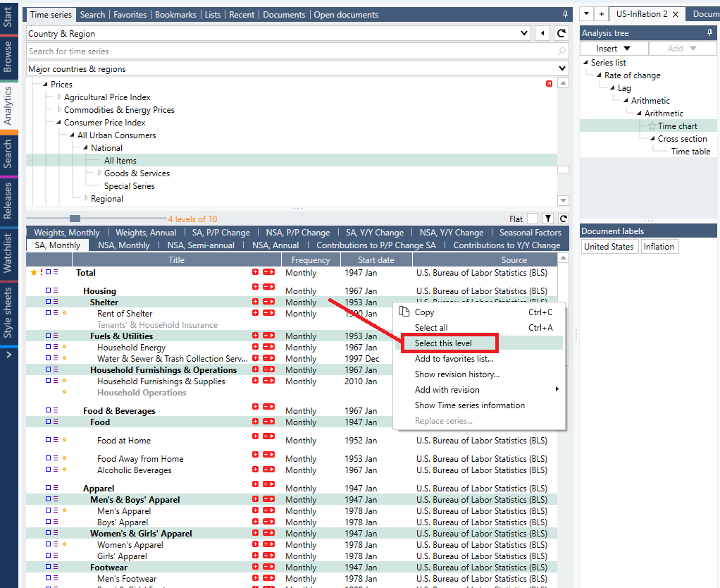
Enhanced data navigation for series with components, such as CPI
Ability to select all items belonging to a specific level of classification
When possible, Macrobond tries to present datasets with a relevant indentation structure, allowing users to identify easily totals, sub-totals, and components.
Working with datasets having a high level of granularity often means having to manipulate a large set of variables, belonging to different levels of granularity. As an example, to build a diffusion index using the deepest level of CPI components, one needs to manually select dozens of variables while being careful about the level structure.
To simplify such workflow, we’ve introduced a selection shortcut: with any dataset displayed with an indentation structure, right-clicking on a specific series now allows you to apply “select this level”, which will result in highlighting all series belonging to the corresponding level of details.
All in all, in one click you can now pick all components belonging to a specific level of the data structure.
CPI releases are a good example to illustrate this feature: in the screenshot below, using the “select this level” option, all series belonging to the level 2 of the US CPI release are now marked and ready to be added to a document.
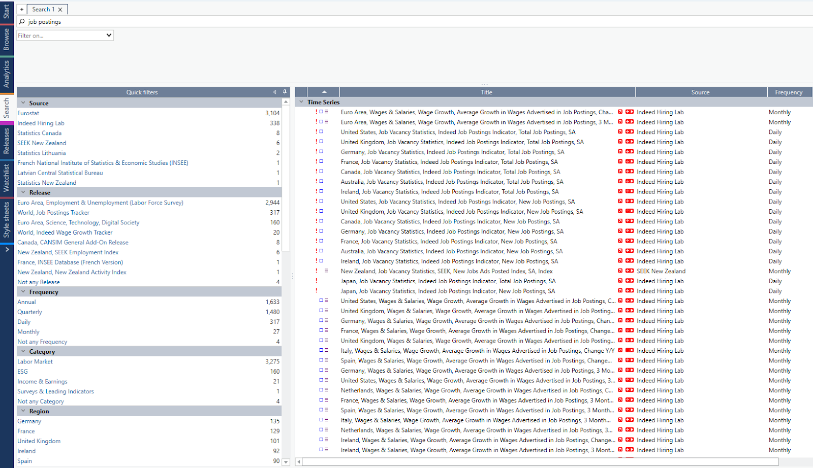
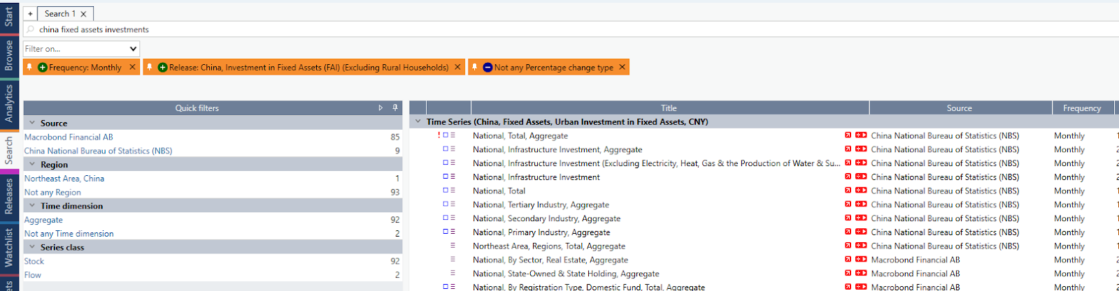
Improvements in the Search activity
Quick filters based on attributes
To facilitate filtering out results in the Search activity, a list of attributes based on the current search query is now displayed on a left pane, together with the number of series available for each attribute.
Selecting an attribute will add it as filter for your search query, highlighting it in orange on the top. You can then easily remove it, or turn it as permanent filter if you want to combine attributes filtering together.
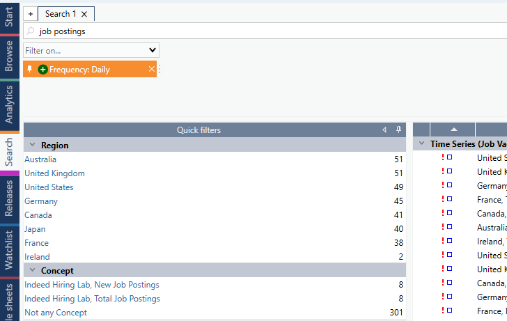
Filtering out attributes
As part of this new feature, you can also apply filters to exclude certain types of attributes from the search query. This can be performed by not selecting any attribute value and then choosing this to be an "exclusion filter" by pressing the "-" button in the filter setting.
For instance, in the picture below we excluded any series having a “percentage change” unit as an attribute.
Using the new search features in the Analytics activity
For users who prefer staying within the Analytics activity, we incorporated the features above in Analytics.
Keep in mind that you can always adjust the width of each section (data navigation, analysis tree, and charting) on the fly, making it easier to focus on each panel.
Library Management
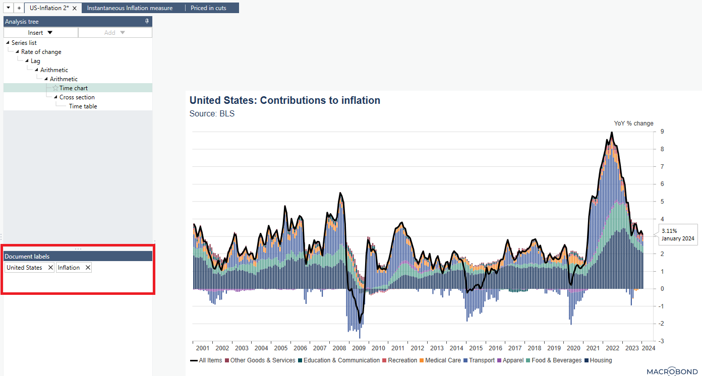
Document labels
To make the management of your chart libraries smoother, we are introducing the concept of “document labels”.
Labels can be set directly in the document, below the Analysis tree.
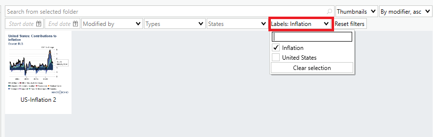
Filtering your library by labels
Labels can then be used when searching for documents in your chart libraries.
On a side note, we’ve also added a few more filtering options:
Start / end date: allowing you to look for documents having been modified within a specific date range
Modified by: filtering by user who last modified a document
Types: allowing you to display either Macrobond documents or presentation documents
States: filtering for documents including / excluding discontinued series. This can become handy when you want to list documents that need updates as some series got discontinued.
Tracking documents through labels
The concept of “labels” is also introduced is the monitoring / subscription tool we released in version 1.26.
When setting your subscription rules for a given folder, you can now decide to track and be notified when documents containing specific labels are created, modified or removed from a folder. This way, you can now be easily alerted when colleagues create charts on a given topic of interest.
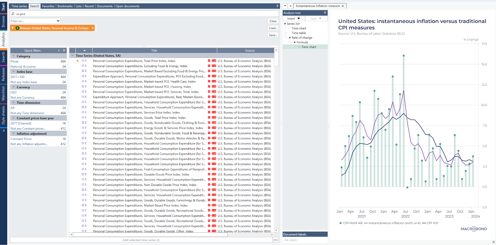
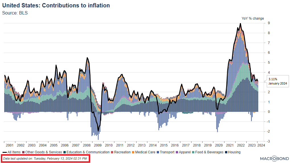
New dynamic text property
Highlighting as a note the date at which series were last updated
There is now a new dynamic text property that you can use in any chart text, displaying the date at which series were last updated. This is particularly useful for charts displayed in publications where you want to indicate the last update.
In the chart below, we displayed it as a foot note in the copyright text.
It is available under the “Document Properties” grouping and called DocumentLastDataRevision.
In the chart below, we displayed it as a foot note in the copyright text.
Corporate Templates
Defining a common variable and applying it to multiple settings at once
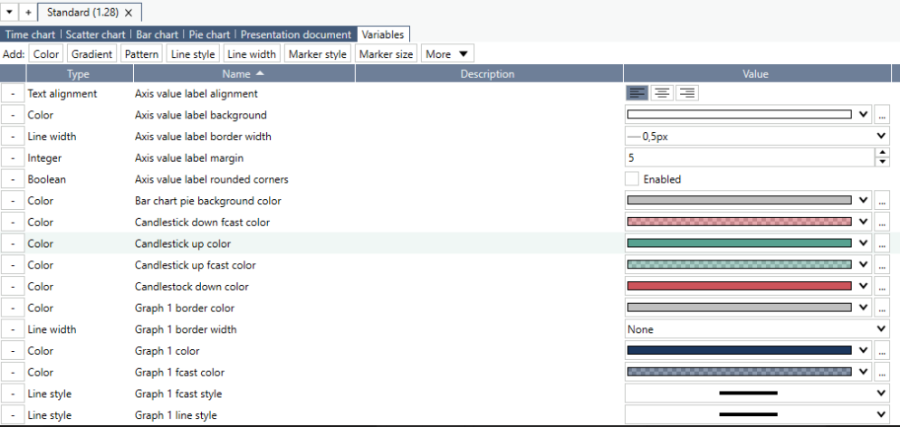
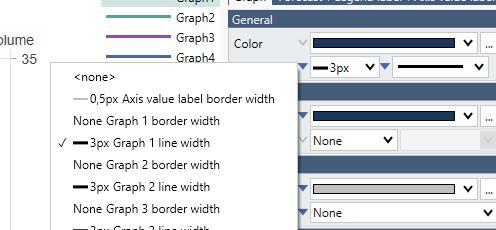
We’ve added new features to the Stylesheet activity, simplifying the creation and later adjustments of corporate templates.
This new feature introduces the concept of “variables”. A “variable” is a predefined setting that can be mapped to various locations on a stylesheet template. Changing the variable setting will then be reflected to all locations at once, making it easier to do adjustments on the fly.
An example could be a unique color code which should be applied for several settings of a template. Having it set as a “variable” allows you to adjust it with one click for its various locations (instead of changing it one by one).
A setting is associated to a variable by using the small downward pointing triangle to the left of the setting. A filled triangle means that a variable is selected for that setting. By clicking it you can see or select the variable of choice.
To simplify the creation of new corporate templates, Macrobond built a logical mapping of variables in its “standard” stylesheet that users can leverage and adjust to their own criteria.
Main menu adjustment
New “Configuration” menu to access your settings and notifications
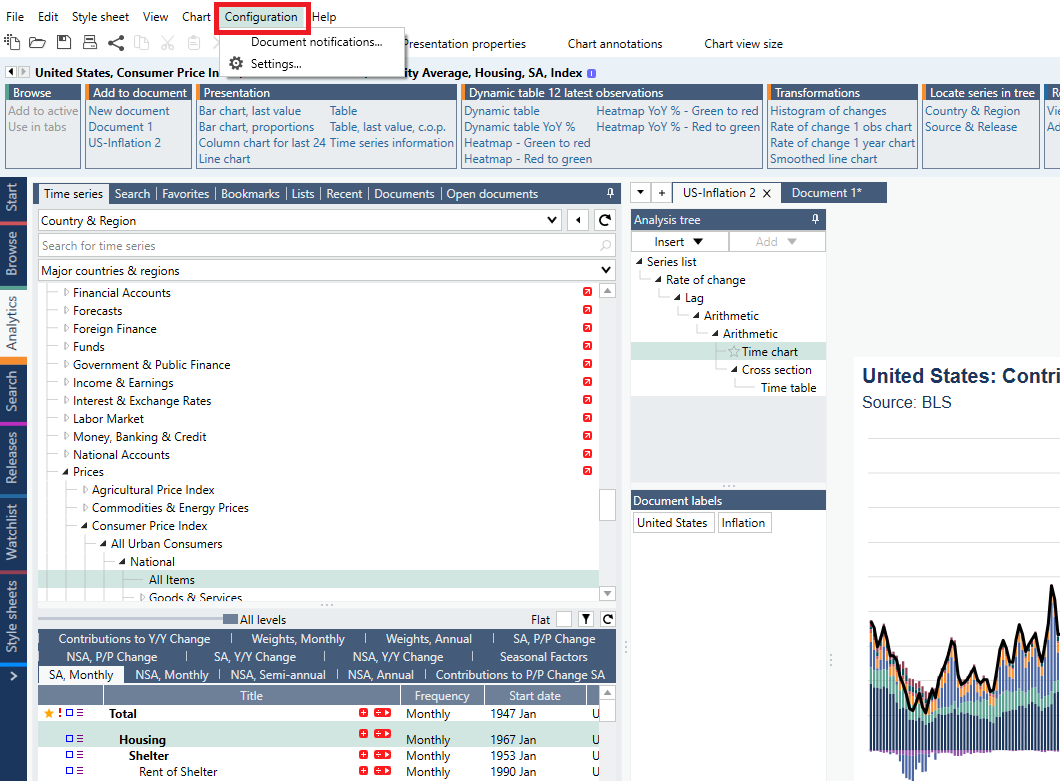
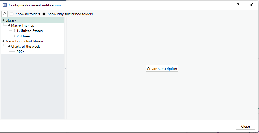
We’ve a slight adjustment to the menu tabs available on the top of the Macrobond Application. To simplify the access to your application settings and document notifications, we’ve grouped them under a new tab named “Configuration”.
Document notifications can be managed via a new dedicated dialog menu, allowing you to view / edit your current subscriptions (i.e., the folders you are currently tracking for notifications) as well as creating new ones.
Other changes
You can now delete a complete branch of analyses in the Analysis tree by using the new command on the context menu "Delete with children".
In the My series Activity, where you manage in-house series, there is now information about when a series was last modified and by whom. This information is also available as a metadata attribute called LastModifiedBy that can be use in dynamic text in charts. This attribute can be provided by Web API Series providers.
We now enforce the rule that series identifiers must be in lower case when provided via a Web API Series provider. This has always been the rule, but now there is an error if it is not followed.
Meghna Shah
Macro Strategist & Chief Economist
Macrobond
All opinions expressed in this content are those of the contributor(s) and do not reflect the views of Macrobond Financial AB. All written and electronic communication from Macrobond Financial AB is for information or marketing purposes and does not qualify as substantive research.
The Federal Reserve's latest meeting minutes underscored a cautious approach towards reducing interest rates too quickly, especially given the persisting tightness in the labour market and the yet-to-be-confirmed indications that inflation is on a consistent downward trajectory. This careful stance seems well justified when examining the internals of inflation and their alignment with the Fed's perspective.
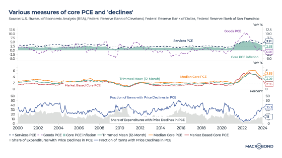
Delving into inflation internals
By leveraging insights from Indicio and considering various factors, the US Core Personal Consumption Expenditures (PCE) Price Index for January 2024 is projected at 2.85%, slightly down from 2.9% in December 2023. However, the month-over-month increase is estimated at around 0.4%, higher than the 0.2% rise observed in December. This nuanced analysis sheds light on the intricate dynamics influencing inflation.
Various measures of core PCE and its composition
In December, Goods PCE was almost at 0, while Services PCE surged to 3.91%, pushing the overall core PCE to 2.9%. Other measures, such as the Cleveland Fed median inflation at 3.8%, the Trimmed mean 12-month at 3.3%, and the BEA’s market-based PCE at 2.95%, all hover above the Fed's 2% target. This suggests that, despite the slight decline, inflation pressures remain.
Expenditure and price decline dynamics
The discrepancy between the share of expenditure with price declines in PCE at 15% and the fraction of declining items in PCE at 35% highlights the stickiness in core inflation and the challenges in steering it towards the target.
Cyclicality of inflation trends
The disparity between cyclical inflation at 5.4% and non-cyclical inflation at 1.5% in December underscores the dominant contribution of recent cyclical factors to the core PCE of 2.9%. Factors such as robust growth momentum, tight labour market conditions, and resilient consumer spending have exacerbated the cyclical component of inflation.
Supply and demand driven inflation factors
Initially spurred by a supply shock, the inflationary cycle quickly transitioned into a demand-driven inflation phase, fuelled by substantial fiscal spending post-Covid. As supply chain disruptions began to ease, it became evident that demand-driven factors, evident in ‘Services’ inflation would need to be moderated to achieve the Fed's 2% inflation target.
Core PCE forecast for January 2024
Using a variety of indicators related to economic growth, labour market dynamics, earnings, government spending and the real estate sector, Indicio employs multivariate models to forecast Core PCE. Adjustments and transformations facilitated by Indicio allow for rapid estimation through multiple models. The analysis points to earnings growth as a significant driver of Core PCE, with month-on-month momentum expected to rise to 0.4% from the previous month's 0.2%. The forecasted year-over-year core PCE of 2.85% for January remains elevated, indicating ongoing inflationary pressures.
In conclusion, the Fed’s caution in adjusting interest rates is well-founded, with inflation internals suggesting a complex interplay of factors that require careful monitoring and management. The analysis underscores the challenges in achieving and maintaining the Fed's inflation target, highlighting the need for a nuanced approach to monetary policy.
Our economist examined price pressures in Europe’s economic engine.
Meghna Shah
Macro Strategist & Chief Economist
Macrobond
All opinions expressed in this content are those of the contributor(s) and do not reflect the views of Macrobond Financial AB. All written and electronic communication from Macrobond Financial AB is for information or marketing purposes and does not qualify as substantive research.
The German economy has faced headwinds through 2023, with a backdrop of sustained inflation and higher borrowing costs. The market is expecting a reversal of this trend, with steadily decelerating inflation making room for a more accommodative stance by the European Central Bank in 2024 and beyond.
To generate a prediction for German inflation figures that are due on Nov. 29, we used our partnership with Indicio Technologies. We deployed univariate and multivariate forecasting techniques that incorporated food, fuel and core inflation category indicators.
We also chose consumer confidence as an input parameter to gauge the underlying demand conditions – this indicator has been waning amid Germany’s economic challenges.
Our model calls for the consumer price index to rise 3.7 percent year-on-year for November, slowing slightly from the 3.8 percent pace in October.
To consider the backdrop to our forecast, the following charts analyse the components that have been contributing to inflation.
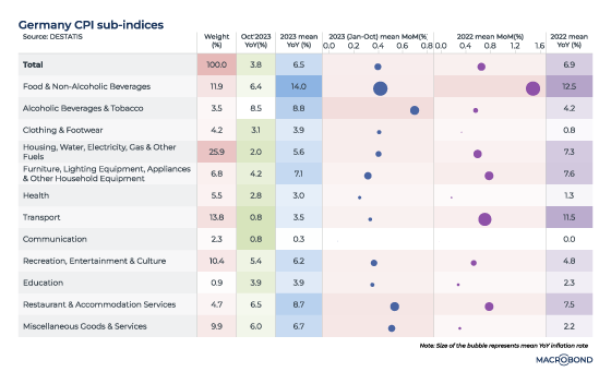
The inflation story so far
Our first visualisation plots inflation trends in the various CPI sub-indices, comparing October year-on-year figures to the 2023 and 2022 year-on-year averages. The table’s wider columns track month-on-month averages for the various categories; bubble size represents the average year-on-year pace.
Diverse supply- and demand-side factors have impacted CPI trends for Germany over the past two years. Cost-push pressures – primarily in food and fuel – surged after Russia’s invasion of Ukraine.
Since then, inflation has cooled off swiftly, helped by a decline in wholesale energy prices and government policies that aimed to shield consumers.
The contribution to headline inflation from major categories, such as the housing and utilities bucket (with a weighting of 25.9 percent in the CPI) and transport (a 13.8 percent weighting) has come off sharply. October inflation for these two segments slowed to 2 percent and 0.8 percent respectively.
Food inflation is lingering, however. Disruption in food supply chains is being accentuated by the tightness in the labour market, keeping costs elevated for food processing, restaurants and supermarkets. The “food & non-alcoholic beverages” and “restaurant & accommodation services” buckets are among categories with the worst inflation, both in October and for 2023 as a whole; the food and drink category’s bubble size and rapid month-on-month advance is also notable in 2022.
The evolving macro dynamics have seen the transmission of higher input costs into services, as our next chart shows -- breaking down the respective contribution of goods and services to headline inflation. The elevated goods inflation of 2022, coupled with a rise in wages, has resulted in sticky core inflation.
It’s worth noting how the green “services” band has gradually widened. At its October 2022 peak, goods inflation contributed 7 percentage points to inflation, while services contributed just 1.8 percent. But the October 2023 print indicates that services contributed 2 percentage points to inflation – exceeding the 1.8 percent contribution from goods.
That’s important because services inflation tends to be sticky, and the deceleration towards target is likely to be slower.
Watching the markets: the CPI vs. two-year yields
The International Monetary Fund is forecasting that German CPI will slow to 3.5 percent in 2024 and 2.2 percent in 2025 – still above the central bank’s 2 percent target.
As for the markets, Euro STR futures are pricing in the first ECB rate cut by the second quarter of next year. In bonds, one-year German debt started out-yielding its two-year equivalent almost a year ago, as our chart shows; i.e., the inversion began right around the time that inflation peaked.
The inverted yield-curve corridor, in grey, indicates that even lower interest rates (tracking lower expected inflation) are expected two years down the line.
We have also added, in bold, the 3.7 percent November CPI forecast that we generated with Indicio -- flanked by various confidence intervals. Monetary policy transmission is effective with lags and getting to target inflation can take longer.
Our economist examines Europe’s slowing but persistent inflationary pressures.
Meghna Shah
Macro Strategist & Chief Economist
Macrobond
All opinions expressed in this content are those of the contributor(s) and do not reflect the views of Macrobond Financial AB. All written and electronic communication from Macrobond Financial AB is for information or marketing purposes and does not qualify as substantive research.
The European Central Bank is meeting this week and an interest-rate pause is priced into the markets. This follows the 25-basis-point hike in September, when economists were split on whether the “pause” would kick in.
The ECB has tightened by a cumulative 450 basis points in this cycle. It’s aiming to keep policy at restrictive levels for long enough to ensure that inflation returns to its 2 percent medium-term target in a timely manner.
An outlook for slower growth
The ECB’s last hike was at odds with its peers. The Federal Reserve and Bank of England both “paused” in September to gauge how their previous tightening was being transmitted into the economy. (Both of those central banks also adopted a “data-dependent” stance, which will see them assess how inflation pans out before making more hikes.)
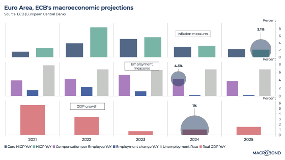
The ECB also lowered gross domestic product projections for 2023, 2024 and 2025, as the next chart shows. It also includes the central bank's latest projections for different inflation measures, as well as employment metrics.
It’s particularly notable that the ECB cut its 2024 GDP estimate by 50 basis points to 1 percent. The central bank projects that it will likely (almost) reach its inflation target by the end of 2025.
One central bank, many countries
The ECB faces a dilemma not shared by its UK and US peers; it makes policy for 20 different nations in the eurozone, and some of these countries are experiencing different economic dynamics. Spain, for example, remains supported by its services sector.
However, steep tightening, elevated policy rates and the increased cost of borrowing are leading to a gradual growth deceleration overall – and this is especially evident in the industrial sector. Germany and France are seeing a sharp contraction in manufacturing sentiment.
The risk of a sharp slowdown in the eurozone has increased substantially. The latest business surveys are already pointing to contraction in both services and manufacturing activity, as the next chart shows; the EU purchasing managers indices (PMIs) remain below 50.
Inflation – and, more so, growth – are both surprising on the downside
The next chart looks at “surprise” indices from Citigroup that track whether economic or inflation data releases in the eurozone are beating or trailing expectations.
In all cases, the arrows are pointing down. But the economic surprise index is at minus 54, compared with minus 4 for its inflation equivalent.
Our next chart measures the cost of borrowing, as measured by the ECB. As the second pane indicates, after many years of ultra-low rates, borrowing costs have moved swiftly higher for both households (financing their home purchases at 3.85 percent) and non-financial corporations (which can borrow at about 5 percent).
The top pane compares long-term to short-term borrowing costs. This indicator is currently steeply inverted (negative 107bps compared to a 20 year average of positive 19bps); this suggests that near-term investments will likely continue to see a drag.
Governments are also likely to tighten the fiscal strings amid a backdrop of their own growing interest cost burden. This, too, may impact consumption demand ahead.
These trends add up to a likely struggle for the eurozone’s economy over the next 12 to 18 months.
Meanwhile, the job market seems to be staying tight
Pressures on core inflation are supported by continued tight labour markets and positive wage growth. To illustrate this, the next visualisation (a scatter chart) is a Phillips curve for the EU, tracking the relationship between unemployment and inflation.
The curve was relatively flat (with a slope of 0.19 for the mean) from 2000-2020. The mean unemployment rate was 9.3 percent and inflation was 1.8 percent. But the Covid and post-Covid era has seen a much steeper slope (0.76), with mean unemployment rate at 6.7 percent and inflation at 5.1 percent.
The ECB’s own projections for wage growth (4.3 percent in 2024) and the unemployment rate (still 6.7%, staying well below that 2000-2020 average) indicate that the labour market will weaken only gradually. That limits meaningful downslide in near-term core inflation: the ECB’s projection stands at 2.9 percent for 2024.
Money supply and energy prices
The ECB’s cumulative interest-rate and balance-sheet tightening is shrinking M3 growth – measure of the broad money supply in economy.
M3 growth has broadly led inflation trends, with the highest correlation at a 22-month lag observed over the last two decades.
Indeed, inflation has come down a long way from the 10 percent levels shown in this chart. Falling energy prices and favourable base effects account for much of this slowdown; energy prices peaked in October 2022.
However, the next leg of deceleration may be slower given sticky core inflation. Services inflation can tend to keep overall inflation sticky for a longer period of time, and that has been factored into the consensus expectations.
The ECB’s policy decision – and beyond: watch for a longer pause
Given that the ECB expects inflation to stay above its target through 2024 amidst those tight labour markets, the central bank may choose to keep policy rates restrictive enough to contain demand-led inflationary pressures – even as growth falters.
So while policy rates may have reached their peak for the current cycle, an extended duration of these elevated rates may be the ECB’s indirect policy tool to manage inflation expectations. Rising long-term bond yields reflect the fact that the market’s rate-cut expectations have been pushed out towards the fourth quarter of 2024.
As John Major said about his own battle with inflation when he was Britain’s finance minister in 1989: “If it isn’t hurting, it isn’t working.”
Our economist Meghna Shah analyses the impacts of a Saudi supply disruption, utilising Indicio to model her forecast. The blog explores potential implications for emerging markets, which are known for being significant oil consumers, along with the trickle effect into inflation as the world struggles with escalating commodity prices.
Meghna Shah
Macro Strategist & Chief Economist
Macrobond
All opinions expressed in this content are those of the contributor(s) and do not reflect the views of Macrobond Financial AB. All written and electronic communication from Macrobond Financial AB is for information or marketing purposes and does not qualify as substantive research.
Hamas' assault on Israel came as a geopolitical shock. As the situation escalates, potentially drawing in other players in the Middle East, there are implications for crude-oil prices.
This blog examines the oil market’s geopolitical linkages and the potential for supply disruptions.
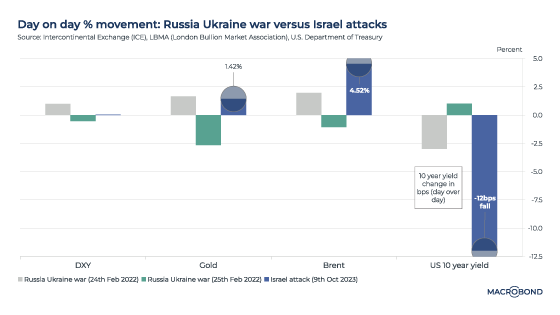
Early market reaction was stronger than Russia-Ukraine in 2022
The Monday after the attacks saw an immediate reaction in the market for commodities and safe-haven assets.
Crude-oil prices jumped by about 5 percent. Gold rose 1.5 percent. And US government bonds rose, with 10-year yields falling about 12 basis points. These sharp market movements give a glimpse of the uncertainty being priced into this conflict. As our first chart shows, these moves were stark when compared to the first two trading days after Russia invaded Ukraine last year. (To be sure, market reactions in other assets were relatively contained; the S&P 500 initially sold off, but quickly reversed).
Turning to the options market, there was a steep decline in the ratio of put volume versus call volume for the West Texas Intermediate (WTI) oil price, as the second panel of the next chart shows. This is indicative of upward price risks.
A put/call ratio below 1 implies there are more expectations of a price rally versus a drop. On Monday, the put/call ratio dipped sharply to about 0.4 from closer to 1.25 earlier.
The chart’s top panel charts the WTI price in 2023 and shows periods shaded in gray where the put/call ratio was below 1; broadly, these coincide with rising crude prices.
The importance of the Gulf producers
Israel and the Palestinian territories are not key oil producers, but many nations in the wider region are. The Middle East as a whole accounts for almost a third of global oil supply; Saudi Arabia accounts for about 12 percent and Iran about 4 percent. Iraq, the United Arab Emirates, Kuwait and Qatar are also significant producers.
The next chart tracks oil production by countries bordering the Persian Gulf over the years.
The bottom pane of the chart tracks the Brent crude price’s relationship to Middle East oil production as a percent of world supply. This is where we see the price impact of OPEC’s production cuts and increases: the move to pump more oil from late 2014 is clearly visible, as is the sustained period of low prices that followed. OPEC’s production cut in late 2022 can also be seen.
Downside risks to supply from Saudi Arabia and Iran
The Israel-Hamas war comes at a delicate time.
Prior to the attacks, Saudi Arabia signaled to Washington that it could boost production in 2024, if required, to keep oil price pressures in check – but also as part of a deal that could see a normalisation of Saudi diplomatic relations with Israel and greater defense cooperation with the US (according to the Wall Street Journal).
As the war reduces the probability of a Saudi rapprochement with Israel in the short term, it lessens the chances of such a 2024 supply increase.
There are also downside risks to Iranian production. Before Hamas’ attack, in mid-September, the US and Iran agreed to release prisoners in a move that was seen as de-escalating tensions and potentially allowing for a gradual rise in Iranian oil sales.
However, given Iran’s ties to Hamas, the conflict instead raises the possibility of tighter US sanctions on Iran.
The next chart is a different visualisation of the importance of Saudi and Iranian crude, which together account for about 16 percent of global supply. A month-on-month decline in combined Saudi and Iranian oil production in the past quickly translated into steeper month-on-month price changes and sharp volatility. The pandemic disruptions are most notable, but there are other month-on-month spikes of up to 25 percent.
Modeling price scenarios: USD 100-plus oil in 2024?
Crude prices are a function of several supply and demand dynamics.
Demand is driven by 1. overall economic growth; 2. growth potential in emerging markets, which are large oil consumers; 3. demographic and employment trends; 4. macroeconomic indicators, such as growth, inflation and exchange rates. (We’re currently looking at a world of slowing GDP growth, concern about oil demand in China and sticky inflation that is denting consumers’ purchasing power.)
Supply factors include: 1. different sources of oil becoming viable to produce at various price points; 2. technological advancements influencing substitute production; 3. weather patterns; 4. regulatory changes, especially environmental policy; and 5. geopolitical events.
Using Macrobond’s partnership with Indicio, we constructed forecasting models to help gauge broad Brent price trends for:
Status quo – no supply impact from the war; and
A scenario where oil supply is reduced
Our models‘ input parameters included broad macro indicators, such as world GDP growth; demand, i.e. oil consumption as released by OPEC; and oil production trends. Oil supply and year-on-year GDP growth estimates have the greatest influence on price trends.
All other things being equal, given a backdrop of slowing economic growth, Indicio’s weighted output from univariate and multivariate models predicts that Brent crude will slip toward USD 86 per barrel over the next year.
We then ran the scenario analysis for adverse geopolitical fallout from a continued war in Gaza.
If we factor in a 0.3 mbpd reduction in oil output from Saudi Arabia, we end up with a significantly higher oil price in a year’s time – closer to USD 103/barrel.
Our economist models healthy US employment using Indicio.
Meghna Shah
Macro Strategist & Chief Economist
Macrobond
All opinions expressed in this content are those of the contributor(s) and do not reflect the views of Macrobond Financial AB. All written and electronic communication from Macrobond Financial AB is for information or marketing purposes and does not qualify as substantive research.
The September non-farm payrolls report, a key data release watched by the Federal Reserve to gauge employment trends, is scheduled for release on Friday.
Using Macrobond’s partnership with Indicio Technologies, we were able to create a model for NFP. It suggests that September payrolls rose by 170,000 – only a marginal softening from the 187,000 print seen a month earlier.
Such models are built by seeking out the most explanatory variables available. So what is the data context for this healthy forecast?
Recent employment trends
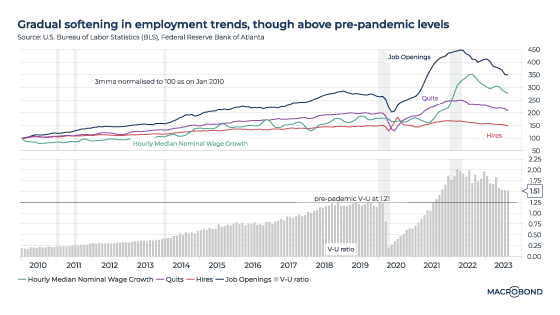
The August JOLTS (Job Openings and Labor Turnover Survey) data suggested that employment trends with Job openings (9.61 million), hires (5.857 million) and quits (3.64 million) remained well above pre-pandemic levels.
Median nominal wage growth was 5.5 percent on a three-month m
oving average basis, also supporting the resilient trend.
Importantly, as the second panel in the chart shows, the vacancies-to-unemployed ratio – indicative of job market tightness and demand-supply mismatch – was 1.51, higher than the January 2020 level of 1.21.
The tight labour market through 2023 has supported US consumer spending, keeping core price pressures intact.
The gradual nature of the labour market normalisation process is shown in the next chart, which tracks the three-month moving averages of these four variables over the past 13 years. Year-to-date openings, hires, and wage growth have decelerated since the peaks seen in 2022. However, true labour-market normalisation – with demand and supply closer to pre-pandemic levels – might still take one or two more quarters, once the transmission of rate tightening has materialised on overall economic demand.
This provided little respite for either consumers or the Fed and its 2 percent inflation target. This stickiness in core inflation – broadly representing demand in the economy – is coming on the back of the surge seen in post-pandemic wages and employment numbers.
As we wrote in our forecast about two weeks ago – and as the second panel of our updated chart shows – almost 30 percent of the items in the PCE are showing price declines. But only 13 percent of expenditures are experiencing price declines.
For now, both core PCE and employment trends remain very relevant given the Fed’s data-dependent stance.
These data points align with market expectations – shown in our final chart – that any rate-easing cycle seem unlikely before the second half of 2024.
Indicio’s automated forecasts are built using univariate and multivariate models, allowing you to combine different approaches to create a forecast that can potentially outperform any single model. For NFP, our models considered several employment-related indicators and data points related to monetary policy, inflation, consumer sentiment and more.
Our economist constructs a model that shows sticky price increases in the short term.
Meghna Shah
Macro Strategist & Chief Economist
Macrobond
All opinions expressed in this content are those of the contributor(s) and do not reflect the views of Macrobond Financial AB. All written and electronic communication from Macrobond Financial AB is for information or marketing purposes and does not qualify as substantive research.
Monetary policy reaction functions target stable prices, maximum employment and moderate long-term interest rates conducive to balanced growth-inflation dynamics. Policy rates and hence yield curves evolve in line with these macro determinants - largely CPI. The shorter end of the curve is reactive to policy rate driven liquidity function while the longer end encompasses medium to long term growth and fiscal dynamics. The 1 year yield closely depicts the CPI index, normalised to 100 as of January 2022.
The high(er) for long(er) narrative prevails as seen in rising yields, despite policy rates seeming peakish. The data dependency optionality seems prudent to read inflation-related high frequency indicators with caution amid rising cost-push factors and sticky demand. Extrapolation of YTD inflation deceleration towards target rates seems unlikely, keeping the window for rate cuts closed in the near term.
US resiliency outweighs UK and EZ prospects: Fed raised its dot plot mindful of the upside risks to inflation. Impact of rate tightening transmission on overall demand has not materialised yet as seen in demand pull inflation numbers – the core PCE. In addition, cost push factors such as rising energy prices (crude, gasoline) and higher food prices can catch up in the headline. The comfort so far from rental and medical care inflation may wane. (Read more about the medical cost effect here.)
Market participants are assigning a 50-50 probability of a Fed rate hike by December 2023 given the US economy has remained less rate sensitive than the UK and Eurozone. Signs of a slowdown are evident in the UK, where retail sales and consumer spending sentiment have been contracting since 2022, while Germany is taking the blow from a contracting manufacturing sector and curbed household spending. The US, on the other hand, has remained resilient, gaining strength from consumer spending closer to pre-pandemic rate levels.
Higher yields reflect sticky inflation: Treasury yields at 15-year highs are reflecting the sticky core inflation and the 2 percent target being distant. PCE inflation figures indicate goods inflation supported lower trending headline rates since January, while services inflation and core inflation remained elevated.
Further, while 28 percent of items in the PCE are showing price declines, the expenditure share showing price declines remains low at 12 percent.
Comparisons are drawn to the 1980s Paul Volcker era: former Treasury Secretary Lawrence Summers stated it is "more likely than not" that the Federal Reserve will be surprised by the persistence of higher inflation and weaker-than-expected economic growth.
Near term inflation forecasts do not provide comfort.
Using Macrobond’s partnership with Indicio, we constructed models to predict the upcoming inflation figures in four countries scheduled to release them this week.
The models forecast US core PCE for August at 3.9 percent, Germany’s September preliminary CPI at 4.7 percent, France’s September preliminary CPI at 5.15 percent and Italy’s September preliminary CPI at 5.35 percent.
Our models factored in interest-rate sensitivity, growth dynamics, employment trends, wage pressures, consumer resiliency and forward-looking surveys to focus on demand-pull inflation and various commodities (energy, etc.) to account for cost-push factors.
The month-on-month growth remains positive, indicating continued inflation momentum for now. Over the next few months we remain cautious on the inflation front: upside risks from energy prices tracking a cold winter, tight supply in the energy market, recent labour strikes keeping wage pressures intact, and rising agricultural commodity prices may provide little respite.
Meaningful inflation deceleration remains contingent upon a slowdown in discretionary demand. Further comfort on the inflation front could come at a cost of dwindled pent-up savings, a housing market slowdown, an easing labour market and wages and overall weaker growth prospects. Rate tightening transmission is likely to be felt in varied cycles across geographies.


.svg)