Overview
The Pie chart lets you display category series. It can be added only after analyses which remove time parameter. It’s a good way to show proportions for few items.
Settings
The settings for the pie chart are different than for other charts.

Chart elements:
- Chart area
- Main title
- Legend
- Note(s)
- Slice (of Pie chart)
- Slice's label
- Source logo & text
After clicking on an element, several tabs appear in the ribbon area with different properties that you can edit. There are many settings to help customize the chart, so they are grouped under tabs and panels.
Changing default settings
Most properties have a default setting that is applied to the whole chart. You can override a default setting by editing specific elements. The new setting will make the field pinned and will no longer use the default value. You can go back to use the default value by unpinning the setting - 'blue pin' will be shown then vertically.

Chart properties
Here you can apply general settings for the whole chart. Among others you can control Appearance of the Pie chart.

Start angle
You can choose where the app should start drawing the first division line. From the list you can select 0/90/180/270 angle, but you can also insert your own number.
Radius
Here you can change size of the Pie chart.

Offset
If you decide to push out a slice of Pie chart, you can decide here how far away should it be. The value can be from 0 to 100.
To push the slice out, click on it and under Slice properties tab check box next to ‘Offset slice’.
Units
Units are automatically displayed in the top note. It's constructed using dynamic text: {s .DisplayUnit -m}. To remove the units, double click on it, or go to Chart properties > Notes >Top, and remove the text.
Slice defaults
Here you can apply general settings for all slices regarding text and labels appearance.

Slice properties
This tab becomes available after clicking on an individual slice. You can change slice’s text and legend label content, select color, and decide if you want to offset the slice (push it out of the pie). To change how far away it should be, go to Chart properties > Appearance > Offset setting.

Label properties
Inside
Labels inside the Pie chart can be moved to a position between 0 (center of Pie chart) and 100 (outer line of Pie chart).

Outside
Outside labels work the same as regular labels. Instead of ‘Position’, they have a ‘Distance’ setting.
To remove them from chart, use Text > Edit default and delete text from there.
Main title properties / Legend properties
After clicking on one of these elements, you will see a separate tab with settings for it.
Graph layout
If you have created more than one data set (for example with Scalar or Cross sampling) you can choose here which one should be used for your Pie chart.
Style sheets
Pie charts have a separate tab in the Style sheet creator.
What analyses work with this chart type?
All types of analyses which remove time parameter and turn series into category series or use such series.
Examples
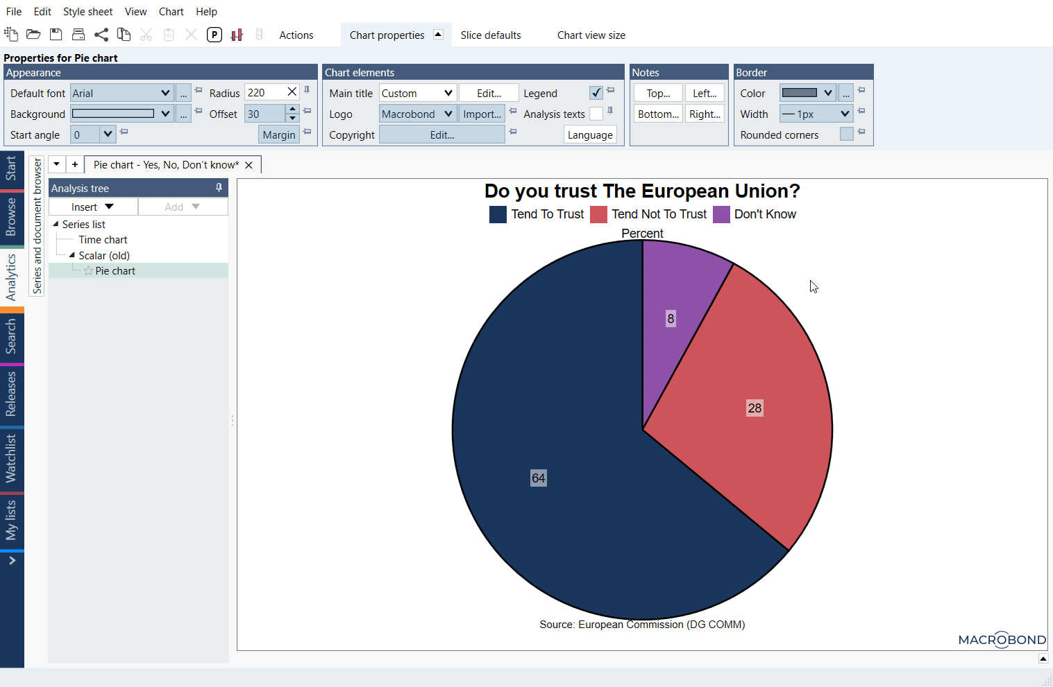
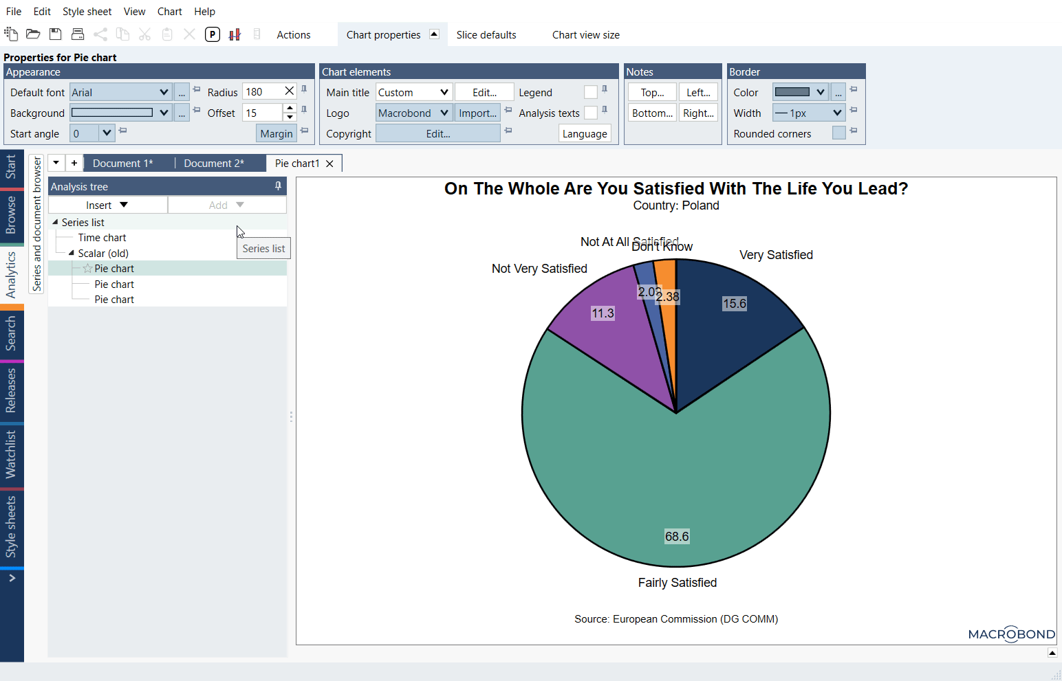
We have created Pie charts with survey answers for different countries, with one slice popping from the pie. You can easily add more countries and quickly create new Pie charts.
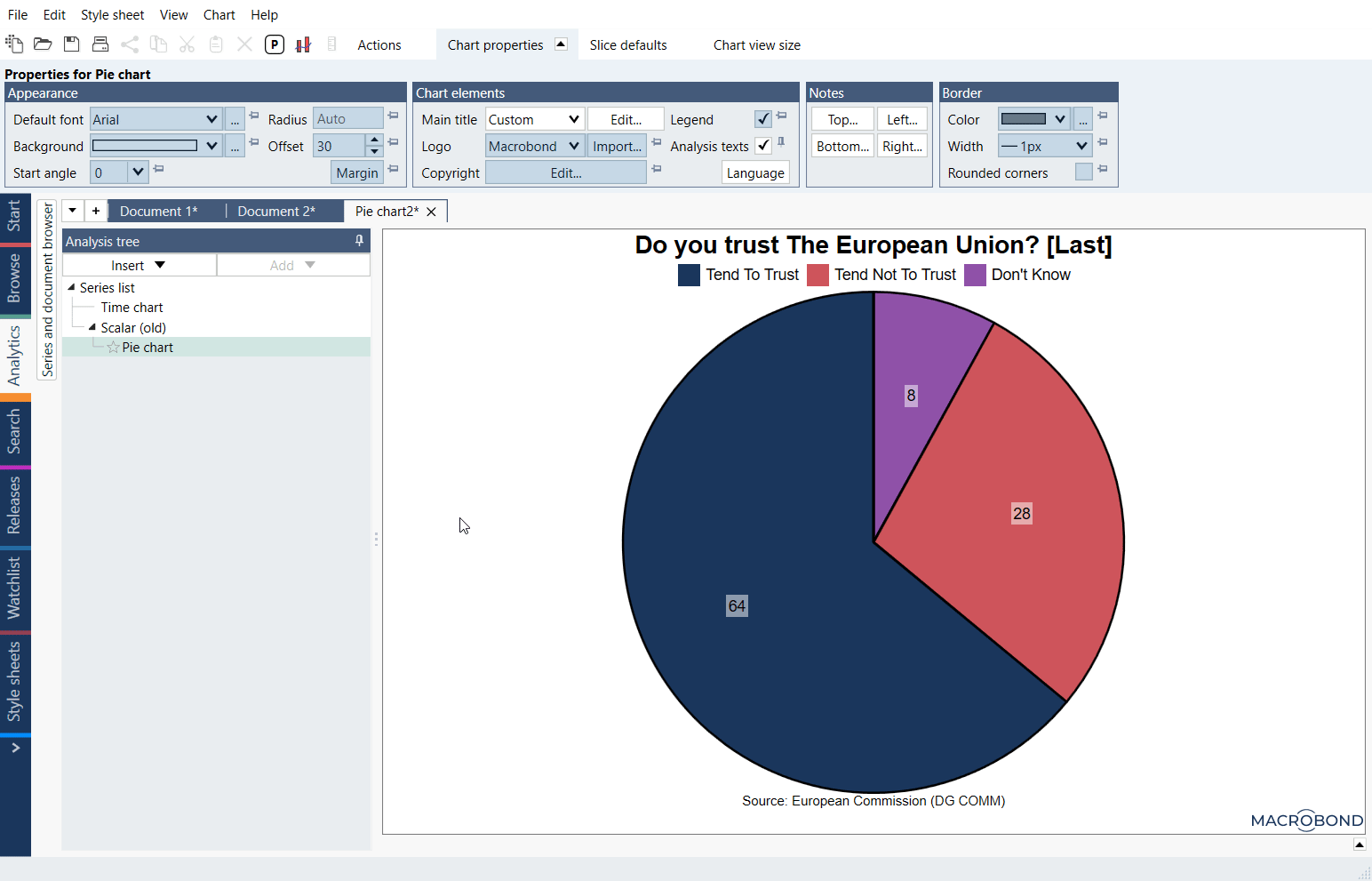
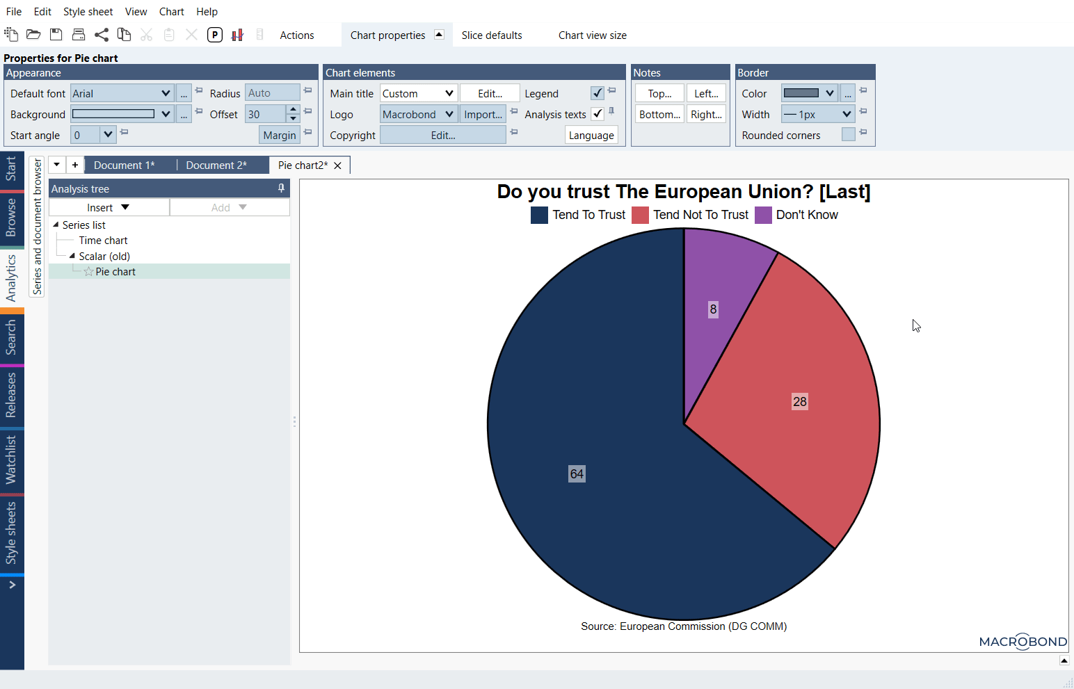
The classic survey answers in a form of Pie chart.